

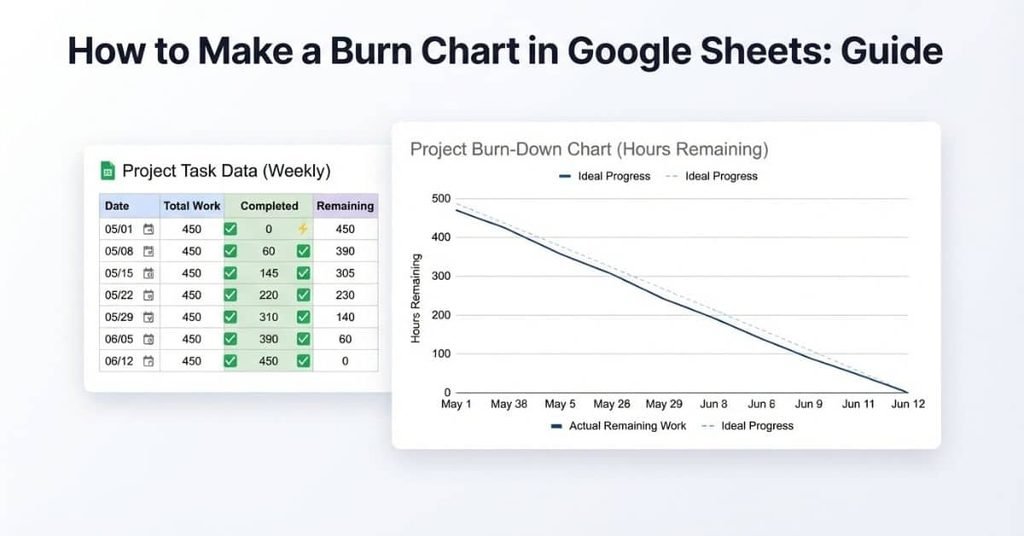
Table of Contents
Introduction
Ever wonder why your project feels busy, but you cannot tell if it is actually moving forward?
A burn chart makes project progress easier to see at a glance. If you are learning how to make a burn chart in Google Sheets, you do not need advanced spreadsheet skills. A simple task list, a few formulas, and a line chart can create a useful visual tracker.
This approach works well for students, freelancers, teachers, and project teams across the USA. It can help you track completed work and spot whether a project is staying on schedule.
In this guide, you will learn how to build a burn chart in Google Sheets from scratch. We will start with your task data and finish with a clear chart. You will also learn the difference between burn-down and burn-up charts.
By the end, you will have a practical Google Sheets burn-down chart you can customize for your own project.
What Is a Burn Chart?
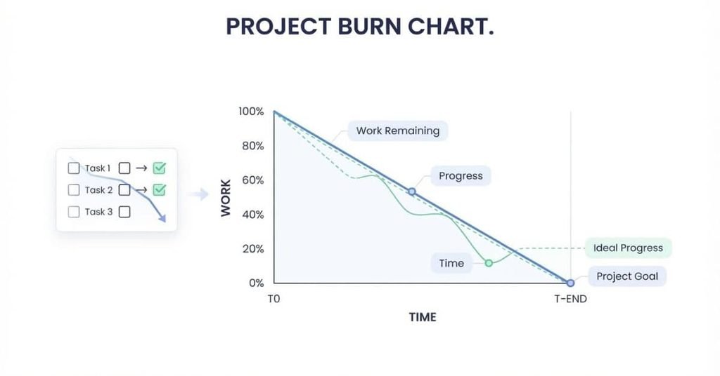
A burn chart is a visual project-tracking chart that shows how work changes over time. It helps teams see project progress, task completion, and remaining work in one view.
The horizontal axis usually represents time, such as days, weeks, or project sprints. The vertical axis represents the amount of work remaining or completed, depending on the chart type. Work might mean tasks, hours, story points, or another measurable unit.
As work gets completed, the chart shows how the project is moving toward its goal. This makes it easier to notice slow progress, changing workloads, or schedule concerns. You can create a simple burn chart from a task list and update it as work changes.
What Is a Burn-Down Chart?
A burn-down chart shows how much work remains as time passes. The remaining work should generally decrease as team members complete tasks.
Project teams commonly use burn-down charts to monitor progress during a project or sprint. A typical chart starts with the total planned work and moves toward zero.
Example burn-down chart
Illustrative project work remaining across five time periods.
| Day | Remaining |
|---|---|
| Day 1 | 20 |
| Day 2 | 16 |
| Day 3 | 11 |
| Day 4 | 6 |
| Day 5 | 0 |
A line that falls steadily toward zero suggests that work is being completed over time. A flat section means little work was completed during that period.
A line that stays above the expected pace may signal that the project needs closer attention. The chart shows progress clearly without requiring a detailed task review.
What Is a Burn-Up Chart?
A burn-up chart shows how much work the team has completed over time. Instead of tracking remaining work, it focuses on progress that has already been finished.
The completed-work line generally rises as more tasks reach completion. This makes a burn-up chart useful when you want to see the amount of finished work at each point.
A burn-up chart differs from a burn-down chart mainly in what the vertical measure represents. A burn-down chart tracks work remaining, while a burn-up chart tracks work completed.
Burn-up charts can also make changes to the total project scope easier to understand. If planned work increases, you can compare the completed work against the changing total scope.
Pro Tip: Choose the chart that matches the question you need to answer. Use burn-down for remaining work and burn-up for completed work.
What You Need to Make a Burn Chart in Google Sheets
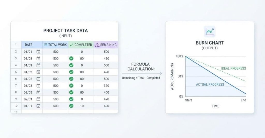
You don’t need advanced spreadsheet skills to create a burn chart in Google Sheets. A simple project tracker provides everything you need.
Prepare these basic components before creating your chart:
- Google Sheets: Use a blank spreadsheet for your project data.
- Project or task list: List the work you need to complete.
- Dates: Add the days, weeks, or other time periods you want to track.
- Total tasks or estimated work: Record the starting amount of work.
- Completed tasks or work: Update this value as work gets finished.
- Remaining work: Subtract completed work from total work.
- Chart: Turn your tracking data into a line chart.
For beginners, tracking tasks by day is a simple starting point. You can later change the setup to weekly tracking or another schedule.
Create Your Task Data in Google Sheets
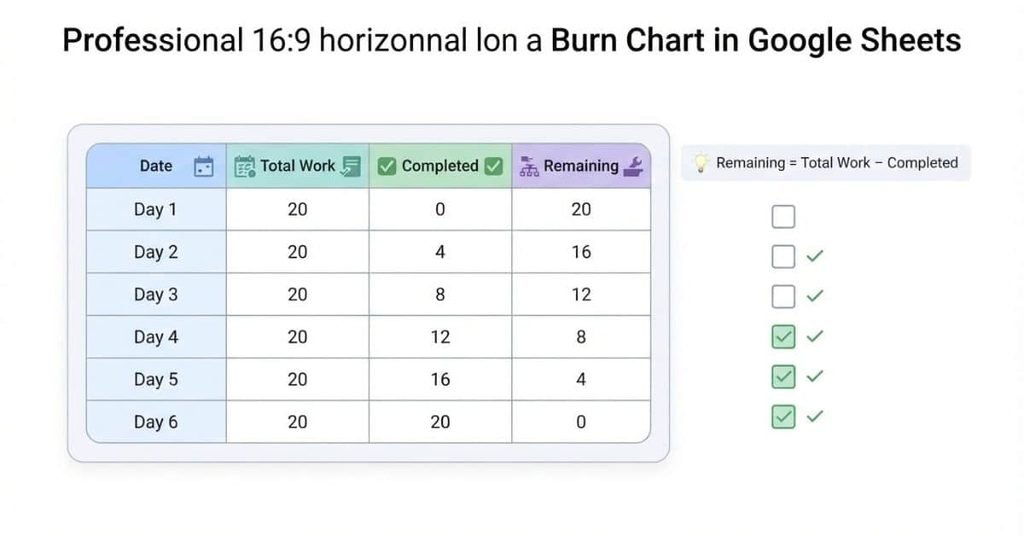
Start by opening a new Google Sheets spreadsheet. Create four columns for your burn chart: Date, Total Work, Completed, and Remaining.
Enter your project information row by row. For this example, the project starts with 20 units of work. The completed amount increases each day until all work reaches zero remaining.
| Date | Total Work | Completed | Remaining |
|---|---|---|---|
| Day 1 | 20 | 0 | 20 |
| Day 2 | 20 | 3 | 17 |
| Day 3 | 20 | 7 | 13 |
| Day 4 | 20 | 11 | 9 |
| Day 5 | 20 | 15 | 5 |
| Day 6 | 20 | 20 | 0 |
This table becomes the source data for your Google Sheets burn-down chart. Keeping each value in its own column also makes later chart setup easier.
Add Your Project Dates
Enter each tracking period in the Date column. You can use actual dates, weekdays, project days, or sprint periods.
For a beginner project, daily entries make progress easy to follow. For longer projects, weekly dates may keep the sheet easier to manage.
Keep your dates in chronological order. This helps Google Sheets display the project timeline correctly when you create the line chart.
Add Total Work or Tasks
Enter the project’s starting workload in the Total Work column. You can measure this as tasks, hours, story points, or another consistent unit.
For example, a project with 20 tasks starts with a total work value of 20. Keep the measurement consistent throughout your tracking period.
If your project contains different task sizes, estimated work hours may provide more useful tracking than simple task counts.
Track Completed Work
Use the Completed column to record work finished during each tracking period. Update this value as your project moves forward.
For example, you might have 3 completed tasks on Day 2 and 7 completed tasks on Day 3. The completed value should never exceed the total planned work.
Regular updates keep the burn chart connected to your actual project progress.
Calculate Remaining Work
The Remaining column shows how much work still needs completion. Calculate it by subtracting completed work from total work.
The basic formula is:
Remaining Work = Total Work − Completed Work
In Google Sheets, if Total Work is column B and Completed is column C, enter this formula in D2:
=B2-C2
Then copy the formula down the column. Google Sheets will adjust the row references automatically.
When completed work reaches the total workload, remaining work reaches 0. This value becomes the key measure for your burn-down chart.
Calculate Remaining Work Automatically
A burn-down chart needs accurate remaining work values. Instead of entering them manually, let Google Sheets calculate them for you.
Use this simple formula:
Remaining Work = Total Work − Completed Work
For example, if your project has 20 total tasks and 7 are complete, 13 tasks remain. This calculation updates automatically whenever you change the completed-work value.
In your Google Sheets table, place Total Work in column B and Completed in column C. Then select the first cell under Remaining, such as D2.
Enter:
=B2-C2
Press Enter. Google Sheets will calculate the remaining work for that row. For example, 20 total tasks minus 7 completed tasks gives 13 remaining tasks.
This setup saves time and reduces manual calculation errors. It also keeps your chart data accurate as the project progresses.
Copy the Formula Down the Column
After creating the first formula, apply it to the remaining rows. Select the cell containing your formula and drag the small blue square in its bottom-right corner downward.
Google Sheets automatically adjusts the row references. For example, the next row changes from =B2-C2 to =B3-C3.
You can also copy the formula with Ctrl+C and paste it into the cells below. On a Mac, use Command+C and Command+V.
Keep the formula in every row that represents a tracking period. This ensures each date has an updated remaining-work value.
Check Your Results
Before creating the chart, review the Remaining column. Each value should match the total work minus completed work.
Your final row should show 0 remaining work when all planned work is complete. If the result doesn’t reach zero, check your total and completed values for that row.
Also look for negative values. A negative result usually means your completed-work value exceeds the total planned work.
How to Make a Burn Chart in Google Sheets
Now you can turn your project data into a visual burn chart. Google Sheets can create the chart directly from your date and remaining-work columns.
For a basic burn-down chart, you only need two key data series: time and remaining work. Follow these steps to build the chart.
Step 1: Select Your Date and Remaining Work Columns
Select the Date column and the Remaining column in your spreadsheet. These columns provide the chart’s timeline and work values.
If the columns aren’t next to each other, hold Ctrl on Windows or Command on Mac while selecting them.
Include the column headers in your selection. Google Sheets can then use those headers to label the chart automatically.
Step 2: Insert a Chart
With your data selected, open the Insert menu at the top of Google Sheets.
Choose Chart from the menu. Google Sheets will create a chart based on your selected data.
The default chart type may not be the one you need. You can change it using the Chart editor that appears beside the spreadsheet.
Step 3: Choose a Line Chart
In the Chart editor, open the Setup section. Find the Chart type option and select Line chart.
A line chart works well because your burn chart tracks changes across time. Each point represents the remaining workload for a specific date.
You should now see your remaining-work values connected by a line. As work gets completed, the line should generally move downward.
Step 4: Set the X-Axis to Dates
Check the X-axis setting in the Chart editor. Set your Date column as the horizontal axis.
Your dates should appear from left to right in chronological order. This creates the timeline for your project.
If the dates appear incorrectly, check that your spreadsheet stores them as actual dates rather than plain text.
Step 5: Set Remaining Work as the Series
Under the Series setting, select your Remaining column.
The chart should now plot remaining work against your project dates. Each point shows how much work remained during that period.
For a basic burn-down chart, you don’t need to include every column in your data table. Keeping the chart focused makes the progress easier to understand.
Step 6: Customize the Chart
A few simple formatting changes can make your burn chart clearer and more professional.
Chart title: Use a descriptive title such as Project Burn-Down Chart. This tells readers exactly what the chart represents.
Axis titles: Label the horizontal axis Date and the vertical axis Remaining Work. Clear labels help beginners understand the chart without guessing.
Legend: Keep the legend if it helps identify the series. For a single series, you can hide it if it adds no useful information.
Gridlines: Keep light gridlines when they help readers compare values. Remove unnecessary gridlines if the chart looks crowded.
Data labels: Add data labels when readers need to see the exact remaining value at each point. For larger projects, labels may create visual clutter.
Line formatting: Adjust the line thickness or point style to improve visibility. Keep the formatting simple so the progress line remains the main focus.
Once these settings are complete, your Google Sheets burn-down chart is ready to use. Update the underlying data as work progresses, and the chart will reflect those changes automatically.
How to Make a Burn-Down Chart in Google Sheets
A burn-down chart in Google Sheets shows how much work remains as your project moves toward its deadline. It uses your actual remaining-work data and can include an ideal progress line for comparison.
Start with columns for Date, Total Work, Completed, Remaining, and Ideal Remaining. Your actual remaining value comes from the formula =Total Work-Completed.
For the ideal line, spread the starting workload evenly across your planned project periods. This creates a simple reference for the progress you expected to make.
For example, a six-day project with 20 total work units could reduce the ideal workload by about 4 units each day. Your actual line can then move above or below that reference.
This setup helps you see project progress without manually judging each day’s performance.
Add a Target/Ideal Burn-Down Line
The ideal line represents the remaining work if your project follows its planned pace. It gives you a reference point for comparing actual progress.
Use this concept:
Ideal Remaining Work = Total Work − Planned Progress
For example, if your project starts with 20 work units and planned progress reaches 4 units by Day 2, the ideal remaining work is 16 units.
Create a new Ideal Remaining column beside your actual Remaining column. Enter the calculated ideal values for each project period.
You can also calculate them with a formula. If total work is in B2, and planned progress is in E2, use:
=B2-E2
Copy the formula down the column. Then add the Ideal Remaining column to your chart as another series.
Your chart will now contain two lines: one for actual remaining work and one for ideal remaining work.
Compare Actual vs. Ideal Progress
Compare the actual line with the ideal line to understand your current pace.
If the actual remaining-work line stays below the ideal line, less work remains than planned. If it stays above the ideal line, more work remains than planned.
For example, suppose your ideal remaining work is 12 units, but your actual remaining work is 15 units. Your project has more unfinished work than your planned pace expected.
This comparison doesn’t automatically explain why progress changed. It simply gives you a clear visual signal to investigate.
For students, this can help track assignments, research projects, or group work. You can quickly see whether your completed work matches your planned schedule.
How to Make a Burn-Up Chart in Google Sheets
A burn-up chart tracks completed work instead of remaining work. It provides a different view of project progress and can also show changes in total project scope.
To create one, use columns for Date, Completed Work, and Total Work. Select the relevant columns, insert a line chart, and use the date as the horizontal axis.
The completed-work line should generally rise as you finish more tasks. The total-work line shows the amount of work required for the project.
This makes it easier to see both progress and scope on the same chart.
Track Completed Work
Use your Completed column to record the amount of work finished during each period.
For example, you might record 0 completed units on Day 1, 3 on Day 2, and 7 on Day 3. Continue updating the value as more work reaches completion.
Select your Date and Completed columns when creating the chart. Then choose Line chart in the Chart editor.
Set Date as the X-axis and Completed as the series. Your completed-work line should rise as your project advances.
Add the Total Work Line
The Total Work line represents the project’s current scope. Add your Total Work column as another chart series.
If your project has 20 total work units, the line stays at 20 while the scope remains unchanged. This creates a reference point above your completed-work line.
If the project scope changes, update the Total Work values for the affected dates. The chart can then show how the required work changed over time.
This is one of the key differences between burn-up and burn-down charts. A burn-up chart can make scope changes easier to see.
Compare Actual Progress With Total Scope
Look at the Completed Work line alongside the Total Work line. The gap between them represents work that remains unfinished.
For example, if completed work reaches 15 units while total scope is 20 units, 5 units remain.
A burn-up chart can be especially useful when project requirements may change. The total-work line can move upward when new work gets added.
A burn-down chart focuses on work remaining. A burn-up chart focuses on work completed against total scope. Choose the view that matches the progress question you need to answer.
How to Make a Burn Chart From a Task List
You can create a burn chart directly from a simple task list. This method works well when your project already tracks tasks and completion status.
The key is to convert each task’s status into a number. Then, summarize completed and remaining tasks for each date.
For a basic task-based burn-down chart, you can track tasks completed each day and tasks remaining. This approach works for assignments, research projects, group work, and personal project plans.
Start With Your Task List
Begin with a task table in Google Sheets. Create columns that describe each task and its progress.
| Task | Due Date | Status | Completed |
|---|---|---|---|
| Research topic | Day 1 | Completed | 1 |
| Create outline | Day 2 | Completed | 1 |
| Write draft | Day 3 | Not completed | 0 |
| Edit content | Day 4 | Not completed | 0 |
| Final review | Day 5 | Not completed | 0 |
The Task column identifies the work. Due Date shows when each task is planned, while Status records its current state.
The Completed column converts that status into a value that Google Sheets can calculate.
Convert Task Status Into Numbers
Google Sheets works more easily with numerical values than text when you need totals and formulas.
Use a simple system:
- Completed = 1
- Not completed = 0
Each completed task contributes one unit to your total. Each unfinished task contributes zero.
You can enter these values manually or create a formula based on the Status column. If Status is in column C, enter this in D2:
=IF(C2="Completed",1,0)
Copy the formula down the column. Google Sheets will then update the number when you change a task’s status.
This creates a clean data source for calculating daily project progress.
Calculate Daily Completed Tasks
Next, group your completed tasks by date. The goal is to determine how many tasks were completed during each tracking period.
For example:
| Date | Completed Tasks |
|---|---|
| Day 1 | 1 |
| Day 2 | 1 |
| Day 3 | 0 |
| Day 4 | 0 |
| Day 5 | 0 |
You can use SUMIF when your task list contains due dates and completion values. For example, if dates are in column B and completed values are in column D, a formula can total completed work for a specific date.
This daily summary becomes the foundation for your burn chart. As more tasks become complete, your daily totals change.
Calculate Remaining Tasks
Now calculate how many tasks remain unfinished.
Use:
Remaining Tasks = Total Tasks − Completed Tasks
If your project contains 5 tasks and 2 are complete, 3 tasks remain.
For a daily summary, you can build a table like this:
| Date | Total Tasks | Completed | Remaining |
|---|---|---|---|
| Day 1 | 5 | 1 | 4 |
| Day 2 | 5 | 2 | 3 |
| Day 3 | 5 | 2 | 3 |
| Day 4 | 5 | 2 | 3 |
| Day 5 | 5 | 2 | 3 |
If Total Tasks is in B2 and Completed is in C2, enter:
=B2-C2
Copy the formula down to calculate remaining tasks for every date.
Turn the Data Into a Chart
Once your summary table is ready, select the Date and Remaining columns. Then choose Insert → Chart in Google Sheets.
Select Line chart from the Chart editor. Set Date as the X-axis and Remaining as the series.
Your chart will now show how unfinished tasks change over time. As tasks are completed, the line should move downward toward zero.
Expert Tip: Keep your task list and chart data separate when possible. This makes your spreadsheet easier to update and reduces the chance of breaking chart formulas.
Burn-Down vs. Burn-Up Chart in Google Sheets
Both burn-down and burn-up charts help you track project progress in Google Sheets. The main difference is what each chart measures.
A burn-down chart tracks the work that remains. Its line usually moves downward as tasks get completed. The main goal is to reach zero remaining work by the project deadline.
A burn-up chart tracks the work you have completed. Its line usually moves upward as you finish more tasks. You compare completed work with the project’s total scope.
| Feature | Burn-Down | Burn-Up |
|---|---|---|
| Measures | Work remaining | Work completed |
| Direction | Usually decreases | Usually increases |
| Goal | Reach zero | Reach total scope |
| Shows scope changes | Less clearly | More clearly |
| Best for | Tracking unfinished work | Tracking completed work and scope |
| Main question | How much work is left? | How much work have we completed? |
A burn-down chart can be easier when your main concern is unfinished tasks. For example, a student can use it to track how many assignments remain before a deadline.
A burn-up chart can help when project requirements may change. It lets you compare completed work with the current total scope.
Neither chart requires complicated spreadsheet skills. Your choice depends on the type of progress you want to see.
Pro Tip: Use a burn-down chart when you want to focus on remaining tasks. Use a burn-up chart when completed work and scope changes matter more.
Example: Google Sheets Burn Chart for a Student Project
Imagine you’re a student completing a project with 10 assignments or project tasks over 5 days. You want to know whether you’re completing work fast enough to meet your deadline.
Start with 10 planned tasks. If you expect to complete two tasks each day, your ideal progress increases steadily. You can compare that target with your actual completed tasks.
| Day | Planned Tasks | Completed Tasks | Remaining Tasks | Ideal Progress | Actual Progress |
|---|---|---|---|---|---|
| Day 1 | 10 | 1 | 9 | 2 | 1 |
| Day 2 | 10 | 3 | 7 | 4 | 3 |
| Day 3 | 10 | 5 | 5 | 6 | 5 |
| Day 4 | 10 | 8 | 2 | 8 | 8 |
| Day 5 | 10 | 10 | 0 | 10 | 10 |
The Planned Tasks column shows the starting workload. Completed Tasks records the work you actually finish each day.
Remaining Tasks shows the unfinished work. You can calculate it with:
=Planned Tasks - Completed Tasks
The Ideal Progress column shows where you expected to be. In this example, the target increases by two tasks each day.
Read the Student Project Chart
You can turn the data into a line chart by selecting the Day, Completed Tasks, and Ideal Progress columns. Choose Insert → Chart, then select a line chart.
The chart lets you compare actual progress with your planned pace. On Day 1, you completed one task instead of the ideal two. By Day 4, your actual progress reaches the ideal target.
This makes the chart useful for school projects, research papers, presentations, and assignment planning. You can quickly see whether your work is keeping pace with your plan.
For a burn-down chart, use the Remaining Tasks column instead. The line should move from 10 toward zero as you complete the project.
Expert Tip: Update your task list each day instead of changing chart values manually. Your formulas will keep the burn chart connected to your project data.
How to Read a Burn Chart
Once you create a burn chart in Google Sheets, the next step is understanding what the lines mean. You don’t need advanced project management knowledge to read the chart.
Start by checking the horizontal axis for time. The vertical axis shows your chosen work measure, such as tasks, hours, or story points.
For a burn-down chart, the line usually moves downward as you complete work. You can compare the actual line with an ideal line to understand whether your project follows the planned pace.
Line Going Down
A downward line on a burn-down chart means the amount of remaining work is decreasing. In most cases, this means you’re completing tasks.
For example, if remaining work falls from 8 tasks to 5 tasks, you completed three tasks during that period.
A steady downward trend usually shows regular progress. A flat section means the remaining workload hasn’t changed during that period.
Remember that a burn-up chart works differently. Its progress line usually moves upward because it measures completed work.
Line Above the Ideal Line
When the actual burn-down line stays above the ideal line, more work remains than your planned pace suggests.
For example, the ideal line may show 4 tasks remaining, while your actual line shows 6. You have more unfinished work than expected at that point.
This may indicate that your project needs attention. Check your task list, deadline, workload, and recent progress before deciding what caused the difference.
Line Below the Ideal Line
When the actual burn-down line falls below the ideal line, less work remains than expected.
For example, your ideal line might show 6 remaining tasks, while your actual line shows 4. You’ve completed work faster than the planned pace.
This indicates progress ahead of the reference plan. Continue updating the task data so the chart reflects your current position.
Line Reaches Zero
When the burn-down line reaches zero, no planned work remains in your tracked workload.
For example, if your project started with 10 tasks and all 10 become complete, remaining work equals zero.
A zero value means the tasks included in your chart are complete. It doesn’t automatically confirm that your entire project is finished if you left tasks out of the original task list.
Expert Tip: Always check the task list alongside the chart. The chart summarizes your data, while the task list shows exactly which work remains.
Common Google Sheets Burn Chart Mistakes
A Google Sheets burn chart is simple to build, but small data errors can make the chart misleading. Most problems come from incorrect formulas, inconsistent dates, or choosing the wrong chart setup.
Before using your chart to track a project, review the source data carefully. A few quick checks can prevent confusing results later.
Mistake 1: Using the Wrong Chart Type
A line chart usually works well for showing project progress over time. Choosing a different chart type can make the timeline harder to understand.
For most basic burn charts, use Insert → Chart → Line chart. Make sure your dates appear on the horizontal axis.
Mistake 2: Forgetting to Calculate Remaining Work
A burn-down chart needs accurate remaining-work values. If you only track completed tasks, you may not have the data needed for a standard burn-down chart.
Use:
Remaining Work = Total Work - Completed Work
Then copy the formula down your tracking table.
Mistake 3: Using Inconsistent Dates
Your dates should follow a clear chronological order. Mixing dates, weekdays, or project-day labels can make the timeline confusing.
Use actual dates when possible. Keep each tracking period consistent throughout the project.
Mistake 4: Mixing Completed and Remaining Work
Completed work and remaining work represent different measurements. Mixing them in one series can produce a chart that doesn’t answer a clear question.
Label each column clearly before creating your chart.
Mistake 5: Not Updating the Task Data
Your chart can only reflect the information in your spreadsheet. If you don’t update completed tasks, the chart will quickly become outdated.
Update your task status and formulas regularly during the project.
Mistake 6: Confusing Burn-Down With Burn-Up
A burn-down chart measures work remaining, while a burn-up chart measures work completed.
Check what you want to measure before building the chart. This simple distinction prevents many setup errors.
Google Sheets Burn Chart Template
Building a burn chart from scratch is easy once your data is organized. A ready-to-use Google Sheets burn chart template can make the process even faster.
The template should keep your project data separate from the chart. This makes updates easier and helps prevent formula or chart errors as your project changes.
Use the following columns as your starting structure:
| Date | Total Work | Completed Work | Remaining Work | Ideal Remaining Work |
|---|---|---|---|---|
| Day 1 | 20 | 2 | 18 | 20 |
| Day 2 | 20 | 5 | 15 | 16 |
| Day 3 | 20 | 9 | 11 | 12 |
| Day 4 | 20 | 14 | 6 | 8 |
| Day 5 | 20 | 20 | 0 | 4 |
Each column has a specific purpose:
- Date: Shows each project tracking period.
- Total Work: Records the starting workload.
- Completed Work: Shows how much work has been finished.
- Remaining Work: Calculates unfinished work.
- Ideal Remaining Work: Shows the planned pace toward completion.
- Chart: Visualizes actual progress against the ideal line.
For Remaining Work, use a formula such as =B2-C2. Your ideal line can use a planned reduction across the project timeline.
Once your table is ready, select the Date, Remaining Work, and Ideal Remaining Work columns. Choose Insert → Chart, then select a line chart. Rename the chart and axis titles so readers can understand it immediately.
This structure works for school assignments, research projects, work tasks, and personal deadlines. You can also expand it with weekly dates, estimated hours, story points, or additional project details.
Copy the Template or Build Your Own Chart
You can use this structure as a starting point for your own Google Sheets burn chart. Copy the columns, replace the sample values with your project data, and let the formulas calculate your remaining work.
Conclusion
A burn chart turns a simple task list into a clear picture of project progress. In this guide, you learned how to make a burn chart in Google Sheets using formulas, task data, and line charts.
You also learned how burn-down and burn-up charts track progress differently. With the right setup, you can compare actual progress with your ideal project pace.
You don’t need advanced spreadsheet skills to get started. A few organized columns and simple formulas can create a useful project tracker.
Try building your own chart with a real assignment or project. Then update it regularly as tasks become complete.
Want more practical spreadsheet tips? Explore our other calculator and project-tracking guides, and share this guide with someone who needs it.
Frequently Asked Questions
Find quick answers to common questions about creating and using burn charts in Google Sheets.
Start with columns for Date, Total Work, Completed Work, and Remaining Work.
Calculate remaining work with =Total Work-Completed Work.
Then select your Date and Remaining Work columns. Choose Insert → Chart
and select a line chart. You can add an ideal remaining-work line to compare actual progress with your planned pace.
Create a table with dates, total work, completed work, and remaining work.
Calculate remaining work using =Total Work-Completed Work.
Select the Date and Remaining Work columns. Go to Insert → Chart
and choose a line chart. Add an ideal line if you want to compare actual progress with your target schedule.
Yes. Google Sheets can create a burn-up chart using a line chart. Track your Date, Completed Work, and Total Work columns. Plot completed work and total scope as separate series. The completed-work line usually rises as tasks finish, while the total-work line shows the project’s current scope.
Start with a task list containing the task name, due date, and status. Convert task status into numbers, such as 1 for completed and 0 for incomplete. Group completed tasks by date, then calculate remaining tasks. Use the resulting date and progress data to create a line chart in Google Sheets.
A line chart is usually the best choice for a burn chart. It shows how work changes across time and makes progress trends easy to see. Use dates on the horizontal axis and your work measurement on the vertical axis. For a burn-down chart, plot remaining work.
A burn-down chart measures work remaining, so its line usually moves downward toward zero. A burn-up chart measures work completed, so its line usually moves upward toward the total scope. Burn-up charts can also make changes in project scope easier to see.
Yes. You can automate much of the process with formulas. For example, use formulas to calculate completed and remaining work from your task data. When your source data changes, the calculated values can update automatically. Your chart can then reflect those updated values without rebuilding it.
Yes. A burn chart can help students track assignments, research tasks, presentations, or group projects. Add each task to Google Sheets and update its status as work gets completed. A burn-down chart can show how many tasks remain, while a burn-up chart can show completed work over time.

Team ClassRank builds smart, student-friendly calculators to make grade and rank tracking simple and accurate. For questions or feedback, contact us at classrankcalculator@gmail.com.