

Table of Contents
Introduction
Ever wonder why a project can feel behind schedule even when tasks are getting completed?
A burn down chart makes project progress easier to see in Excel. If you are learning how to make a burn down chart in Excel, you can build one with a simple task list, formulas, and a line chart.
These charts are useful for students, teachers, freelancers, and project teams across the USA. They help you compare remaining work with the time available to finish it.
You do not need advanced Excel skills to create an effective chart. A basic understanding of rows, columns, dates, and simple formulas is enough.
In this guide, you will learn how to create an Excel burn down chart from a task list. We will cover the data setup, formulas, chart creation, and useful formatting tips.
You will also learn how to make a burn up chart in Excel. By the end, you can choose the chart style that fits your project tracking needs.
What Is a Burn-Down Chart?
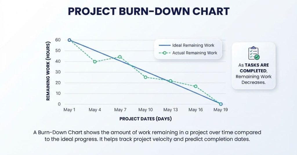
A burn-down chart is a simple project tracking tool that shows how much work remains over time. It helps you see whether a project is moving toward its target completion date.
The chart usually places time on the horizontal axis and remaining work on the vertical axis. As the team completes tasks, the remaining work should decrease. This creates a downward trend toward zero.
A burn-down chart often compares two progress lines:
- Ideal progress: How work should decrease according to the project plan.
- Actual progress: How work is actually decreasing as tasks get completed.
This comparison helps you spot schedule differences early. If actual progress stays above the ideal line, the team has more work remaining than planned.
You can measure project work in different ways. For example, a team might track tasks, hours, assignments, or story points. The important part is using a consistent measurement throughout the project.
What Does a Burn-Down Chart Show?
A burn-down chart shows whether a project is reducing its remaining work at the expected pace. It connects the amount of unfinished work with the time left before completion.
The ideal line represents the planned rate of progress. The actual line represents the work that remains based on real project activity.
For example, imagine a project starts with 100 hours of planned work. The team should gradually reduce those hours as they complete assignments. The chart makes that change visible across each project date.
A burn-down chart can help you identify:
- Remaining work
- Completed work over time
- Planned progress
- Actual progress
- The target completion point
- Potential schedule gaps
The chart does not automatically explain why progress changes. It gives you a visual signal that helps you investigate the project further.
When Should You Use a Burn-Down Chart?
Use a burn-down chart when you need a clear view of remaining work throughout a project. It works especially well when the project has a defined start date, target date, and measurable workload.
Students can use one to track assignments during a semester. Freelancers can monitor project tasks against a deadline. Project teams can track planned work during a sprint or other defined work period.
A burn-down chart can be useful when you want to:
- Monitor progress toward a deadline
- Compare actual work with planned progress
- Identify delays early
- Track remaining tasks or hours
- Give teammates a quick progress update
It works best when you update the underlying data regularly. If completed work changes often, keeping the chart current gives you a more useful picture of progress.
What You Need to Create a Burn-Down Chart in Excel
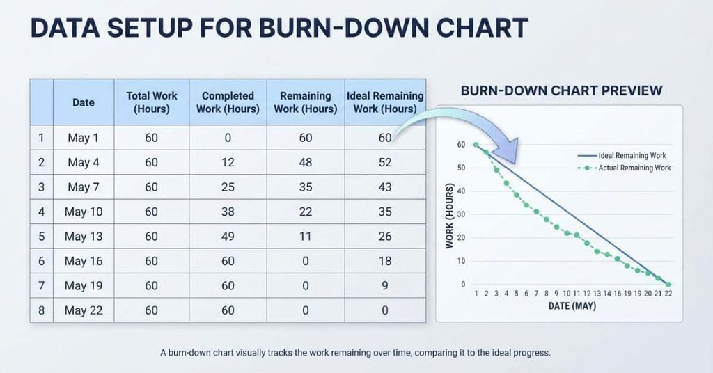
Creating a burn-down chart in Excel starts with a simple project tracking table. You don’t need a complicated spreadsheet or advanced formulas.
At minimum, your table should include these columns:
| Data | Purpose |
|---|---|
| Date | Shows when each progress measurement occurs |
| Total project work | Records the original amount of planned work |
| Completed work | Shows work finished by each date |
| Remaining work | Shows unfinished work |
| Ideal remaining work | Shows the planned reduction in remaining work |
The remaining work value usually comes from the total project work minus completed work. For example, if a project has 80 hours and 30 hours are complete, 50 hours remain.
The ideal remaining work line provides a planned path toward zero. Excel can then display both values on a line chart for easy comparison.
You can measure project work using:
- Tasks — useful for simple task-based projects.
- Assignments — helpful for school or training projects.
- Story points — commonly used for agile development work.
- Hours — useful when work effort matters more than task count.
- Other units — any consistent measurement that fits your project.
Choose one measurement and use it consistently. Mixing tasks, hours, and story points in the same burn-down calculation can make the chart misleading.
Pro Tip: Keep your raw project data in a clean Excel table. This makes formulas, updates, and chart ranges easier to manage.
Create Your Excel Task and Progress Table
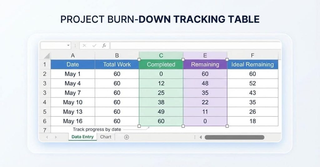
Before creating an Excel burn-down chart, build a clear table for your project data. This table gives Excel the information needed to plot progress over time.
A simple structure works well for beginners. Use one row for each project date or progress update.
| Date | Total Work | Completed | Remaining | Ideal Remaining |
|---|---|---|---|---|
| Sep 1 | 50 | 0 | 50 | 50 |
| Sep 2 | 50 | 8 | 42 | 40 |
| Sep 3 | 50 | 15 | 35 | 30 |
| Sep 4 | 50 | 25 | 25 | 20 |
| Sep 5 | 50 | 35 | 15 | 10 |
| Sep 6 | 50 | 50 | 0 | 0 |
You can replace these example values with your own project data. Your work units could represent tasks, hours, assignments, or story points.
Keep the headings consistent and avoid blank rows inside the data range. A clean table makes later formulas and chart creation much easier.
Enter Project Dates
Start by entering the dates for your project in the Date column. Enter the project start date first, then add each date you want to track.
For a daily project, you might enter one date per row. For a longer project, weekly progress updates may work better.
You can type the dates manually or use Excel’s fill feature. Enter the first two dates, select both cells, and drag the fill handle downward.
Make sure Excel recognizes the entries as dates rather than plain text. Consistent dates help Excel display the chart timeline correctly.
Add Total Work
Enter the project’s starting workload in the Total Work column. This value represents the full amount of work planned for the project.
For example, suppose your project contains 50 tasks. Enter 50 as the total work for the relevant tracking rows.
If you measure work in hours, you could enter 50 hours instead. The unit doesn’t matter as much as keeping it consistent throughout your table.
Record Completed Work
Use the Completed column to record how much work has been finished by each date.
For example, if your project starts with 50 tasks and you complete eight tasks on the second day, enter 8 for that date.
The completed value should represent cumulative work completed up to that date. Don’t enter only the tasks completed during that individual day.
Calculate Remaining Work
The Remaining column shows how much work is still unfinished. You can calculate it by subtracting completed work from total work.
For example, with 50 total tasks and 15 completed tasks, the remaining work equals 35 tasks.
Excel can perform this calculation automatically with a simple formula. This saves time and reduces manual calculation errors.
Calculate Remaining Work With an Excel Formula
The basic calculation for a burn-down chart is:
Remaining Work = Total Work − Completed Work
Suppose your table uses these columns:
- B: Total Work
- C: Completed
- D: Remaining
If your first project row is row 2, click cell D2 and enter:
=B2-C2Press Enter, and Excel calculates the remaining work automatically.
For example, if B2 contains 50 and C2 contains 15, cell D2 returns 35.
This formula keeps your remaining-work values connected to your project data. When you change the completed amount, Excel can update the remaining value automatically.
Copy the Formula Down
After entering the formula in the first Remaining cell, copy it to the rows below.
You can select D2 and drag the fill handle downward. Excel will adjust the row references automatically.
For example, the next row becomes:
=B3-C3The following row becomes:
=B4-C4Continue until every project date has a remaining-work calculation.
This approach is faster than entering each formula manually. It also keeps your calculations consistent across the entire burn-down chart data set.
Check for Errors
Review the Remaining column before creating your chart. The values should match your project’s actual progress.
Pay particular attention to these checks:
- Remaining work should not become negative.
- Completed work should not exceed total work.
- The final remaining value should reach zero when all work is complete.
- Each row should use the correct date and progress data.
If a formula produces -5, your completed value exceeds the total work recorded for that row. Check the completed-work entry before continuing.
A final value of 0 means the tracked work has been fully completed. This gives your burn-down chart a clear endpoint for the project.
Calculate the Ideal Burn-Down Line
The ideal burn-down line shows how remaining work should decrease if the project follows its planned schedule. It gives you a baseline for comparing planned and actual progress.
The line normally starts at the project’s total work and reaches zero at the target completion date. A steady decline creates a simple visual path toward completion.
Determine the Starting Work
Start with the total amount of work planned for the project. This becomes the first value on your ideal burn-down line.
For example, suppose your project has 50 tasks to complete. Your starting work is therefore 50 tasks.
The measurement can also represent hours, assignments, or story points. Use the same unit throughout your spreadsheet.
Determine the Number of Project Days
Next, determine how many tracking periods your project includes. For a daily burn-down chart, count the project dates from the starting date through the target date.
For example, a project running from September 1 through September 6 has six tracked dates.
Be consistent with how you count periods. Your ideal line should start with the full workload and reach zero on the planned final date.
Calculate Ideal Remaining Work
A simple conceptual formula for evenly distributed work is:
Ideal Remaining Work = Starting Work × (Days Remaining ÷ Total Project Days)
Suppose your project starts with 50 tasks and has six tracked days. On each date, calculate the planned work remaining based on the time left.
In Excel, you can calculate this dynamically using the starting work, project dates, and elapsed time. For example, if B2 contains starting work, A2 contains the current date, A$2 contains the start date, and A$7 contains the final date, you could use:
=$B$2*(($A$7-A2)/($A$7-$A$2))This formula decreases the ideal remaining work as the project date moves forward.
For a six-day project with 50 tasks, you may see ideal values such as 50, 40, 30, 20, 10, and 0. Your actual values can then be compared against this planned path.
How to Make a Burn Down Chart in Excel
Learning how to make a burn down chart in Excel becomes much easier once your progress table is ready. Excel’s line chart can turn your dates and remaining-work values into a clear visual.
The goal is to show actual remaining work alongside ideal remaining work. This lets you compare your project’s real progress with its planned pace.
Step 1: Select the Date and Progress Columns
Select the Date, Remaining, and Ideal Remaining columns in your Excel table.
If the columns aren’t next to each other, hold Ctrl on Windows while selecting each required range.
Include the column headings when selecting your data. Excel can then use those headings as chart series names.
Step 2: Open the Insert Tab
With your data selected, go to the Insert tab in Excel’s ribbon.
Look for the Charts section. Excel provides several chart types, including column, bar, and line charts.
For a burn-down chart, a line chart works well because project progress changes across time.
Step 3: Select a Line Chart
Choose Insert → Line or Area Chart → 2-D Line.
Excel will create a chart using your selected dates and progress values.
The dates should appear along the horizontal axis. The remaining-work values should appear on the vertical axis.
Step 4: Add Actual Remaining Work
Make sure the Remaining column appears as one chart series.
This line represents your project’s actual remaining work at each recorded date.
As completed work increases, the actual remaining-work line should generally move downward.
If the series doesn’t appear correctly, right-click the chart and choose Select Data. Check that the Date column provides the horizontal-axis labels.
Step 5: Add Ideal Remaining Work
Add the Ideal Remaining column as the second chart series.
In Select Data, choose Add and select the cells containing your ideal remaining-work values.
Your chart should now show two lines. One represents actual progress, while the other represents the planned burn-down path.
Step 6: Configure the Horizontal Axis
The horizontal axis should display your project dates in chronological order.
If Excel treats the dates incorrectly, right-click the axis and open Format Axis. Check the axis settings and make sure Excel recognizes your entries as dates.
Use a readable date format when many dates appear. This keeps the chart clean without removing important project information.
Step 7: Add Chart Titles and Labels
Give the chart a clear title, such as Project Burn-Down Chart.
Add an axis title if it improves clarity:
- Horizontal axis: Date
- Vertical axis: Remaining Work
Keep the legend visible so readers can distinguish Actual Remaining from Ideal Remaining.
A clean chart makes progress easier to understand without requiring readers to inspect every spreadsheet value.
Customize Your Excel Burn-Down Chart
A basic line chart gives you the structure, but a few adjustments can make it easier to read. Clear labels and sensible scales help beginners understand project progress quickly.
Keep the design simple and focus on the two important lines: actual remaining work and ideal remaining work.
Change the Chart Title
Click the chart title and replace Excel’s default text with a descriptive title. Project Burn-Down Chart is a clear option for most projects.
You can also include the project name or tracking period if that information helps your team.
Avoid overly long titles. A short title keeps the chart readable, especially when you place it inside a project report.
Label the X-Axis
The X-axis represents time, so label it Date or Project Date.
Your dates should appear in chronological order from the project start through the target completion date.
If Excel displays too many date labels, adjust the axis formatting. You can also change the date format to make the labels shorter.
Label the Y-Axis
The Y-axis represents the amount of work remaining. Label it Remaining Work.
Your label should match the unit used in your table. For example, you could use Remaining Tasks, Remaining Hours, or Remaining Story Points.
This helps readers understand exactly what the vertical values represent.
Adjust the Vertical Scale
Excel usually chooses the vertical scale automatically. Check the scale to make sure it fits your project data clearly.
For example, if your project starts with 50 tasks, a scale from 0 to 50 may be appropriate.
Keep zero visible on the axis. Reaching zero is an important part of a burn-down chart because it represents completed work.
Format the Data Lines
Format the two lines so readers can distinguish them quickly. Use different line styles, widths, or markers for actual and ideal progress.
Keep the formatting consistent with the rest of your spreadsheet or project report.
Avoid excessive effects, bright decorations, or unnecessary chart elements. The goal is quick comparison rather than visual complexity.
Add or Remove Gridlines
Gridlines can help readers estimate values between data points. Keep them when they improve readability.
If the chart already looks clear without them, remove unnecessary gridlines. A less crowded chart often works better in presentations and reports.
Display the Legend
Keep the legend visible when your chart contains both data series. It tells readers which line represents Actual Remaining and which represents Ideal Remaining.
Place the legend where it doesn’t cover the chart data. Excel lets you position it above, below, or beside the chart.
How to Make a Burn-Up Chart in Excel
A burn-up chart uses a different view of project progress. Instead of showing remaining work, it shows how much work the team has completed over time.
If you’re learning how to make a burn up chart in Excel, you can use much of the same spreadsheet structure. The main difference is the progress measure shown on the chart.
A burn-up chart commonly compares completed work with the project’s total scope. Completed work generally moves upward as the team finishes more work, while the total scope line shows the amount of work planned.
This makes it useful when you want to see progress toward the project’s full scope.
Create a Completed Work Column
Start with a Completed Work column in your Excel table.
Enter the cumulative amount of work completed at each project date. For example, if your project contains 50 tasks, your values might increase from 0 to 8, then 15, and eventually 50.
The values should use the same unit as your total project work.
Add the Total Scope Line
Create a Total Scope column beside your completed-work data.
Enter the project’s total scope for each tracking date. If the project contains 50 tasks, the column can contain 50 for each date.
Keeping this value constant creates a horizontal reference line. If the project scope changes, update the total scope values to reflect that change.
Insert a Line Chart
Select your Date, Completed Work, and Total Scope columns.
Then choose Insert → Line or Area Chart → 2-D Line. Excel will create a line chart using your selected dates and data series.
The horizontal axis should show dates, while the vertical axis should show completed work.
Compare Completed Work With Total Work
The completed-work line shows how much work the team has finished. The total-scope line shows the amount required for full completion.
As completed work approaches the total scope, the project moves closer to completion. The chart also makes changes in project scope easier to notice.
For example, if total scope increases during a project, the scope line can move upward. This helps separate slower progress from a larger amount of planned work.
Burn-Down vs. Burn-Up Charts in Excel
Both charts help you track project progress, but they measure progress from different directions. A burn-down chart focuses on what remains, while a burn-up chart focuses on what has been completed.
| Feature | Burn-Down | Burn-Up |
|---|---|---|
| Main metric | Remaining work | Completed work |
| Direction | Down | Up |
| Target | Zero | Total scope |
| Scope changes | Harder to see | Easier to see |
A burn-down chart works well when your main question is, “How much work do we still have?” The line moves toward zero as work gets completed.
A burn-up chart answers a different question: “How much work have we completed?” The completed-work line moves upward toward the total project scope.
Burn-up charts can also make scope changes more visible. If the total amount of planned work changes, the scope line can show that change directly.
Choose the chart based on the progress view you need. Both can use Excel line charts and similar project data.
How to Make a Burn Chart From a Task List in Excel
You can create a burn chart directly from a task list by organizing task details before summarizing progress by date.
This approach works well when each project task has its own deadline, status, and estimated workload. It also gives you a useful source table for an Excel burn down chart.
Start With Your Task List
Create a worksheet with one row for each task. Include basic information that helps you track completion.
A simple structure could look like this:
| Task | Due Date | Status | Estimated Work |
|---|---|---|---|
| Research topic | Sep 2 | Complete | 2 |
| Draft outline | Sep 3 | Complete | 1 |
| Write introduction | Sep 4 | In Progress | 2 |
| Finish first draft | Sep 6 | Not Started | 4 |
| Review project | Sep 8 | Not Started | 2 |
You can measure Estimated Work using tasks, hours, or another consistent unit. Choose the measurement that best represents your project.
Track Completed Tasks
Update the Status column as you finish each task. Use simple labels such as Complete, In Progress, and Not Started.
For a task-based burn chart, completed tasks contribute to your completed-work count. Keep your status labels consistent so Excel formulas can identify completed tasks correctly.
If you want to track effort instead of task count, use the estimated work values instead.
Calculate Remaining Tasks
Calculate remaining tasks by subtracting completed tasks from total tasks.
The basic concept is:
Remaining Tasks = Total Tasks − Completed Tasks
For example, if your list contains 20 tasks and you have completed 7, you have 13 tasks remaining.
You can calculate this automatically with Excel formulas instead of updating the value manually.
Summarize Progress by Date
A chart needs progress values connected to specific dates. Create a summary table that records total, completed, and remaining tasks for each tracking date.
For example:
| Date | Total Tasks | Completed | Remaining |
|---|---|---|---|
| Sep 1 | 20 | 0 | 20 |
| Sep 3 | 20 | 5 | 15 |
| Sep 5 | 20 | 9 | 11 |
| Sep 7 | 20 | 15 | 5 |
| Sep 10 | 20 | 20 | 0 |
This summary table turns individual task records into a timeline. You can then use the Date and Remaining columns to create your burn-down chart.
Create the Chart
Select the Date and Remaining columns from your summary table. Then choose Insert → Line or Area Chart → 2-D Line.
Add an ideal remaining-work series if you want to compare actual progress with planned progress.
Your finished chart should show the remaining workload moving toward zero. This makes delays, faster progress, and the expected completion path easier to understand.
Example: Excel Burn-Down Chart for a Student Project
Imagine a U.S. student has a project with 20 assignments or tasks to complete over 10 days. The student wants to track progress against the planned completion schedule.
The project starts with 20 tasks. The ideal plan reduces the remaining workload evenly until it reaches zero on Day 10.
| Day | Total Tasks | Completed Tasks | Remaining Tasks | Ideal Remaining |
|---|---|---|---|---|
| 1 | 20 | 0 | 20 | 20 |
| 2 | 20 | 2 | 18 | 18 |
| 3 | 20 | 5 | 15 | 16 |
| 4 | 20 | 7 | 13 | 14 |
| 5 | 20 | 9 | 11 | 12 |
| 6 | 20 | 12 | 8 | 10 |
| 7 | 20 | 15 | 5 | 8 |
| 8 | 20 | 17 | 3 | 6 |
| 9 | 20 | 19 | 1 | 4 |
| 10 | 20 | 20 | 0 | 2 |
The ideal completion line represents the planned pace. The actual progress comes from the student’s completed tasks.
In this example, actual progress moves below the ideal remaining-work line during much of the project. That means the student has fewer remaining tasks than the original plan expected at those points.
However, the final row shows an important detail. The student reaches zero remaining tasks on Day 10, while the simple ideal values shown above have not yet reached zero. When building your actual Excel chart, make sure the ideal formula reaches zero on the selected target completion date.
Expert tip: Track assignments by due date and update status regularly. A current task list makes your burn-down chart much more useful for managing schoolwork.
How to Read a Burn-Down Chart
A burn-down chart becomes useful when you know what the lines and movements mean. The main idea is simple: the actual line shows remaining work, while the ideal line shows planned progress.
Compare the two lines throughout the project. Their position can help you spot whether work is moving faster, slower, or close to the expected pace.
Actual Line Above Ideal Line
When the actual remaining-work line stays above the ideal line, more work remains than planned at that point.
This may mean the project is potentially behind schedule. Check the task list before drawing a final conclusion. Delayed tasks, changing priorities, or updated project scope can affect the chart.
Actual Line Below Ideal Line
When the actual line falls below the ideal line, less work remains than the original plan expected.
This may indicate that the project is potentially ahead of schedule. The team may have completed tasks faster than planned.
However, confirm that the total scope has not changed. A smaller workload can also make the remaining value fall faster.
Actual Line Reaches Zero
When the actual remaining-work line reaches zero, the tracked work is complete.
This means all work included in the chart has been completed. If the project still has additional tasks, update the task list and total scope before interpreting the result.
Actual Line Stays Flat
A flat actual line means the remaining-work value did not change during that period.
Usually, this means little or no work was completed during those dates. It can also indicate that your task data or formulas were not updated.
If the line stays flat unexpectedly, check the completed-work values and remaining-work formula in your Excel table.
Common Excel Burn-Down Chart Problems
A burn-down chart can look incorrect when the source data or chart settings contain small errors. Most problems are easy to fix once you know where to look.
Before changing the chart design, check your underlying Excel table. Correct dates, formulas, values, and chart ranges create a more reliable project burn-down chart.
Mistake 1: Choosing the Wrong Chart Type
A burn-down chart normally uses a line chart because progress needs to be displayed across time.
Choosing an unrelated chart type can make the project timeline harder to understand. In Excel, select your date and progress columns, then use a 2-D line chart.
Mistake 2: Incorrect Remaining-Work Formula
The remaining-work formula should subtract completed work from total work.
Use:
=Total Work - Completed Work
For example, if total work is in B2 and completed work is in C2, use:
=B2-C2
Check several rows manually after entering the formula.
Mistake 3: Missing Dates
Every progress value should connect to the correct project date.
Missing or inconsistent dates can create gaps or misleading movements in your chart. Keep dates in chronological order and use a consistent date format.
Mistake 4: Mixing Completed and Remaining Values
Completed work and remaining work measure different things.
A burn-down chart should plot remaining work, not cumulative completed work. If you want to show completed work, consider creating a burn-up chart instead.
Mistake 5: Forgetting the Ideal Line
The ideal line gives you a planned path for comparison.
Without it, you can see whether remaining work is falling, but you have less context about the expected pace. Add an ideal remaining-work column when you want to compare actual and planned progress.
Mistake 6: Incorrect Axis Scaling
An unsuitable vertical scale can make normal progress look dramatic or hide meaningful changes.
Keep the Y-axis appropriate for your workload. For example, a project with 50 tasks may use a scale starting at zero and extending slightly above 50.
Mistake 7: Including Blank Rows in the Chart
Blank rows inside your chart range can create unexpected gaps or extra points.
Check the selected data range before creating or updating the chart. Keep your source table organized and remove unnecessary blank rows from the selected range.
Pro tip: If your chart suddenly looks wrong after adding new data, check the chart’s source range first. Many display problems come from an incorrect selected range rather than the chart itself.
Excel Burn-Down Chart Template
An Excel burn-down chart template can save time when you track recurring projects, assignments, or team tasks. Start with a simple progress table, then use the data to create your chart.
Set up your worksheet with these five columns:
| Dates | Total Work | Completed Work | Remaining Work | Ideal Remaining Work |
|---|---|---|---|---|
| Sep 1 | 50 | 0 | 50 | 50 |
| Sep 2 | 50 | 8 | 42 | 40 |
| Sep 3 | 50 | 15 | 35 | 30 |
| Sep 4 | 50 | 25 | 25 | 20 |
| Sep 5 | 50 | 35 | 15 | 10 |
| Sep 6 | 50 | 50 | 0 | 0 |
Use the following formulas:
- Remaining Work:
=Total Work-Completed Work - Ideal Remaining Work: calculate the planned remaining work for each project date.
Once your table is ready, select Dates, Remaining Work, and Ideal Remaining Work. Go to Insert → Line Chart to create the burn-down chart.
Your final worksheet should contain:
- Dates — project tracking dates.
- Total Work — the original project workload.
- Completed Work — work completed by each date.
- Remaining Work — work still left.
- Ideal Remaining Work — planned progress toward completion.
- Burn-down Chart — visual comparison between actual and planned progress.
You can copy this structure into a blank Excel worksheet and replace the sample values with your own project data.
If your website offers a downloadable or copy-ready template, add a clear CTA below the section, such as “Download the Excel Burn-Down Chart Template” or “Copy the Burn-Down Chart Template.”
Conclusion
You now know how to build a burn-down chart in Excel using a task list, formulas, dates, and a line chart. We also covered burn-up charts, task tracking, chart reading, common Excel mistakes, and a simple template.
Learning how to make a burn down chart in Excel can make project progress easier to understand. You can quickly compare actual remaining work with your planned progress.
Start with a small project or assignment if you’re new to Excel charts. Once your data is organized, creating and updating the chart becomes much easier.
Try the process with your next project and adjust the template to fit your workflow. Explore more Excel guides and calculator tools on our website for practical project and study support.
Frequently Asked Questions
Start by creating columns for dates, total work, completed work, remaining work, and ideal remaining work. Calculate remaining work by subtracting completed work from total work. Then select the date, remaining work, and ideal remaining work columns. Go to Insert → Line Chart to create your burn-down chart. Add clear titles and axis labels to make the chart easier to read.
A burn-up chart tracks completed work instead of remaining work. Create columns for dates, completed work, and total project scope. Enter cumulative completed work for each date and keep total scope as a separate series. Select these columns and insert a 2-D Line Chart in Excel. The completed-work line should move upward toward the total scope.
Yes, Excel can create a burn-down chart using a standard line chart. Excel does not require a special burn-down chart type. Create the required project data first, then plot remaining work against dates. Adding an ideal remaining-work line lets you compare actual progress with the planned completion path.
A 2-D line chart is usually the most suitable choice for a burn-down chart in Excel. It shows how remaining work changes over time. You can add separate lines for actual remaining work and ideal remaining work. Clear axis labels and an appropriate vertical scale also make the chart easier to understand.
Start with a task list containing the task name, due date, status, and estimated work. Update each task as work gets completed. Then summarize completed and remaining tasks by date. Use the summary data to create a line chart. This approach lets you turn an ordinary task list into a useful project burn-down chart.
A burn-down chart shows remaining work and moves toward zero as work is completed. A burn-up chart shows completed work and moves upward toward the total project scope. Burn-up charts can also make changes in project scope easier to see. Both charts help teams understand progress over time.
Yes, you can create a burn-down chart from a blank Excel worksheet. You only need project dates, total work, completed work, remaining work, and ideally planned remaining work. Enter the data, apply the required formulas, and insert a line chart. A template simply saves setup time.
Yes. Students can use an Excel burn-down chart to track assignments, research tasks, study projects, or group work. For example, a student can list 20 tasks and track how many remain each day. Comparing actual progress with an ideal line can help identify periods when work falls behind the planned schedule.

Team ClassRank builds smart, student-friendly calculators to make grade and rank tracking simple and accurate. For questions or feedback, contact us at classrankcalculator@gmail.com.