

Table of Contents
Introduction
Have you ever looked at a scatter plot and wondered, “Is there really a pattern here?”
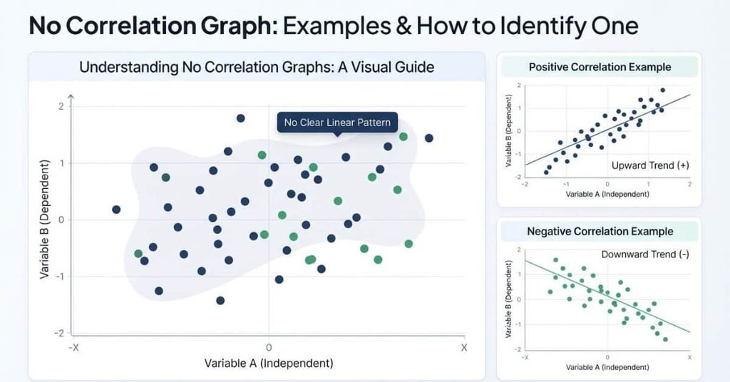
A no correlation graph shows data points without a clear linear relationship between two variables. Instead of forming an upward or downward trend, the points appear scattered across the graph.
Understanding this pattern is important for beginners learning statistics, scatter plots, and correlation in school. It can also help you avoid confusing random data with positive or negative relationships.
In this guide, you’ll learn what a no correlation graph looks like and how to identify one quickly. We’ll explore simple examples and explain what zero correlation means in statistics.
You’ll also see how a graph with no correlation differs from positive and negative correlation. By the end, you’ll have a clear way to recognize a no correlation scatter graph and explain what it means.
What Is a No Correlation Graph?
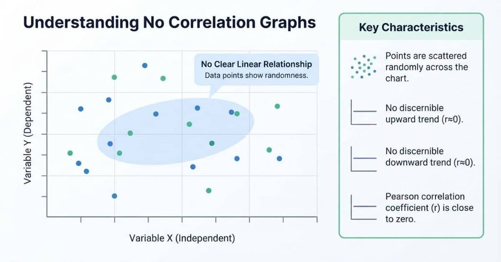
A no correlation graph is a scatter plot where two variables show no clear linear relationship. The data points appear scattered rather than forming a consistent pattern.
As one variable changes, the other does not reliably increase or decrease. You won’t see a clear upward pattern or a consistent downward pattern. This means knowing one variable does not reliably help you predict the other.
For example, a scatter plot might compare the number of hours students sleep with their shoe size. The points could appear spread across the graph without a clear direction. In that case, the variables show little or no linear correlation.
No Correlation Graph: Compare Correlation Patterns
Switch between the three scatter-plot patterns to see how correlation changes.
What Does a No Correlation Graph Look Like?
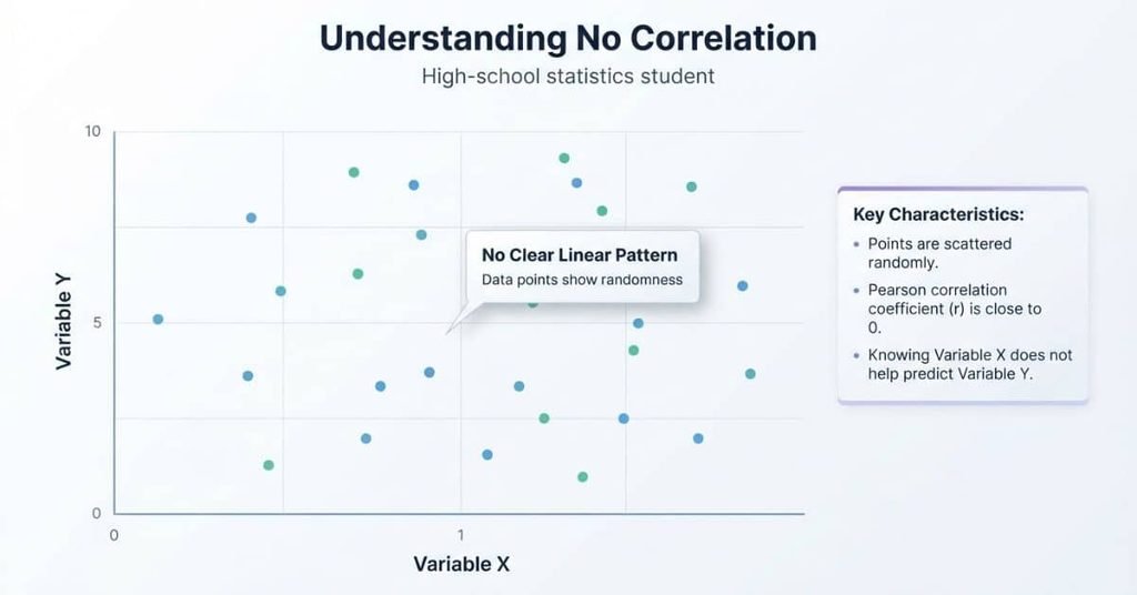
A no correlation graph usually looks random at first glance. The points spread across the graph without creating a clear line or direction.
This visual pattern helps students answer questions such as “what does a no correlation graph look like?” When the points lack a noticeable trend, the graph may represent zero or very weak linear correlation.
Visual Characteristics
A no-correlation scatter plot has several easy-to-spot features:
- Random-looking point pattern: The points appear scattered across the graph.
- No obvious slope: The points don’t consistently move upward or downward.
- No linear trend: You can’t draw a useful straight line through the middle of the points.
- Wide spread: Data points appear across different x- and y-values.
- Approximately flat trendline: A fitted line may sit close to horizontal.
Don’t expect every no-correlation graph to look perfectly random. Real data often contains small patterns or clusters. The key is whether the points show a meaningful linear direction.
Example of a No Correlation Graph
Consider a scatter plot comparing two unrelated measurements. Each dot represents one observation, with its position determined by an x-value and a y-value.
Example of a No Correlation Graph
Illustrative data showing points scattered without a clear linear relationship.
Here, the x-axis represents the first variable, while the y-axis represents the second variable. The dots don’t form a consistent upward or downward pattern.
An optional trendline would be approximately flat because the data does not show a clear linear relationship. This makes the graph a useful example of a graph with no correlation.
What Is a No Correlation Scatter Graph?
A scatter plot, also called a scatter graph, displays the relationship between two quantitative variables. Each point represents one pair of values from the data.
In a no correlation scatter graph, the points don’t show a consistent linear direction. They may spread across the graph without forming a clear upward, downward, or straight-line pattern.
For example, one variable may increase while the other sometimes increases and sometimes decreases. This makes it difficult to use one variable to predict the other through a linear relationship.
No Correlation vs. Random Scatter
A graph that looks scattered does not automatically prove zero correlation. Real data can look somewhat random while still showing a weak positive or negative trend.
Look at the overall direction of the points rather than one or two unusual observations. A no-correlation graph has no meaningful linear pattern across the data.
It also helps to consider the correlation coefficient. A visual inspection can suggest no correlation, but the value of r provides a numerical measure of linear association.
How Do You Know if a Graph Has No Correlation?
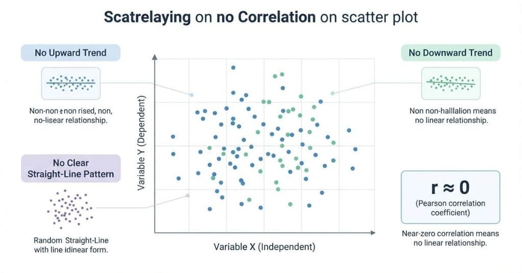
Students can use a simple process to identify a graph with no linear correlation. Start by looking at the overall pattern rather than individual points.
Step 1: Look for an Upward Pattern
Check whether the points generally rise as you move from left to right. If they do, the graph may show a positive correlation.
If no clear upward pattern exists, continue to the next step.
Step 2: Look for a Downward Pattern
Next, check whether the points generally fall as you move from left to right. A clear downward pattern suggests negative correlation.
If the points don’t consistently fall, continue checking the graph.
Step 3: Look for a Clear Linear Pattern
Now examine the overall shape of the points. Ask whether you could draw a straight line that reasonably follows their direction.
If no clear linear pattern appears, the graph may show no linear correlation.
Step 4: Check the Correlation Coefficient
The correlation coefficient, represented by r, measures the strength and direction of a linear relationship. Its value ranges from -1 to +1.
A value close to 0 indicates little or no linear correlation. Values closer to +1 or -1 indicate stronger positive or negative linear relationships.
What Does No Correlation Mean in Statistics?
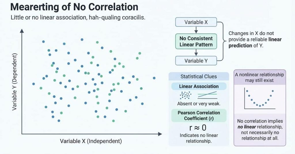
In statistics, no correlation means two quantitative variables have little or no linear association. Changes in one variable don’t show a consistent linear pattern with changes in the other.
Correlation focuses on how two variables move together. A positive correlation means both variables tend to increase together. A negative correlation means one tends to increase as the other decreases.
With no linear correlation, knowing one variable provides little help when making a linear prediction about the other. The correlation coefficient, r, helps measure this relationship. A value near zero indicates little or no linear association.
It’s also important to remember that correlation does not establish causation. Even a strong correlation doesn’t prove that one variable causes changes in the other. Other variables or factors may explain the observed pattern.
Does No Correlation Mean No Relationship?
No. No linear correlation does not necessarily mean the variables have no relationship at all.
The Pearson correlation coefficient measures the strength of a linear relationship. Two variables can have a strong curved or other nonlinear relationship while their linear correlation remains close to zero.
This distinction matters in AP Statistics. A scatter plot should always be examined before interpreting a correlation coefficient.
For example, imagine a graph where y-values rise as x increases, then fall after reaching a peak. The points clearly follow a curved pattern. However, the overall linear association can be weak because the upward and downward movements balance each other.
So, when you see r ≈ 0, don’t automatically conclude that the variables are unrelated. First, look at the shape of the scatter plot.
Examples of No Correlation Graphs
Different scatter plots can help you distinguish true no correlation from weak or nonlinear patterns. The examples below use illustrative data for learning purposes.
Example 1 — Clearly No Correlation
A clearly uncorrelated scatter plot has points spread throughout the graph without a consistent direction.
Example 1: Clearly No Correlation
Illustrative points show no obvious linear direction between the two variables.036912036912
| X | Y |
|---|---|
| 1 | 7 |
| 2 | 3 |
| 3 | 8 |
| 4 | 5 |
| 5 | 2 |
| 6 | 7 |
| 7 | 4 |
| 8 | 9 |
| 9 | 3 |
| 10 | 6 |
| 11 | 4 |
| 12 | 8 |
Illustrative data for learning purposes.
There is no consistent upward or downward movement. A straight trendline would be approximately flat.
Example 2 — Weak Correlation
A weak correlation looks different from true no correlation. The points may appear scattered, but they still show a slight overall direction.
Illustrative points show a small upward tendency despite considerable scatter.036912036912
| X | Y |
|---|---|
| 1 | 2 |
| 2 | 5 |
| 3 | 3 |
| 4 | 6 |
| 5 | 4 |
| 6 | 7 |
| 7 | 5 |
| 8 | 8 |
| 9 | 6 |
| 10 | 9 |
| 11 | 7 |
| 12 | 10 |
Illustrative data for learning purposes.
Notice the slight upward direction. The points don’t form a tight line, but the overall pattern moves upward from left to right.
This is weak positive correlation, not true no correlation. A correlation coefficient would be above zero, although its exact value depends on the data.
Example 3 — Nonlinear Relationship
A nonlinear relationship can look very different. Consider points that form a curved pattern instead of a straight one.
Illustrative points form a curved pattern, showing why near-zero linear correlation does not always mean no relationship.036912-6-3036
| X | Y |
|---|---|
| -6 | 8 |
| -5 | 6 |
| -4 | 4 |
| -3 | 2 |
| -2 | 1 |
| -1 | 0 |
| 0 | 0 |
| 1 | 1 |
| 2 | 1 |
| 3 | 3 |
| 4 | 5 |
| 5 | 7 |
| 6 | 9 |
Illustrative data for learning purposes.
Here, the points follow a curved pattern rather than a straight line. A linear correlation coefficient may be close to zero even though the variables clearly have a relationship.
This example shows why you should never judge correlation from r alone. Always inspect the scatter plot for curves, clusters, and other patterns.
No Correlation vs. Positive vs. Negative Correlation
The easiest way to distinguish correlation types is to examine the overall direction of the points. A scatter plot can show an upward trend, a downward trend, or no clear linear pattern.
| Type | Pattern |
|---|---|
| Positive Correlation | Points generally rise from left to right |
| Negative Correlation | Points generally fall from left to right |
| No Correlation | No clear linear pattern |
Positive Correlation
The points generally move upward from left to right.
Positive correlation: The points generally move upward as the x-variable increases.
Negative Correlation
The points generally move downward from left to right.
Negative correlation: The points generally move downward as the x-variable increases.
No Correlation
The points show no clear upward or downward linear pattern.
No correlation: The points don’t show a consistent linear direction.
When comparing graphs, focus on the overall pattern, not whether every point follows the trend. Real datasets rarely form a perfect line.
No Correlation and the Correlation Coefficient
The correlation coefficient, represented by r, summarizes the direction and strength of a linear relationship. Its value ranges from -1 to +1.
The sign tells you the direction of the relationship. The distance from zero helps describe the strength of the linear association.
Positive r
A positive r indicates that the variables tend to move upward together. As the x-variable increases, the y-variable generally increases.
Values closer to +1 indicate a stronger positive linear association. However, a positive correlation alone does not prove that one variable causes the other.
Negative r
A negative r indicates a downward trend between the variables. As the x-variable increases, the y-variable generally decreases.
Values closer to -1 indicate a stronger negative linear association. The negative sign describes direction, not whether the relationship is automatically strong.
r Near 0
When r is near 0, the data shows little or no linear relationship. The scatter plot may lack a clear upward or downward direction.
A value near zero does not mean the variables have no connection whatsoever. You should inspect the scatter plot before drawing that conclusion.
Important AP Statistics Note
A correlation coefficient close to zero does not rule out a nonlinear relationship. The variables might follow a curve even when their linear correlation is weak.
For AP Statistics, remember the key distinction: r measures linear association. Always examine the shape of the scatter plot for curves or other patterns.
Which Graph Shows No Correlation?
When you look at several scatter plots, you can identify no correlation by checking whether the points follow a clear linear direction.
Question
Which graph shows no correlation?
Graph A
The points generally rise from left to right.
Graph B
The points generally fall from left to right.
Graph C
The points are scattered without a clear linear direction.
Answer: Graph C
Explanation
Graph C shows no clear linear correlation because the points don’t consistently rise or fall. Their distribution looks random around the graph.
Graph A shows a positive correlation because the points generally move upward as x increases.
Graph B shows a negative correlation because the points generally move downward as x increases.
A graph can also show a stronger or weaker correlation. The closer the points follow a straight-line pattern, the stronger the linear association tends to be.
How to Identify No Correlation on a Scatter Plot
Use this quick checklist when you need to identify a graph with no correlation.
Look For:
- No upward trend: The points don’t generally rise from left to right.
- No downward trend: The points don’t generally fall from left to right.
- No obvious straight-line pattern: The points don’t cluster around an imaginary line.
- Random-looking distribution: The points appear spread across the graph without a clear direction.
- Correlation coefficient close to zero: A value of r near 0 suggests little or no linear relationship.
Do Not Assume:
- A scattered graph always has exactly zero correlation.
- Zero linear correlation means no possible relationship exists.
- Correlation proves causation.
The scatter plot gives you important visual evidence. The correlation coefficient adds a numerical measure of the linear association.
For a reliable interpretation, use both the graph and r when the coefficient is available. Also check for curved patterns because a nonlinear relationship can exist even when r is close to zero.
No Correlation vs. Weak Correlation
No correlation and weak correlation can look similar at first. The key difference is whether the points show a slight overall direction.
| Pattern | What You See |
|---|---|
| No Correlation | No meaningful linear pattern |
| Weak Positive Correlation | Slight upward tendency |
| Weak Negative Correlation | Slight downward tendency |
No correlation: The points are spread without a consistent upward or downward direction.
Weak positive correlation: The points have a slight upward tendency. The relationship may be difficult to see because the points are widely scattered.
Weak negative correlation: The points have a slight downward tendency, but they don’t closely follow a straight line.
The important idea is that weak correlation still has a direction. No correlation has no meaningful linear direction.
When studying a scatter plot, don’t expect every point to follow the same path. Look for the overall pattern across all the points.
Can a Graph Have No Correlation but Still Have a Relationship?
Yes. A graph can have little or no linear correlation while still showing a clear relationship.
This happens when the variables follow a nonlinear pattern. Instead of forming a straight-line trend, the points may follow a curve.
For example, imagine a scatter plot where y decreases as x moves toward the center. After reaching a low point, y begins increasing again. The points form a U-shaped pattern.
A straight line cannot describe this pattern well. As a result, the correlation coefficient may be close to zero even though the variables clearly follow a pattern.
Linear vs. Nonlinear Relationships
Correlation measures the strength and direction of a linear association between two quantitative variables.
A linear relationship can be described with a general straight-line pattern. A nonlinear relationship follows a curve or another shape.
This distinction is important when interpreting r. A correlation coefficient near zero means there is little or no linear association. It does not prove that the variables have no relationship.
For this reason, always inspect the scatter plot before interpreting the correlation coefficient. Look for curves, clusters, or other patterns that r may not describe well.
Example of a Nonlinear Pattern
A U-shaped scatter plot provides a simple example. The points decrease at first, reach a low point, and then increase.
This pattern shows a clear relationship, but it isn’t linear. The points follow a curve rather than a straight line.
So, r near 0 does not always mean “no relationship.” It can mean that the relationship is nonlinear and that a straight-line correlation does not capture its shape.
Common Mistakes When Identifying No Correlation
Students often recognize scattered points but still misinterpret what the graph means. These common mistakes can make correlation questions harder than they need to be.
Mistake 1: Looking Only at Individual Points
Don’t judge correlation by looking at one or two points. Focus on the overall pattern across the entire scatter plot.
One point can move against the general trend without changing the relationship.
Mistake 2: Assuming Random Means Exactly r = 0
A graph that looks random does not always have a correlation coefficient of exactly zero.
A random-looking sample can produce an r value slightly above or below zero. Look for the overall linear pattern instead.
Mistake 3: Ignoring Nonlinear Patterns
A scatter plot can have little linear correlation while still showing a strong curved pattern.
Always check for curves, U-shapes, clusters, or other visible structures before interpreting r.
Mistake 4: Confusing Weak Correlation With No Correlation
Weak correlation still has a slight direction.
A weak positive relationship tends to rise, while a weak negative relationship tends to fall. No correlation has no meaningful linear direction.
Mistake 5: Thinking No Correlation Means No Possible Relationship
No linear correlation does not mean the variables cannot be related.
A nonlinear relationship can exist even when the correlation coefficient is close to zero.
Mistake 6: Confusing Correlation With Causation
Correlation describes an association between variables. It does not prove that one variable causes the other.
A third variable or another factor may help explain an observed association.
No Correlation Graph Examples for AP Statistics
AP Statistics questions often test whether you can interpret a scatter plot, understand the correlation coefficient, and recognize patterns that correlation may miss.
Use these practice questions to check your understanding.
Practice Question 1 — Identify the Graph
Three scatter plots show different relationships. Graph A has points that generally rise from left to right. Graph B has points that generally fall from left to right. Graph C has points scattered without a clear linear direction.
Question: Which graph shows no correlation?
Answer: Graph C
Explanation: Graph C has no consistent upward or downward pattern. Graph A shows positive correlation, while Graph B shows negative correlation.
Practice Question 2 — Interpret r
A scatter plot has a correlation coefficient of r = -0.82.
Question: What does this value tell you about the relationship?
Answer: The variables have a strong negative linear association.
Explanation: The negative sign indicates a downward direction. The value is fairly close to -1, which indicates a strong linear association.
Remember that this describes association. It does not prove causation.
Practice Question 3 — Identify Weak vs. No Correlation
Two scatter plots are shown. Graph A has points with a slight upward tendency. Graph B has points scattered without any noticeable linear direction.
Question: Which graph represents weak positive correlation, and which represents no correlation?
Answer: Graph A shows weak positive correlation. Graph B shows no correlation.
Explanation: Graph A has a small upward trend, so the relationship has a positive direction. Graph B lacks a meaningful linear direction.
The key is to look for an overall trend rather than perfect alignment.
Practice Question 4 — Recognize a Nonlinear Relationship
A scatter plot forms a clear U-shaped pattern. The points decrease as x increases, reach a minimum, and then increase.
Question: Could the graph have a correlation coefficient near zero while still showing a relationship?
Answer: Yes.
Explanation: Pearson’s correlation measures linear association. A U-shaped pattern is nonlinear, so its correlation can be close to zero even though the variables clearly follow a pattern.
This is why you should inspect the scatter plot instead of relying only on r.
Practice Question 5 — Interpret a Scatter Plot
A scatter plot shows points that are widely spread but have a slight downward trend from left to right.
Question: Should you describe this graph as no correlation or weak negative correlation?
Answer: Weak negative correlation.
Explanation: The points do not need to form a tight line to have correlation. The slight overall downward direction indicates a negative association.
Because the points are widely scattered, the relationship is weak rather than strong.
Quick AP Statistics Reminder
When identifying a no correlation graph, check three things:
- Look for an overall upward or downward direction.
- Check whether the points follow a straight-line pattern.
- Look for nonlinear patterns before concluding that there is no relationship.
The goal is not to find a perfect graph. Instead, identify the overall pattern and explain what it tells you about the variables.
Quick Reference: No Correlation Graph
No Correlation
No clear linear pattern
The points don’t show a consistent upward or downward direction.Points are broadly scattered
The data points appear spread across the graph without a clear straight-line trend.r is close to 0
A correlation coefficient near zero indicates little or no linear association.Limited linear prediction
Knowing one variable provides little useful information for making a linear prediction about the other.A nonlinear relationship may still exist
A curved pattern can exist even when the linear correlation is close to zero.
Student tip: Don’t decide that a scatter plot has no relationship just because the points look scattered. Check for direction, linear patterns, and possible curves before interpreting r.
Conclusion
Understanding a no correlation graph becomes easier when you focus on the overall pattern. We covered how to identify no correlation and distinguish it from weak, positive, and negative correlation.
You also learned how the correlation coefficient r describes linear association. A value near zero can still occur with a nonlinear pattern. So, always examine the scatter plot before drawing a conclusion.
With these basics, you can approach correlation questions with more confidence. Look for direction, check the strength, and watch for curved relationships.
Ready to test your skills? Try the examples and practice questions again to reinforce what you learned. You can also share this guide with a classmate studying statistics.
A no correlation graph is a scatter plot with no clear linear relationship between two variables. The points don’t show a consistent upward or downward trend. Knowing one variable provides little help with a linear prediction of the other.
A no correlation graph usually has points spread randomly across the plotting area. You won’t see a clear upward, downward, or straight-line pattern. However, random-looking points don’t always mean the correlation coefficient is exactly zero.
A no correlation scatter graph is a scatter plot where the points show little or no linear association. The data doesn’t form a meaningful straight-line trend. A curved pattern can still exist, even when linear correlation is near zero.
The graph with no clear upward or downward linear trend shows no correlation. Its points appear broadly scattered without following a straight-line direction. Compare the overall pattern rather than focusing on individual points.
Look for the absence of a consistent upward or downward trend. Check whether the points form an obvious straight-line pattern. If the correlation coefficient r is available, a value near zero supports little or no linear correlation.
A graph with no correlation means the variables show little or no linear association. Changes in one variable don’t reliably correspond with predictable linear changes in the other. This does not rule out every type of relationship.
No. No linear correlation does not necessarily mean there is no relationship. The variables could have a nonlinear relationship, such as a U-shaped pattern. Pearson’s correlation measures linear association.
A correlation coefficient of r = 0 means there is no linear association between the variables in the data. It does not prove that the variables have no relationship. A nonlinear relationship may still be present.
Yes. A scatter plot can show a clear curved pattern while having little or no linear correlation. For example, a U-shaped pattern may have a correlation coefficient near zero because a straight line doesn’t describe the relationship well.
Weak correlation shows a slight overall linear direction. Weak positive correlation tends to rise, while weak negative correlation tends to fall. No correlation has no meaningful linear direction.

Team ClassRank builds smart, student-friendly calculators to make grade and rank tracking simple and accurate. For questions or feedback, contact us at classrankcalculator@gmail.com.