


Table of Contents
Introduction
Have you ever looked at a graph and noticed one clear peak rising above the rest?
A unimodal distribution is a set of data with one main peak, or mode. It is common in statistics and appears in many real-world datasets. Understanding its shape can make graphs much easier to read and interpret.
For beginners, the term “unimodal” may sound more complicated than it really is. The key is learning how to identify the main peak and understand what it tells you about the data.
In this guide, you will learn the unimodal meaning, how to recognize a unimodal distribution, and how it differs from other distribution shapes. We will also look at simple examples using histograms and dot plots.
By the end, you should be able to identify unimodal data and explain what its single peak represents in a statistics problem.
What Is a Unimodal Distribution?
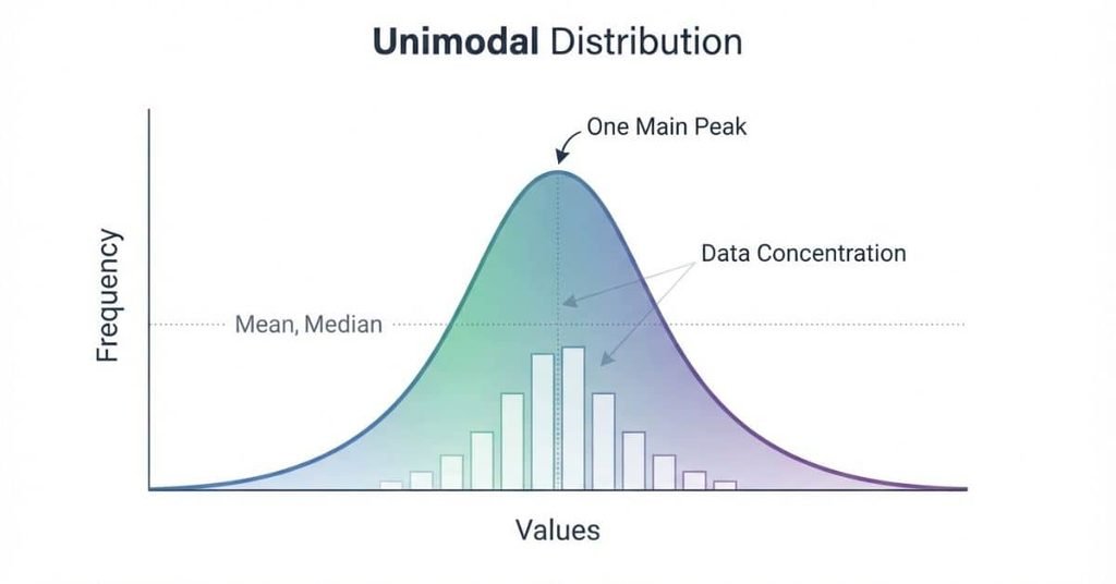
So, what is a unimodal distribution? It is a distribution with one main peak where observations tend to cluster. The peak shows where the data has its greatest concentration.
Imagine a histogram showing students’ test scores. If most scores gather around one range, the graph may have one clear high point. That high point represents the distribution’s main mode.
A unimodal distribution does not require every observation to sit near the peak. Values can spread across a wider range on either side. The important feature is that one dominant peak stands out from the rest.
The shape helps you understand how the data behaves. It can show where observations concentrate and whether values spread evenly or lean toward one side.
When describing data, look beyond the center. Consider the number of peaks, the spread, and the overall shape. These features can reveal patterns that a single summary value may miss.
What Does Unimodal Mean in Statistics?
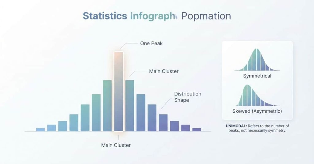
The unimodal meaning in statistics is simple: a distribution has one prominent mode or peak. The term helps describe the overall shape of data rather than just one numerical value.
In unimodal statistics, the peak identifies the area where observations are most concentrated. You can see this pattern in histograms, dot plots, and other graphs that display distributions.
However, one peak does not mean the distribution must be perfectly balanced. A unimodal distribution can be symmetric, but it can also have a longer tail on one side. Therefore, “unimodal” describes the number of main peaks, not the balance of the graph.
It also helps to separate the mode from the mean. The mode describes the most common value or the main peak. The mean represents the arithmetic average of the observations.
Understanding what does unimodal mean makes it easier to describe distributions accurately. Look at the graph’s peaks first, then examine its center, spread, and symmetry.
What Does a Unimodal Distribution Look Like?
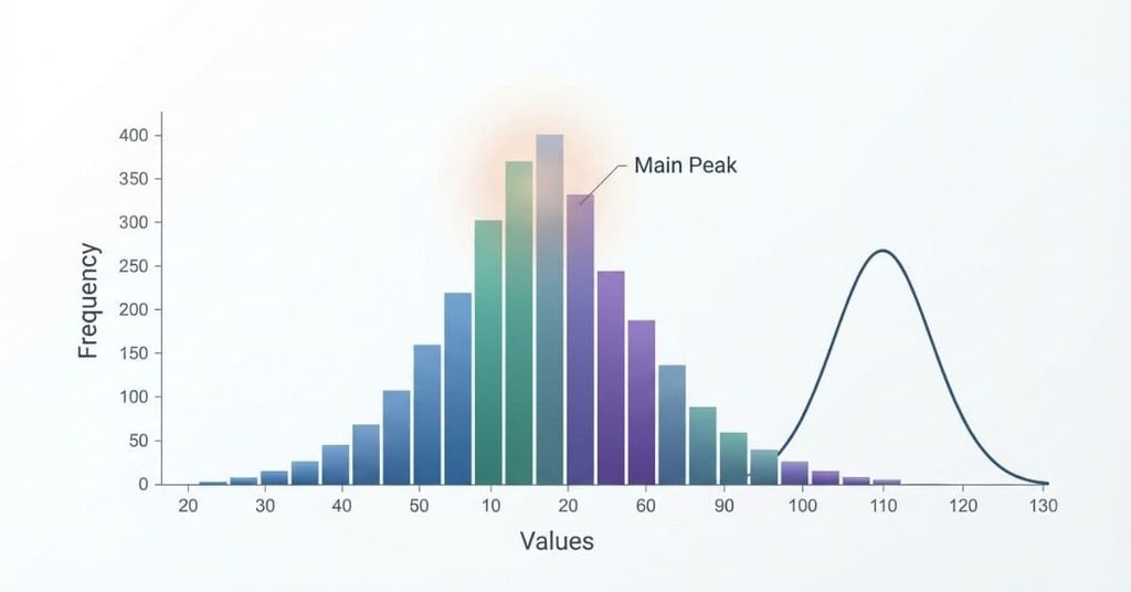
A unimodal distribution usually looks like a graph with one noticeable high point. Values become more common as they approach the peak, then become less common afterward.
For example, imagine a graph showing a group of students’ test scores. Most scores may fall near the middle, while fewer students score at the lowest and highest values.
Unimodal Distribution
A distribution with one clear main peak where observations are concentrated
In a typical distribution graph:
- X-axis: Shows the measured values, such as test scores or heights.
- Y-axis: Shows frequency, count, or relative frequency.
- Peak: Shows the main area where observations are concentrated.
- Spread: Shows how widely the observations extend across the x-axis.
- Center: Shows the general location of the data’s main cluster.
- Shape: Shows how the observations rise, peak, and fall across the distribution.
The peak does not need to sit exactly in the center. A unimodal distribution can lean toward one side while still having one main peak.
Unimodal Distribution Examples
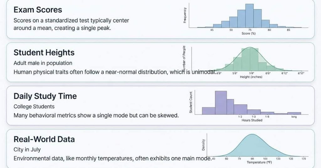
Unimodal distributions appear when data forms one main cluster around a particular range. The following examples show how this pattern can occur in everyday and academic data.
Example 1 — Exam Scores
Suppose a class takes the same statistics exam. Most students score somewhere around the middle of the possible score range. Fewer students receive very low or very high scores.
A histogram of these scores could form one main peak around the most common score range. This creates a unimodal distribution example.
The distribution does not need to contain identical scores. Students can have different results while still forming one clear cluster. The important feature is the single dominant peak.
However, the actual shape depends on the scores collected. If two separate groups perform differently, the graph could develop multiple peaks instead.
Example 2 — Heights of Students
Student heights can sometimes form a distribution with one primary cluster. Most measurements may fall within a central range, with fewer observations toward the lower and higher ends.
A histogram could therefore show one noticeable peak. That pattern represents a unimodal distribution.
The exact shape can vary depending on the students included. Age, grade level, and the population being measured can affect the distribution.
Example 3 — Daily Study Time
Imagine recording how long students study each day. Many students might study around a similar amount of time, while fewer students study very little or much longer.
A dot plot could show one main cluster around the most common study-time range. That creates a unimodal pattern.
This example also shows why context matters. Different classes or student groups could produce different distribution shapes.
Example 4 — Real-World Data
Consider the daily temperatures recorded in a location during a season. If most temperatures gather around one typical range, a histogram may show one main peak.
The resulting shape can be unimodal even when individual temperatures differ. The peak represents the range containing the greatest concentration of observations.
Not every real-world dataset is unimodal. Some datasets have two or more distinct clusters, which can create multiple peaks instead.
What Is a Unimodal Histogram?
A unimodal histogram is a histogram with one clear, dominant peak. The bars rise toward one main high area and then fall away.
The peak shows where observations occur most often. The bars around it help you see how the data spreads across different values.
A unimodal histogram does not have to look perfectly balanced. One side can stretch farther than the other. The key feature is the presence of one dominant cluster.
How to Identify a Unimodal Histogram
Use this simple checklist when examining a histogram:
- Look for the highest area. Find where the bars reach their greatest height.
- Identify the main peak. Look for one clear region where the data concentrates.
- Check for one dominant cluster. Make sure another separate peak does not stand out.
- Examine the tails and spread. Notice how the data extends away from the main peak.
- Consider the overall shape. Focus on the pattern formed by all the bars, not one unusual value.
A graph can still be unimodal when its peak is slightly off-center. Symmetry is not required for a distribution to have one mode.
Unimodal Histogram Example
Consider these sample quiz scores from 20 students:
Data: 62, 65, 67, 68, 70, 70, 71, 72, 72, 73, 74, 74, 75, 76, 77, 78, 80, 82, 84, 87
A histogram of these scores would show most observations around the 70–78 range. The bars would generally rise toward this central area before falling at the higher and lower ends.
What Does Unimodal Mean in Statistics?
Unimodal describes a distribution with one prominent peak or mode.
Peak: The main concentration occurs around the low-to-mid 70s.
This example is unimodal because the data forms one dominant cluster rather than two or more separate clusters. The exact histogram appearance depends on the bin width used.
Unimodal Dot Plot
A dot plot can also show a unimodal distribution. Each dot represents an observation, making clusters and peaks easy to see.
When most dots gather around one area, the dot plot has one main cluster. The tallest stack of dots usually marks the distribution’s most prominent peak.
How to Identify a Unimodal Dot Plot
Use these points to identify a unimodal dot plot:
- Find one main cluster: Most observations should gather around one general area.
- Look for one prominent peak: One region should have the greatest concentration of dots.
- Check the spread: Dots may extend farther on one side than the other.
- Watch for skewness: The distribution can stretch toward the left or right.
- Don’t require symmetry: The two sides do not need to mirror each other.
A unimodal dot plot can therefore have an uneven shape. What matters most is the presence of one dominant peak or cluster.
Does a Unimodal Distribution Have to Be Symmetric?
No. A unimodal distribution does not have to be symmetric.
Unimodal describes the number of prominent peaks. Symmetry describes how evenly the data spreads around its center. These are two different features of a distribution.
A distribution can be:
- Unimodal and symmetric: Both sides have a similar shape around the center.
- Unimodal and right-skewed: The right side extends farther than the left.
- Unimodal and left-skewed: The left side extends farther than the right.
For example, a unimodal distribution may have one clear peak near the lower values. Its right tail can then stretch across a much wider range.
So, seeing one peak does not tell you that the distribution is symmetric. First identify the number of peaks, then examine the shape and tails separately.
Unimodal and Symmetric vs. Unimodal and Skewed
A distribution can have one peak without having equal-looking sides. The number of modes and the symmetry describe different features.
Unimodal and Symmetric
A unimodal and symmetric distribution has one main peak near the center. The left and right sides have similar shapes and spreads.
The peak identifies the main concentration of observations. Symmetry means the data extends in a roughly balanced way around that center.
Unimodal and Right-Skewed
A unimodal and right-skewed distribution still has one main peak. However, its right tail extends farther than its left tail.
The observations remain concentrated around one area, but some larger values stretch the distribution toward the right.
Unimodal and Left-Skewed
A unimodal and left-skewed distribution has one main peak with a longer tail extending toward smaller values.
Most observations cluster near the higher values, while fewer observations stretch toward the left.
The key difference is simple: unimodal tells you about the number of main peaks. Symmetry tells you how the two sides compare.
So, unimodal vs symmetric is not a choice between two distribution types. A distribution can be both symmetric and unimodal, or unimodal and skewed.
How to Tell If Data Is Unimodal
You can identify a unimodal distribution by following a few simple steps. Start with the graph, then examine its peaks and overall shape.
Step 1: Look at the Graph
Start by identifying the type of graph. Histograms, dot plots, and density curves can all display distribution shapes.
Step 2: Find the Main Peak
Look for the area where observations are most concentrated. A tall histogram bar or high density curve can indicate the main peak.
Step 3: Check for Additional Peaks
Ask whether another separate peak stands out. One dominant peak suggests a unimodal pattern.
A small bump does not always represent a separate mode. Consider the overall pattern before deciding.
Step 4: Look at the Overall Shape
Examine the spread and tails on both sides. The distribution may be symmetric, right-skewed, or left-skewed.
Step 5: Describe the Distribution
Use a clear description such as “unimodal and right-skewed.” This gives more information than simply saying “unimodal.”
For example, a histogram might show one tall cluster of bars. A dot plot might show one large stack of dots. A density curve might rise to one high point before falling.
Pro Tip: Identify the number of main peaks before judging symmetry or skewness.
Unimodal vs. Bimodal Distribution
The main difference between unimodal and bimodal distributions is the number of dominant peaks.
| Feature | Unimodal | Bimodal |
|---|---|---|
| Main peaks | One | Two |
| Main clusters | One | Two |
| Common graph | Histogram | Histogram |
| Shape | One dominant peak | Two dominant peaks |
A unimodal distribution has one main concentration of observations. A bimodal distribution has two distinct concentrations.
Students can sometimes confuse the two when a unimodal graph has a small bump. Bin width, random variation, or a few unusual observations can affect how a graph looks.
Unimodal vs. Multimodal Distributions
The term unimodal describes a distribution with one main peak. The number of peaks helps classify different distribution shapes.
- Unimodal: One prominent peak or cluster.
- Bimodal: Two prominent peaks or clusters.
- Multimodal: Multiple prominent peaks or clusters.
A multimodal distribution can contain three or more noticeable peaks. These peaks may suggest that different groups or patterns exist within the data.
When identifying the shape, focus on meaningful peaks rather than every small change in height. A minor bump does not automatically create another mode.
Unimodal Distribution in AP Statistics
In AP Statistics, you often need to describe a distribution using more than its number of peaks. A strong description considers the shape, center, spread, and possible outliers.
A histogram can show how frequently values occur across intervals. A dot plot shows individual observations, while a density curve shows the overall pattern of a distribution.
For a unimodal distribution, start by identifying its single main peak. Then examine whether the shape looks symmetric or skewed. Next, describe where the data centers and how widely the values spread.
You should also compare the distribution with other shapes when needed. For example, a bimodal distribution has two main peaks, unlike a unimodal distribution.
These ideas help you describe graphs clearly instead of simply naming their shape.
How to Describe a Unimodal Distribution on an AP Statistics Question
Use this simple framework when describing a distribution:
- Shape: State that the distribution is unimodal. Then mention whether it appears symmetric or skewed.
- Center: Give a reasonable description of where the data is centered.
- Spread: Describe the overall range or another appropriate measure of variability.
- Possible Outliers: Mention unusual values that appear separated from the main cluster.
For example, you might describe a graph as unimodal, slightly right-skewed, centered around 70, with most values spread across a moderate range.
Pro Tip: Don’t stop after identifying the shape. AP Statistics questions often expect a complete description of the distribution.
Common Mistakes Students Make With Unimodal Distributions
Understanding common errors can make it easier to identify a unimodal distribution correctly.
Mistake 1: Thinking Unimodal Means Symmetric
Unimodal only means the distribution has one prominent peak. It does not require both sides to look alike.
A distribution can be unimodal and right-skewed or left-skewed.
Mistake 2: Counting Every Small Variation as a New Mode
Not every small bump represents another mode. Random variation can create minor changes between neighboring values.
Focus on prominent peaks and meaningful clusters when identifying modes.
Mistake 3: Confusing Mode With Mean
The mode refers to the most common value or the main peak. The mean is the arithmetic average of the data.
They describe different features and do not have to occur at the same location.
Mistake 4: Looking Only at the Highest Bar
The tallest bar can help identify a peak, but you should examine the entire distribution.
Check neighboring bars, clusters, tails, and possible additional peaks before deciding.
Mistake 5: Confusing Unimodal and Bimodal Shapes
A unimodal distribution has one dominant peak. A bimodal distribution has two distinct dominant peaks.
Students may confuse them when a graph contains a small bump. Look for clear separation between major clusters rather than isolated changes.
Quick Unimodal Distribution Examples
Use this quick classification guide to identify common distribution shapes. It can help you review key concepts before a statistics exam.
| Distribution | Classification |
|---|---|
| One clear peak | Unimodal |
| Two clear peaks | Bimodal |
| Several clear peaks | Multimodal |
| No clear peak | May have no single mode |
A unimodal distribution has one dominant peak or main cluster. The data can still be symmetric, skewed, or unevenly spread.
A bimodal distribution has two distinct peaks. A multimodal distribution has several prominent peaks that may represent separate groups within the data.
If a graph has no clear concentration, avoid forcing it into the unimodal category. The data may not have one dominant mode.
Exam tip: Count the meaningful peaks first. Then describe the distribution’s shape, center, and spread.
Conclusion
A unimodal distribution has one main peak where observations tend to concentrate. You also learned how to identify it using histograms, dot plots, and density curves.
Remember that unimodal does not mean symmetric. A distribution can have one peak while being symmetric, right-skewed, or left-skewed. Focus on the overall shape, center, spread, and possible outliers when describing data.
With practice, identifying unimodal data becomes much easier. These skills can also help you handle AP Statistics questions with greater confidence.
Ready to practice? Try identifying the number of peaks in different graphs. Then describe each distribution using its shape, center, and spread.
Frequently Asked Questions
Unimodal means a distribution has one main mode or peak. The data usually forms one primary cluster around that peak. Unimodal describes the number of prominent peaks, not whether the distribution looks symmetric.
A unimodal distribution is a data distribution with one main peak. Most observations tend to concentrate around one central area. You can identify unimodal distributions using histograms, dot plots, or density curves.
Student heights often provide a simple unimodal distribution example. Most students may fall within a central height range, creating one main peak. The distribution can still have some variation on either side of that peak.
In statistics, unimodal describes data with one prominent peak or mode. It helps you describe the shape of a distribution. A unimodal distribution can be symmetric, right-skewed, or left-skewed.
Look at the overall shape of the graph first. Find the main cluster and identify its highest point. If the graph has one clear dominant peak, it is generally considered unimodal.
A unimodal histogram has one main area where the bars reach their highest levels. The bars usually rise toward one peak and then fall away. The distribution may look symmetric or skewed.
Yes. A unimodal distribution can be right-skewed or left-skewed. Skewness describes how the data stretches toward one side. Unimodal describes the number of main peaks.
No. Unimodal does not mean symmetric. A distribution only needs one main peak to be unimodal. Its data can spread evenly on both sides or extend farther toward one side.
No. A unimodal distribution does not have to be bell-shaped. A bell-shaped curve is one possible form. Unimodal distributions can have different shapes and levels of skewness.
A unimodal distribution has one main peak, while a bimodal distribution has two main peaks. These peaks can represent two different clusters within the same dataset. Looking for the number of prominent peaks helps distinguish them.

Team ClassRank builds smart, student-friendly calculators to make grade and rank tracking simple and accurate. For questions or feedback, contact us at classrankcalculator@gmail.com.