

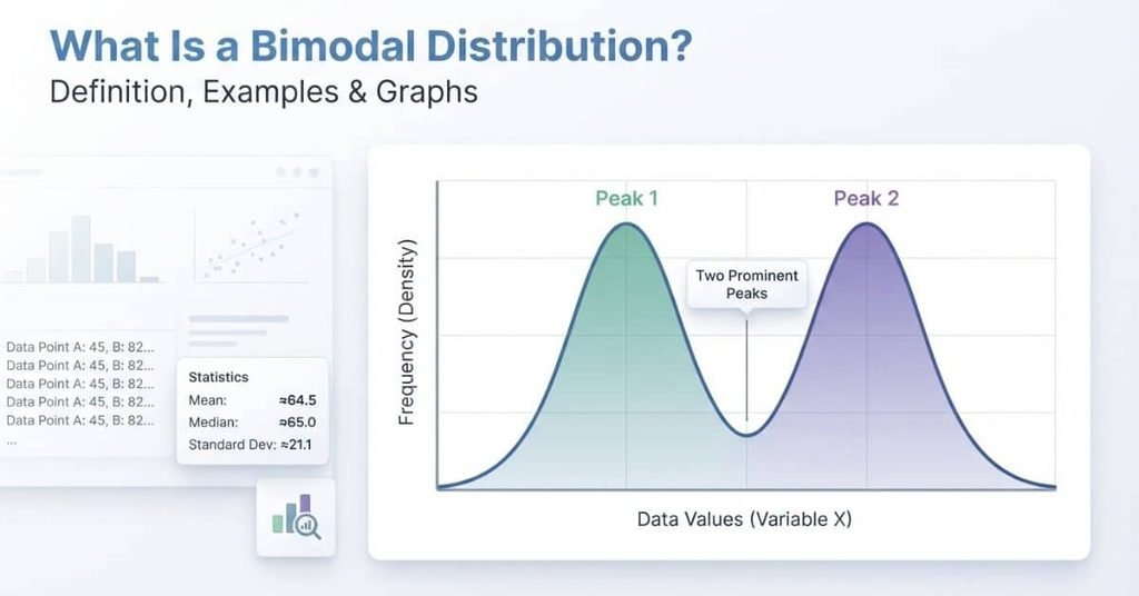
Table of Contents
Intruction
Have you ever looked at a graph and noticed two clear high points instead of one?
That pattern can reveal something important about how data is grouped. A bimodal distribution has two distinct peaks, called modes, in its data. Each peak can represent a different group or concentration of values.
This idea appears in statistics classes, research, surveys, test scores, and real-world data analysis. For beginners, recognizing these patterns can make graphs and histograms much easier to understand.
In this guide, you’ll learn the bimodal meaning, how to identify bimodal data, and what its graphs look like. We’ll also explore clear examples using histograms and dot plots.
You’ll see how bimodal distributions differ from unimodal and multimodal distributions. We’ll also explain why two peaks may appear with or without a visible gap.
By the end, you’ll have a simple way to recognize a bimodal distribution and describe what its two peaks may tell you about the data.
What Is a Bimodal Distribution?
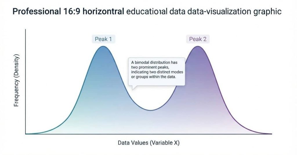
A bimodal distribution is a dataset with two prominent peaks, or modes, in its distribution. These peaks show where observations appear most concentrated.
In simple terms, imagine a graph with one noticeable hill on the left and another on the right. Each hill represents a cluster of observations around a particular range of values. The two clusters may have different centers, sizes, or spreads.
For example, a teacher could record students’ scores from two different classes. If one class tends to score around one range and another class scores higher, the combined data might form two peaks. Each peak could represent one group.
A bimodal pattern matters because it can reveal structure that a single summary may hide. Two peaks often suggest that the dataset contains observations from different groups or processes.
However, two peaks don’t automatically prove that two separate groups exist. The pattern needs to be considered alongside the data’s context and collection method.
What Does Bimodal Mean in Statistics?
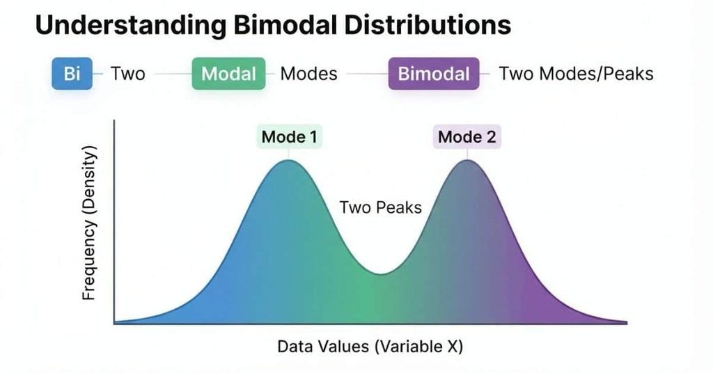
The word bimodal combines “bi,” meaning two, with “modal,” referring to modes. So, the bimodal meaning is a distribution with two prominent modes.
In bimodal statistics, you usually identify these modes by examining a graph of the data. A histogram, dot plot, or density curve can show two clear areas where observations concentrate.
A peak represents a region with relatively high data concentration. When a graph contains two prominent peaks, the distribution may have a bimodal pattern.
This pattern can provide useful clues about the dataset. For instance, one peak might represent younger participants, while another represents older participants. In another dataset, the peaks could reflect two different locations, groups, or underlying conditions.
So, what is bimodal in statistics? It describes a distribution with two prominent modes that stand out from the surrounding values. The key is not simply counting every small bump. You should look for two meaningful concentrations within the overall distribution.
Pro Tip
Don’t label a distribution bimodal just because you see two tiny bumps. Look for two noticeable peaks and consider the context behind the data.
What Does a Bimodal Distribution Look Like?
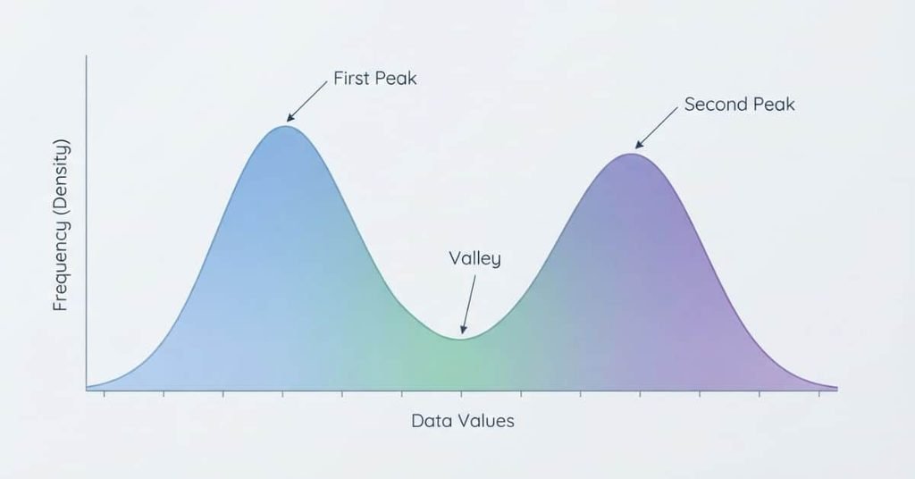
A bimodal graph has two prominent peaks, with a lower region between them. Each peak marks an area where observations cluster more strongly.
In this bimodal distribution graph, the first peak appears around the earlier values. It shows a strong concentration of observations in that region.
The second peak appears farther to the right. It represents another concentration of observations around a different range of values.
Between the peaks, the graph falls into a valley. This lower area shows that fewer observations occur between the two main clusters.
The overall distribution therefore has two noticeable high points rather than one central peak. That pattern makes it bimodal.
When reading bimodal graphs, focus on the shape rather than simply counting small bumps. Two clear concentrations should stand out from the surrounding data.
Bimodal Distribution Examples
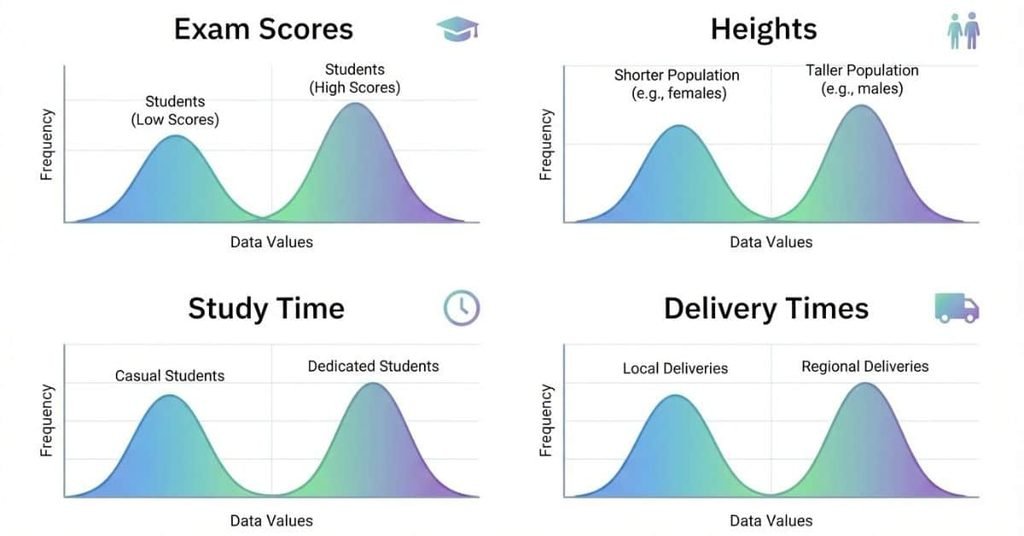
A bimodal data pattern can occur when a dataset combines observations from different groups or conditions. The groups may have different typical values.
The examples below show how this pattern can appear in familiar situations. Each example uses a different setting to make the idea easier to recognize.
Example 1 — Exam Scores From Two Student Groups
Imagine combining exam scores from two student groups. One group may have scores concentrated around 70, while another clusters around 90.
When you graph all the scores together, you could see two prominent peaks. The first peak would represent the lower-scoring group, while the second would represent the higher-scoring group.
The gap between their typical scores can create a noticeable valley. This makes exam scores a useful bimodal data example.
The two peaks don’t mean every student in either group earned the same score. Individual scores can still vary within each group.
The important feature is the overall pattern. Two separate concentrations stand out when you view all the scores together.
Example 2 — Heights From Two Populations
Suppose researchers combine height measurements from two different populations. The populations may have different typical height ranges.
When researchers graph the combined measurements, one group could create the first peak. The other group could create the second peak.
The resulting graph may show two concentrations rather than one smooth center. This creates a possible example of bimodal data.
The peaks represent groups of observations, not necessarily two perfectly separated populations. Some measurements can overlap between the groups.
This example shows why context matters when interpreting a bimodal distribution. The graph can suggest different groups, but the data source provides the explanation.
Example 3 — Daily Study Time
Consider a survey asking students how many hours they study each day. Suppose the dataset includes students with very different study routines.
One group might concentrate around shorter study times. Another group might cluster around longer study times.
A graph of the responses could therefore produce two prominent peaks. The first peak would represent the shorter-study group, while the second would represent the longer-study group.
This pattern could reflect different schedules, course loads, or study habits. However, the graph alone cannot tell you exactly why the groups differ.
The key statistical feature remains the same: two noticeable concentrations appear within the dataset.
Example 4 — Real-World Bimodal Data
Consider delivery times for two different service areas. One area may have shorter typical delivery times, while another has longer times.
Combining both areas could create two clusters in the data. A histogram might then show two prominent peaks.
The first peak would represent the shorter delivery-time cluster. The second would represent the longer delivery-time cluster.
This example shows how bimodal data can appear when different conditions contribute observations to one dataset. The two peaks can provide a useful clue for further investigation.
However, researchers should examine the underlying data before assuming the peaks represent separate groups. Other factors can also influence the distribution’s shape.
What Is a Bimodal Histogram?
A bimodal histogram is a histogram with two prominent peaks. Each peak shows a range where observations occur more frequently.
Instead of forming one main mound, the bars create two noticeable high points. These peaks often reflect two clusters within the dataset.
The space between the peaks usually has fewer observations. This lower region forms a valley and helps separate the two clusters visually.
However, two small bumps don’t automatically make a histogram bimodal. Random variation can create minor changes in bar height.
The pattern becomes more meaningful when two clear concentrations appear and the data’s context supports the distinction.
How to Identify a Bimodal Histogram
Use this simple checklist when examining a histogram:
- Look for two prominent peaks. Identify two clear areas where the bars reach noticeable heights.
- Identify the two clusters. Check whether observations concentrate around two different ranges of values.
- Look between the peaks. A noticeable drop in frequency can create a valley between the clusters.
- Consider the context. Ask whether the two-cluster pattern makes sense for how researchers collected the data.
- Check for random variation. Small bumps may occur naturally and don’t necessarily indicate two modes.
A strong bimodal histogram should show two meaningful concentrations, not simply two randomly taller bars.
Bimodal Histogram Example
Let’s use a simple sample dataset representing exam scores from two student groups:
Sample dataset:
55, 58, 60, 62, 64, 65, 66, 68, 70, 72, 85, 87, 88, 90, 91, 92, 93, 94, 95, 97
A histogram of these scores would show one concentration around the 55–72 range. A second concentration would appear around 85–97.
Bimodal Histogram Example
Two distinct peaks show two main concentrations of observations.
The histogram contains two prominent peaks with a lower concentration between them. These peaks may represent two different groups or patterns within the dataset.
First peak: The first cluster occurs among the lower exam scores. It represents students whose scores fall within that range.
Second peak: The second cluster occurs among the higher scores. It creates another concentration of observations.
Valley: Few or no observations occur between the two groups. This creates a visible separation between the clusters.
This qualifies as a bimodal histogram example because the sample contains two distinct concentrations of scores. The two peaks are separated by a low-frequency region.
Pro Tip
When identifying bimodality, focus on the overall shape. Don’t treat every small change in bar height as a separate mode.
Bimodal Distribution With a Gap vs. Without a Gap
A bimodal distribution can have two peaks whether or not the two clusters have a completely empty space between them. The key feature is two prominent concentrations, not a perfectly separated gap.
Bimodal Distribution With a Gap
A bimodal with a gap pattern has a noticeable empty or nearly empty region between its two clusters. The observations gather around two different ranges, with few or no values between them.
For example, imagine exam scores clustered around 60 and 90. If almost nobody scores between 70 and 80, the graph may show a clear gap.
The gap makes the two groups easier to see. It can suggest that the observations come from different groups or conditions.
However, the gap itself doesn’t create bimodality. The two prominent peaks remain the main feature.
Bimodal Distribution Without a Gap
A bimodal without a gap distribution can still have two clear peaks. Some observations may appear between the peaks, so the graph doesn’t contain an empty region.
For example, scores might cluster around 65 and 85. Several students could have scores between those values.
The graph can still show two noticeable concentrations. A valley between the peaks may separate them visually, even when observations fill that region.
This means a completely empty space isn’t required for bimodality.
Does a Bimodal Distribution Need a Gap?
No. A bimodal distribution does not need a gap.
The important feature is the presence of two prominent peaks. A valley between those peaks can help distinguish the clusters, but some observations can occur there.
When comparing bimodal with a gap vs without a gap, focus first on the number and strength of the peaks. Then consider how clearly the data separates around those peaks.
The context also matters. Two peaks may reflect different groups, processes, or other features within the dataset.
Bimodal Dot Plot
A bimodal dot plot shows two prominent concentrations of dots. Each concentration represents a cluster of observations around particular values.
For example, a dot plot of test scores might have many dots around 60–65 and another group around 85–90. The spaces between individual dots don’t matter as much as the overall pattern.
A bimodal distribution dot plot can show a gap between clusters, but it doesn’t require one. Some dots can appear between the two main concentrations.
How to Identify Two Peaks in a Dot Plot
Use these features when reading a bimodal dotplot:
- Two clusters: Look for two areas containing noticeably more dots.
- Two concentration points: Each cluster should have a clear area of high concentration.
- Valley between groups: Look for a lower concentration between the two peaks.
- Overall shape: Consider the complete pattern instead of focusing on individual dots.
A few scattered dots shouldn’t automatically create a second mode. Look for two meaningful concentrations that stand out from the rest of the data.
How to Tell If Data Is Bimodal
Identifying bimodality takes more than spotting two tall bars. You should examine the entire distribution and consider the data’s context.
Step 1: Look at the Graph
Start by examining the histogram, dot plot, or density curve. Look for the overall shape and where observations concentrate.
Don’t focus on one or two bars immediately. First, notice whether the data appears to form one cluster, two clusters, or several clusters.
Step 2: Identify the Peaks
Look for two prominent peaks where observations concentrate. These peaks should stand out from the surrounding values.
The peaks don’t need to have the same height. One cluster can contain more observations than the other.
Step 3: Check Whether Both Peaks Are Meaningful
Ask whether both peaks represent noticeable patterns in the data. Small bumps can result from ordinary variation.
Simply seeing two unusually high bars doesn’t automatically prove meaningful bimodality. The pattern should extend across neighboring values rather than depend on isolated bars.
Step 4: Look for Separate Clusters
Check whether the observations form two recognizable groups. A valley between the groups can make the pattern easier to identify.
A completely empty gap isn’t required. Two clusters can overlap while still producing two prominent peaks.
Step 5: Consider the Context
Finally, think about how researchers collected the data. Two peaks may make sense when the dataset combines different groups or conditions.
Context can help explain why the distribution has two concentrations. However, the graph itself should still provide evidence for the bimodal pattern.
Why Do Bimodal Distributions Occur?
Bimodal distributions often appear when different groups or conditions contribute observations to the same dataset. The combined data can then produce two main concentrations.
Understanding the cause helps you interpret the graph instead of simply labeling its shape.
Two Different Populations
Two different populations can have different typical values. Combining their observations may produce two peaks.
For example, researchers could combine measurements from two populations with different typical characteristics. Each population may contribute one concentration to the combined distribution.
The resulting graph can therefore appear bimodal. The peaks may provide a clue that the dataset contains distinct populations.
Mixed Groups in One Dataset
A dataset may contain several groups that researchers analyze together. Each group can have its own typical range of values.
For example, a survey might combine responses from two age groups. If their responses differ substantially, the combined data could develop two peaks.
Separating the groups may reveal why the original distribution has its particular shape.
Different Behaviors or Conditions
Different behaviors or conditions can also produce bimodal patterns. People may respond differently under separate circumstances.
For example, students may have two common study-time patterns. One group studies for shorter periods, while another studies for much longer periods.
When researchers combine these observations, the resulting distribution may show two concentrations.
Combining Data From Different Sources
Researchers sometimes combine datasets collected from different locations, periods, or sources. Each source may have a different distribution.
If those distributions have different centers, the combined data can develop two peaks. This pattern can signal that the sources deserve closer examination.
A bimodal shape doesn’t automatically identify the cause. Researchers need the dataset’s context to determine what the two peaks represent.
Bimodal vs. Unimodal Distribution
The clearest way to understand a bimodal distribution is to compare it with a unimodal distribution. The main difference is the number of meaningful peaks.
| Feature | Unimodal | Bimodal |
|---|---|---|
| Main peaks | One | Two |
| Main clusters | One | Two |
| Common shape | One dominant peak | Two dominant peaks |
| Possible explanation | One main group | Two underlying groups |
A unimodal distribution has one main peak where observations concentrate. A bimodal distribution has two prominent peaks with concentrations around different values.
For example, a dataset with one strong concentration of exam scores may appear unimodal. If the scores form two strong concentrations, the distribution may be bimodal.
The peaks don’t have to be identical in height or width. One cluster can contain more observations than the other.
What Is the Difference Between Unimodal and Bimodal?
The difference between unimodal and bimodal distributions is the number of meaningful modes. Unimodal data has one main mode, while bimodal data has two.
This difference can reveal important information about the dataset. One peak may suggest one main concentration, while two peaks can indicate different groups or conditions.
When comparing bimodal vs. unimodal, don’t count every small bump as a mode. Focus on prominent patterns supported by the overall distribution and its context.
For a closer look at the one-peak pattern, see our [Unimodal Distribution article].
Can a Distribution Be Both Unimodal and Bimodal?
A distribution isn’t normally described as both when using one consistent interpretation of its meaningful modes. The classification depends on which modes or peaks are considered meaningful.
A graph may contain small bumps caused by variation, while still having one dominant peak. In another context, two prominent concentrations may support a bimodal description.
So, the difference between bimodal and unimodal depends on the meaningful structure you identify in the distribution.
Bimodal vs. Multimodal Distribution
The key difference in bimodal vs. multimodal is the number of meaningful modes.
- Unimodal: One main peak.
- Bimodal: Two main peaks.
- Multimodal: More than two modes or prominent peaks.
Therefore, a bimodal distribution is a specific type of distribution with two modes. A multimodal distribution has more than two meaningful modes.
When comparing multimodal vs. bimodal, remember that bimodal describes exactly two prominent modes, while multimodal covers distributions with more than two.
Bimodal vs. Symmetric Distribution
Bimodal and symmetric describe different features of a distribution. Bimodal describes the number of prominent peaks, while symmetry describes how the two sides compare.
A distribution can be bimodal and symmetric when its two peaks have a balanced arrangement. The peaks may appear at similar distances from the center, with similar overall shapes on both sides.
A distribution can also be bimodal and asymmetric. One peak might be taller, farther from the other peak, or surrounded by a different spread of observations.
The important point is that number of peaks and symmetry are not the same characteristic. A graph can have two peaks without having matching sides.
When describing a distribution, examine both features separately. First identify whether it has one, two, or more prominent peaks. Then decide whether its overall shape appears symmetric or asymmetric.
Bimodal Distribution in AP Statistics
For USA students taking AP Statistics, recognizing a bimodal distribution can help when describing graphs and interpreting data. Histograms and dot plots can both reveal multiple peaks.
When you see two prominent peaks, describe the pattern clearly instead of simply writing “bimodal.” Consider what the peaks may represent in the given context.
A strong response can discuss:
- Shape: Identify the distribution as bimodal.
- Peaks: Mention the two prominent concentrations.
- Center: Describe typical values for the clusters when appropriate.
- Spread: Discuss the range or variation shown by the data.
- Possible outliers: Note unusual observations when clearly present.
- Context: Explain what the clusters may represent using the problem’s information.
How to Describe a Bimodal Distribution on an AP Statistics Question
A useful structure is Shape → Center → Spread → Possible Outliers → Context.
Start with the shape. State that the distribution is bimodal and mention its two prominent peaks. Then describe the center and spread using appropriate values or ranges from the graph.
Next, mention possible outliers only when the graph provides evidence for them. Avoid claiming an outlier without enough information.
Finish by connecting the pattern to the context. For example, two peaks in a dataset of study hours might suggest two groups with different study habits.
A concise AP Statistics response could follow this structure:
“The distribution is bimodal, with two prominent clusters around [values]. The data range from [value] to [value], with [possible outlier information]. The two clusters may reflect [context-based explanation].”
The exact values and interpretation should always come from the data provided in the question.
Common Bimodal Distribution Mistakes
Identifying a bimodal distribution can seem simple, but several common mistakes can lead to incorrect conclusions. A graph may appear to have two high points without representing true bimodality.
Understanding these mistakes helps you describe bimodal data more accurately. It also makes it easier to interpret histograms, dot plots, and other statistical graphs.
Mistake 1: Thinking Every Two-Hump Shape Is Automatically Bimodal
Two visible bumps do not always mean a distribution is truly bimodal. Small changes in the data or graphing method can create temporary peaks.
A meaningful bimodal distribution usually has two noticeable concentrations of observations. Both peaks should stand out compared with the values around them.
Before calling a graph bimodal, examine the overall pattern rather than counting every small bump.
Mistake 2: Confusing Bimodal With Symmetric
Bimodal and symmetric describe different features of a distribution.
Bimodal means the distribution has two prominent modes or peaks. Symmetric means the two sides of the distribution have a similar shape around its center.
A bimodal distribution can be symmetric, but it does not have to be. Likewise, a symmetric distribution can have one peak instead of two.
Mistake 3: Assuming a Gap Is Required
A common misconception is that bimodal data must contain a completely empty space between its two peaks.
That is not required. A distribution can be bimodal with a gap or without a gap.
The important feature is the presence of two meaningful peaks. Some observations can occur between those peaks while the overall pattern remains clearly bimodal.
Mistake 4: Ignoring the Dataset’s Context
The shape of a graph can suggest two groups, but context helps explain why those groups may exist.
For example, a distribution of test scores might have two peaks because students received different levels of instruction. A dataset combining measurements from two populations can also produce two clusters.
Always consider how the data was collected before deciding what the peaks represent.
Mistake 5: Confusing Bimodal With Multimodal
The number of meaningful peaks determines whether a distribution is bimodal or multimodal.
A bimodal distribution has two prominent modes. A multimodal distribution has more than two meaningful modes.
For example, a graph with three distinct concentrations should not be described as bimodal simply because two of its peaks are especially noticeable.
Mistake 6: Confusing Two Large Bars With Two Meaningful Modes
Two tall bars in a histogram do not automatically represent two modes.
The bars must form part of an overall pattern showing two meaningful concentrations. Random variation, bin width, or the way data gets grouped can sometimes create misleading peaks.
Look at neighboring bars and the full distribution before identifying the modes. This prevents you from treating an accidental graph feature as meaningful bimodal data.
Quick Examples: Unimodal, Bimodal, and Multimodal
The number of prominent peaks helps you classify the shape of a distribution. Use this quick table to review the main differences between unimodal, bimodal, and multimodal data.
| Shape | Classification |
|---|---|
| One clear peak | Unimodal |
| Two clear peaks | Bimodal |
| Three or more prominent peaks | Multimodal |
| No clear peak | May have no single mode |
This classification focuses on the overall pattern rather than isolated high bars. A meaningful peak should represent a noticeable concentration of observations.
Quick Exam Review
Remember these three terms:
- Unimodal: one prominent peak.
- Bimodal: two prominent peaks.
- Multimodal: three or more prominent peaks.
If a graph has no obvious concentration, do not force it into one of these categories. The dataset may have no single clear mode.
Pro Tip: On an exam, first count the meaningful peaks. Then check the graph’s overall shape and context before choosing a classification.
Conclusion
A bimodal distribution has two prominent peaks that show where data values are concentrated. This guide covered bimodal graphs, histograms, dot plots, examples, and common identification mistakes.
You also learned how bimodal data differs from unimodal and multimodal distributions. Remember that a gap between peaks is not required. Context also matters when deciding what the two peaks may represent.
Once you recognize these patterns, interpreting statistical graphs becomes much easier. This skill can help with statistics homework, AP Statistics questions, and data analysis.
Ready to practice? Review a few real datasets and look for meaningful peaks and clusters. Share this guide with classmates who are learning statistics, or explore more statistics resources on our website.
Frequently Asked Questions
A bimodal distribution is a dataset with two prominent peaks or modes. Each peak represents a concentration of observations around certain values. The two peaks may occur because the data combines different groups, populations, or conditions.
In statistics, bimodal means a distribution has two meaningful modes. The word combines “bi,” meaning two, and “modal,” referring to modes. You can often identify bimodal data by looking for two clear peaks in a histogram, dot plot, or density curve.
Exam scores from two different student groups can form bimodal data. For example, one group may have scores concentrated around the 60s, while another clusters around the 90s. These two concentrations can create two distinct peaks in the distribution.
A bimodal histogram has two noticeable peaks separated by a lower area. The peaks may have a visible gap between them, but a completely empty gap is not required. The key feature is two meaningful concentrations of observations rather than simply two tall bars.
Start by looking for two prominent peaks in the graph. Then check whether each peak represents a meaningful concentration of data. Consider the areas between the peaks and the dataset’s context. Two isolated high bars do not automatically prove that the distribution is bimodal.
No. A bimodal distribution does not need a completely empty gap between its peaks. Some observations can appear between the two concentrations. What matters is that the graph shows two distinct and meaningful peaks.
Yes, a bimodal distribution can be symmetric, but symmetry is not required. Bimodal describes the number of prominent peaks, while symmetry describes how evenly the distribution balances around its center. A distribution can be bimodal and symmetric or bimodal and asymmetric.
A unimodal distribution has one prominent peak, while a bimodal distribution has two prominent peaks. Unimodal data often shows one main concentration of values. Bimodal data shows two main concentrations that may represent different groups or processes.
A bimodal histogram is a histogram with two prominent peaks. These peaks show where observations are concentrated within two different parts of the data range. A lower area between the peaks often makes the pattern easier to recognize, although a complete gap is not necessary.
A bimodal distribution has two prominent modes or peaks. A multimodal distribution has three or more meaningful peaks. Therefore, bimodal is a specific type of multimodal pattern, while distributions with more than two prominent modes are generally described as multimodal.
A bimodal graph typically looks like a curve, histogram, or dot plot with two noticeable high points. Each peak represents a concentration of observations. The peaks can be close together or far apart, and the graph may or may not have a visible gap between them.

Team ClassRank builds smart, student-friendly calculators to make grade and rank tracking simple and accurate. For questions or feedback, contact us at classrankcalculator@gmail.com.