

Table of Contents
Introduction
Have you ever looked at a large dataset and wondered how to make sense of it quickly? A cumulative frequency table calculator can turn long lists of numbers into an organized summary in just a few steps. This makes it much easier to spot patterns, compare results, and understand grouped data without getting overwhelmed.
Cumulative frequency tables are widely used in statistics, education, research, and business reporting. They help organize grouped data by showing a running total of frequencies across class intervals. Whether you’re a student, teacher, or professional in the USA, learning this skill can make data analysis faster and more accurate. If you’re working with a cumulative frequency distribution calculator or learning how to calculate a cumulative frequency table, understanding the process is essential.
In this guide, you’ll learn what a cumulative frequency table is, how to create one step by step, and how to use it for graphs, percentiles, and data analysis. You can also generate a complete cumulative frequency table instantly using our Cumulative Frequency Calculator, saving time while ensuring accurate results.
What Is a Cumulative Frequency Table?
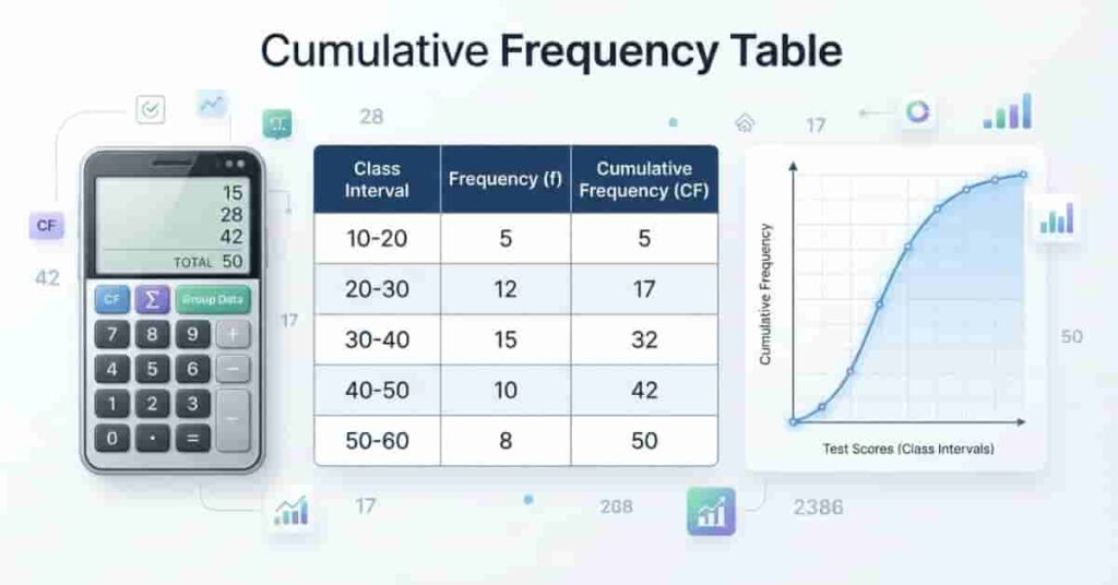
A cumulative frequency table organizes data by showing a running total of frequencies across class intervals. Instead of displaying how many values fall into each group alone, it adds each frequency to the previous total. This approach makes it easier to see how data accumulates from one interval to the next.
Cumulative frequency tables are common in statistics, education, business, and research. They help summarize large datasets, making trends and distributions easier to understand. They also provide the foundation for drawing ogives and estimating the median, quartiles, and percentiles.
If you are working with grouped data, a cumulative frequency table offers a simple way to organize information before creating charts or performing further analysis. Many students and professionals also use a cumulative frequency table calculator to save time and reduce calculation errors.
Definition
A cumulative frequency table is a statistical table that displays class intervals, their frequencies, and the running total of those frequencies. Each cumulative frequency equals the previous cumulative total plus the current frequency.
For example, if the first class has a frequency of 8 and the second class has a frequency of 12, the cumulative frequency for the second class becomes 20. This process continues until every class interval has been included. The final cumulative frequency always equals the total number of observations in the dataset.
Pro Tip: Always check that the last cumulative frequency matches your total dataset size. If it doesn’t, review your frequency counts before continuing.
Purpose of a Cumulative Frequency Table
The main purpose of a cumulative frequency table is to make large datasets easier to analyze. Instead of examining each value individually, you can quickly see how observations build across different class intervals.
A cumulative frequency table also helps you:
- Organize grouped data clearly.
- Find the median and other percentiles.
- Compare data distributions.
- Create ogive graphs.
- Prepare data for statistical analysis.
Expert Tip: Many statistical calculations become much easier once your data is organized into a cumulative frequency table. Creating the table first often saves time later.
If you want to understand the calculation behind each running total, start with our guide on how to calculate cumulative frequency step by step.
When Should You Use One?
You should use a cumulative frequency table whenever your data contains many observations that are grouped into class intervals. It is especially useful when you want to understand how values accumulate rather than viewing individual frequencies alone.
Common situations include:
- Exam score analysis
- Survey results
- Scientific research
- Business reports
- Manufacturing quality control
- Population and demographic studies
For small datasets with only a few values, a simple frequency table is often enough. As the dataset grows larger, a cumulative frequency table provides a much clearer summary.
Understanding the Parts of a Cumulative Frequency Table
Each column in a cumulative frequency table has a specific purpose. Together, they organize grouped data into a format that is easy to analyze. Understanding these parts helps you build accurate tables and interpret results correctly.
Most cumulative frequency tables include class intervals, frequencies, and cumulative frequencies. Some tables also include class boundaries and class midpoints for advanced statistical calculations and graphing.
Class Intervals
Class intervals divide a dataset into continuous groups. Each interval represents a range of values instead of listing every observation separately.
For example:
| Class Interval |
|---|
| 0–9 |
| 10–19 |
| 20–29 |
| 30–39 |
Good class intervals should be equal in width, cover the entire dataset, and never overlap. This keeps the table organized and prevents counting errors.
Pro Tip: Create your class intervals before counting frequencies. Changing intervals later usually means recalculating the entire table.
Frequency
The frequency column shows how many observations fall within each class interval. It provides the starting point for calculating cumulative frequency.
Example:
| Class Interval | Frequency |
| 0–9 | 4 |
| 10–19 | 7 |
| 20–29 | 5 |
Accurate frequency counts are essential because every cumulative frequency depends on them.
Cumulative Frequency
The cumulative frequency column shows a running total of frequencies from the first class interval to the current one.
Example:
| Class Interval | Frequency | Cumulative Frequency |
| 0–9 | 4 | 4 |
| 10–19 | 7 | 11 |
| 20–29 | 5 | 16 |
Each value is calculated by adding the current frequency to the previous cumulative total. The last value should always equal the total number of observations.
Expert Tip: If your final cumulative frequency does not match the total number of data values, recheck your frequency counts before moving on.
Class Boundaries (Optional)
Class boundaries remove any gaps between class intervals. They are especially useful when drawing histograms and ogive graphs.
For example, the interval 10–19 has class boundaries of 9.5–19.5 when working with whole numbers. This creates continuous intervals and improves graph accuracy.
You may not need class boundaries for every cumulative frequency table, but they are helpful in many statistics courses.
Class Midpoints (Optional)
A class midpoint is the value halfway between the lower and upper limits of a class interval.
Use this formula:
Class Midpoint = (Lower Limit + Upper Limit) ÷ 2
For the interval 20–29, the midpoint is 24.5.
Class midpoints are useful when calculating grouped means, estimating averages, and creating certain statistical charts. While they are optional for cumulative frequency tables, they often appear in complete frequency distribution tables.
For spreadsheet-based calculations, you can also learn how to calculate cumulative frequency in Excel using running totals and formulas.
How to Create a Cumulative Frequency Table
Creating a cumulative frequency table is easier than it looks. You only need to organize your data, count how many values fall into each class interval, and keep a running total. Following the same five-step process every time helps you avoid mistakes and produces accurate results.
If you have a large dataset, a cumulative frequency table calculator can automate these steps. However, learning the manual method helps you understand how grouped data is organized and analyzed.
Step 1: Arrange the Data
Start by listing all the values in ascending order. Sorting the data makes it easier to identify the smallest and largest values before creating class intervals.
For example, imagine you collected the following test scores from 30 students:
42, 47, 51, 54, 56, 58, 60, 62, 64, 65, 67, 68, 70, 72, 73, 75, 77, 79, 81, 83, 84, 86, 88, 89, 91, 93, 94, 96, 97, 99
Step 2: Create Class Intervals
Next, divide the data into equal-sized class intervals. Equal intervals make the table easier to read and compare.
For this dataset, you can use intervals of 10:
- 40–49
- 50–59
- 60–69
- 70–79
- 80–89
- 90–99
Keep the intervals continuous and avoid overlaps. Every value should fit into exactly one class.
Step 3: Count Frequencies
Count how many observations belong to each class interval. Record these totals in the Frequency column.
For the example above, the frequencies are:
| Class Interval | Frequency |
|---|---|
| 40–49 | 2 |
| 50–59 | 4 |
| 60–69 | 6 |
| 70–79 | 6 |
| 80–89 | 6 |
| 90–99 | 6 |
Always double-check your counts before moving to the next step. An incorrect frequency will affect every cumulative total.
Step 4: Calculate Cumulative Frequencies
Begin with the first class frequency. Then keep adding each new frequency to the previous cumulative total.
The calculations look like this:
- 2
- 2 + 4 = 6
- 6 + 6 = 12
- 12 + 6 = 18
- 18 + 6 = 24
- 24 + 6 = 30
The final cumulative frequency should always equal the total number of observations.
Step 5: Complete the Final Table
Combine the class intervals, frequencies, and cumulative frequencies into one table.
This completed table gives you a clear summary of the dataset. It also prepares your data for creating an ogive, estimating percentiles, or finding the median of grouped data.
To express these cumulative totals as proportions or percentages, see our guide to calculating cumulative relative frequency.
Example: Cumulative Frequency Table for Grouped Data
Let’s use the same dataset to build a complete cumulative frequency table. This example shows how each cumulative frequency is calculated by adding the current frequency to the previous running total.
Step 1: Count the Frequency
| Class Interval | Frequency |
| 40–49 | 2 |
| 50–59 | 4 |
| 60–69 | 6 |
| 70–79 | 6 |
| 80–89 | 6 |
| 90–99 | 6 |
Step 2: Calculate the Running Totals
- 40–49: 2 = 2
- 50–59: 2 + 4 = 6
- 60–69: 6 + 6 = 12
- 70–79: 12 + 6 = 18
- 80–89: 18 + 6 = 24
- 90–99: 24 + 6 = 30
Completed Cumulative Frequency Table
| Class Interval | Frequency | Cumulative Frequency |
| 40–49 | 2 | 2 |
| 50–59 | 4 | 6 |
| 60–69 | 6 | 12 |
| 70–79 | 6 | 18 |
| 80–89 | 6 | 24 |
| 90–99 | 6 | 30 |
Notice how each cumulative frequency increases as you move down the table. The last cumulative frequency is 30, which matches the total number of observations in the dataset. This confirms that every value has been counted correctly.
Once your table is complete, you can use it to draw an ogive, estimate quartiles and percentiles, or continue with other statistical calculations. If you want to skip the manual work, our Cumulative Frequency Table Calculator can generate the entire table instantly from your grouped data.
Grouped vs Ungrouped Cumulative Frequency
Cumulative frequency tables can represent data in two main ways: grouped data and ungrouped data. The right choice depends on the size of your dataset and the level of detail you need.
Grouped cumulative frequency uses class intervals to organize values into ranges. It works well when you have many observations because it reduces a large dataset into easier-to-read sections. For example, exam scores from hundreds of students can be grouped into intervals like 0–10, 11–20, and 21–30.
Ungrouped cumulative frequency keeps each individual value separate. This method provides more detail but can become difficult to read when the dataset contains many numbers.
The cumulative frequency calculator for grouped data is especially useful when working with large datasets because it automatically organizes values into class intervals and calculates running totals.
| Feature | Grouped Data | Ungrouped Data |
|---|---|---|
| Data format | Uses class intervals | Uses individual values |
| Best for | Large datasets | Small datasets |
| Level of detail | Less detailed summary | More detailed information |
| Organization | Easier to summarize | More values to manage |
| Common use | Statistics and research | Small data analysis |
Grouped data makes patterns easier to identify, while ungrouped data shows exact values. Students often use grouped tables for statistics problems because they simplify calculations and improve data presentation.
Using a Cumulative Frequency Table to Draw an Ogive
An ogive is a graph that shows cumulative frequency as data increases. It helps you visualize how observations build across different class intervals. Researchers, students, and analysts use ogives to estimate values such as medians, quartiles, and percentiles.
Before creating an ogive, you need a completed cumulative frequency table. The table provides the coordinates needed to plot the graph accurately.
Step 1: Prepare the Cumulative Frequency Table
Start with a table containing class intervals, frequencies, and cumulative frequencies. Make sure your cumulative totals are correct before creating the graph.
For example:
| Class Interval | Frequency | Cumulative Frequency |
| 0–9 | 5 | 5 |
| 10–19 | 8 | 13 |
| 20–29 | 12 | 25 |
| 30–39 | 10 | 35 |
The cumulative frequency column provides the values you will plot on the graph.
Step 2: Plot Upper Class Boundaries
Convert your class intervals into upper class boundaries. These values represent the end point of each interval.
For example, the upper boundaries of:
- 0–9 become 9.5
- 10–19 become 19.5
- 20–29 become 29.5
Using boundaries creates a continuous graph and avoids gaps between intervals.
Step 3: Plot Cumulative Frequencies
Place the upper class boundaries on the horizontal axis (x-axis). Place cumulative frequencies on the vertical axis (y-axis).
Each point represents:
(Upper Class Boundary, Cumulative Frequency)
For example:
- (9.5, 5)
- (19.5, 13)
- (29.5, 25)
- (39.5, 35)
Step 4: Connect the Points
After plotting all points, connect them with a smooth line. The finished graph is called an ogive or cumulative frequency curve.
If you already have your frequency values, our Cumulative Frequency Calculator can generate the running totals and help you build the table faster.
How to Interpret an Ogive
An ogive shows how many observations fall below a certain value. A higher point on the curve means more data values have accumulated.
You can use an ogive to:
- Estimate the median value.
- Find quartiles and percentiles.
- Compare data distributions.
- Identify trends in grouped data.
Finding Percentiles From a Cumulative Frequency Table
A cumulative frequency table helps you locate positions within a dataset. Instead of checking every individual value, you can use the running totals to estimate where important points occur. These points include the median, quartiles, and percentiles.
Percentiles show the position of a value compared with the rest of the data. For example, the 50th percentile represents the middle value of a dataset. A cumulative frequency table makes these positions easier to find, especially when working with grouped data.
Finding the Median (50th Percentile)
The median represents the middle point of a dataset. It is also known as the 50th percentile because half of the observations fall below it and half fall above it.
To find the median from a cumulative frequency table:
- Find the total number of observations.
- Divide the total by 2.
- Locate the class interval containing that position.
- Use the cumulative frequency to identify the median class.
For grouped data, the exact median value may require a formula using the class interval, frequency, and boundaries. A cumulative frequency table helps you find the correct position before applying that calculation.
Finding Quartiles
Quartiles divide data into four equal sections. They help you understand how values spread across a dataset.
The main quartiles are:
- Q1 (25th percentile): The point where 25% of data falls below.
- Q2 (50th percentile): The median.
- Q3 (75th percentile): The point where 75% of data falls below.
You can locate quartile positions by using the cumulative frequency column and finding where each percentage falls within the dataset.
Finding Other Percentiles
Percentiles work the same way as quartiles but allow more detailed comparisons. For example, the 90th percentile shows the point where 90% of observations fall below.
Cumulative frequency helps identify these positions by showing how many values have accumulated up to each class interval.
Common Mistakes When Creating Cumulative Frequency Tables
Creating a cumulative frequency table requires careful counting and organization. Small mistakes can change the final results and affect graphs, percentiles, and other statistical calculations.
Understanding common errors helps you build more accurate tables and avoid problems during analysis.
Incorrect Class Intervals
Class intervals should cover the entire dataset without missing values or creating overlaps. Unequal intervals can make the table harder to interpret.
For example, using 10–19 and 19–29 creates an overlap because the value 19 appears in both groups.
Missing Values
Every data value must belong to one class interval. Missing even a few observations will create incorrect frequencies and wrong cumulative totals.
Always compare the total frequency with the number of original data points.
Wrong Running Totals
Cumulative frequency depends on accurate addition. A single incorrect calculation affects every value below it.
For example, if one cumulative frequency is too high, all later totals may also become incorrect.
Unsorted Data
Sorting data before creating intervals makes the process easier. Unsorted values increase the chance of placing observations in the wrong group.
Overlapping Intervals
Class intervals should never share the same values. Clear boundaries help prevent confusion and keep counting accurate.
Arithmetic Errors
Simple addition mistakes can produce incorrect cumulative frequencies. Always review the final total before using the table for further analysis.
How to Create a Cumulative Frequency Table Using Our Calculator
Creating a cumulative frequency table manually helps you understand the process, but large datasets can take extra time. A cumulative frequency table calculator can complete the calculations quickly and reduce manual errors.
Our calculator helps beginners and professionals organize grouped data without performing every step by hand. You can enter your dataset and receive a complete table with frequencies and cumulative totals.
Simple Steps to Use the Calculator
Step 1: Enter Your Dataset
Add your values into the calculator. Make sure your data is complete and correctly formatted before generating results.
Step 2: Generate Class Intervals Automatically
The calculator can organize your data into suitable class intervals. This saves time when working with large datasets.
Step 3: View Frequencies and Cumulative Frequencies
After processing the data, the tool displays:
- Class intervals
- Frequency values
- Cumulative frequency totals
You can review the results and confirm that the final cumulative frequency matches your dataset size.
Step 4: Copy or Export the Completed Table
Once your table is ready, you can copy the results for homework, reports, research, or further statistical analysis.
A calculator is especially useful when you need a cumulative frequency distribution calculator for repeated calculations or large datasets.
CTA: Try the Cumulative Frequency Calculator today and create accurate cumulative frequency tables in seconds.
Applications of Cumulative Frequency Tables
Cumulative frequency tables help people understand how data builds across different values or groups. They are useful whenever you need to analyze large amounts of information and identify patterns, positions, or trends.
From classrooms to businesses, these tables make complex datasets easier to summarize. They show how many observations fall below a certain point, which helps with comparisons and decision-making.
Statistics
In statistics, cumulative frequency tables help organize grouped data and study distributions. They support calculations for the median, quartiles, and percentiles.
Statisticians also use these tables to create ogives, which show how data accumulates across intervals. This makes it easier to compare different datasets and understand overall patterns.
Education
Teachers and students use cumulative frequency tables to analyze test scores, grades, and assessment results. A teacher can quickly see how many students scored below a specific mark.
For students learning statistics, these tables provide a practical way to understand frequency distributions and data analysis methods.
Research
Researchers use cumulative frequency tables to summarize collected data from experiments, surveys, and observations. They help organize large datasets and reveal trends more clearly.
For example, a researcher studying age groups or response ranges can use cumulative totals to understand how data is distributed.
Surveys
Survey analysts often work with large amounts of responses. Cumulative frequency tables help summarize answers by grouping similar values together.
They make it easier to identify response patterns, such as how many people fall within certain age groups, income ranges, or rating levels.
Business Reporting
Businesses use cumulative frequency tables to analyze sales data, customer behavior, and performance reports. They help managers understand how results build across different categories.
For example, a company can study customer spending ranges and identify where most customers fall.
Quality Control
Manufacturers use cumulative frequency analysis to monitor product measurements and detect quality issues. It helps teams understand how many products meet certain standards.
This supports better decision-making during production and inspection processes.
Data Visualization
Cumulative frequency tables provide the foundation for graphs like ogives and cumulative frequency curves. These visuals make data easier to understand for both technical and non-technical audiences.
Graphs created from cumulative frequency data can quickly show trends, comparisons, and distribution patterns.
You can also use the cumulative frequency tool to check your completed table and quickly identify any calculation errors.
Conclusion
Building a cumulative frequency table becomes simple when you follow the right steps. You learned how to organize grouped data, create class intervals, calculate frequencies, and build running totals.
A cumulative frequency table calculator helps you analyze large datasets faster and prepare useful graphs like ogives. These tables also make it easier to find patterns, compare results, and understand data distributions. If you want to explore more methods, check our guides on How to Calculate Cumulative Frequency and How to Calculate Cumulative Frequency in Excel.
Try our Cumulative Frequency Calculator to generate accurate tables instantly and save time on manual calculations. Explore more statistics guides on our website, and share your experience using these tools with others.
Frequently Asked Questions

Team ClassRank builds smart, student-friendly calculators to make grade and rank tracking simple and accurate. For questions or feedback, contact us at classrankcalculator@gmail.com.