

Table of Contents
Introduction
Have you ever looked at a bar graph and wondered what the different sections actually mean?
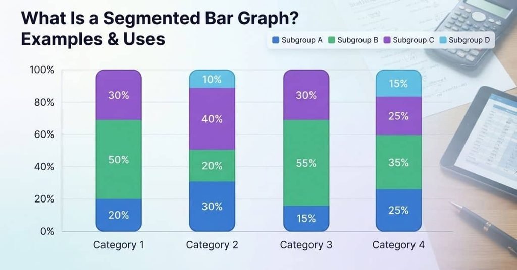
If so, learning what is a segmented bar graph can make data much easier to understand. This graph divides each bar into sections to show how a whole is made up of different parts.
Segmented bar graphs are common in statistics classes, including high-school and AP Statistics courses. They help students compare groups while seeing how categories contribute to each total.
Understanding this graph can also make homework, quizzes, and data analysis less confusing. You do not need advanced math to read or create one.
In this guide, you will learn what a segmented bar graph is and what its parts represent. You will also see clear examples and learn how to make a segmented bar graph step by step.
You can also use our Segmented Bar Graph & Chart Maker to turn your data into a clear segmented chart.
By the end, you will be able to read, interpret, and create segmented bar graphs with confidence.
What Is a Segmented Bar Graph?
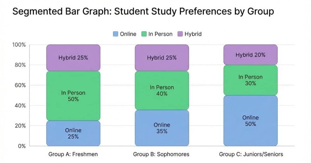
A segmented bar graph is a bar divided into sections, with each section representing a subgroup or part of the total. Each bar shows one main category, while its segments show how that category breaks down.
Think of the graph as having two levels of information:
- Bar → Category: Each complete bar represents a main group being compared.
- Segments → Subgroups: Each section within the bar represents a subgroup or response category.
For example, a student survey might compare students from different grade levels. Each bar could represent a grade level, such as 9th, 10th, 11th, or 12th grade. The segments could then show students’ preferred study methods, such as studying alone, studying with friends, or using online resources.
This structure helps you compare groups while also seeing how each group is divided. A segmented bar graph can therefore show both the whole group and its internal composition in one visual.
Expert tip: Always identify what the entire bar represents before interpreting individual segments. This prevents confusion between categories and subgroups.
What Is a Segmented Bar Chart?
A segmented bar chart is another common name for a segmented bar graph. The two terms are generally used interchangeably in statistics.
Both describe a bar divided into sections, where each section represents a subgroup of the whole. The complete bar represents a main category, while the segments show how that category is divided.
For example, a segmented bar chart might compare students across different grade levels. Each bar represents one grade, while the sections show different study methods.
You do not need to treat segmented bar graph and segmented bar chart as two different graph types. They communicate the same basic idea. Your teacher or textbook may simply prefer one term over the other.
What Does a Segmented Bar Graph Look Like?
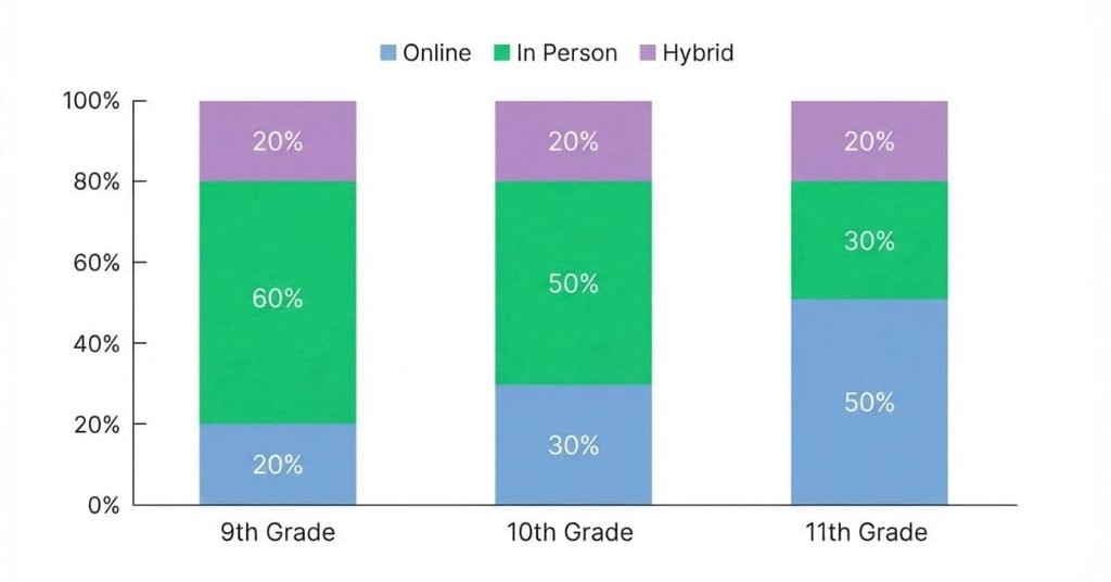
A segmented bar graph looks like a regular bar that has been divided into smaller sections. Each section represents a subgroup and shows its share of the entire category.
Here is a simple example using students’ preferred study methods across three grade levels:
Preferred Study Methods by Grade
In this example, each bar represents a grade level. The 9th-grade bar represents all students included in that group, while its sections show their preferred study methods.
The segments represent subgroups within each grade. For 9th grade, online study makes up 30%, in-person study makes up 50%, and hybrid study makes up 20%.
The same pattern applies to the other bars. The 10th-grade bar contains 40% online, 35% in person, and 25% hybrid. The 11th-grade bar contains 25% online, 45% in person, and 30% hybrid.
Because each bar represents 100% of its group, you can compare the composition of different grades. This makes segmented bar graphs useful when you want to study both group totals and subgroup proportions.
Ready to make your own chart? Use our Segmented Bar Graph & Chart Maker to create and customize a segmented bar graph.
How Does a Segmented Bar Graph Work?
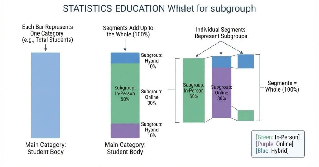
A segmented bar graph organizes data at two levels. The complete bar represents a category, while the sections inside it represent subgroups.
This structure lets you compare categories and examine how each category is divided. The segments can display either actual counts or percentages.
Each Bar Represents a Category
Each bar represents one main category in the dataset. The categories could be grade levels, age groups, schools, or other groups.
For example, a student survey could compare 9th, 10th, and 11th graders. Each grade level would receive its own bar.
Each Segment Represents a Subgroup
Each segment shows a subgroup within the main category. The segments help explain how the category is divided.
For example, a transportation survey might include walking, biking, bus, and car. Each transportation method would appear as a separate segment.
The Segments Make Up the Whole
All segments within one bar together represent the complete category. Their values should therefore add up to the total for that category.
If a bar represents 50 students, its segments must account for all 50 students. When percentages are used, the segments usually add up to 100%.
Segments Can Show Counts or Percentages
A segmented bar graph can display frequency, which means the actual number of observations. For example, 18 students might use the school bus.
It can also display relative frequency, which expresses each subgroup as a percentage of the category. For example, 18 out of 50 students equals 36%.
Counts tell you how many observations belong to each subgroup. Percentages tell you what share of the category belongs to each subgroup.
Segmented Bar Graph Example
Consider a student transportation survey. Students are grouped by grade level and asked how they travel to school.
| Category | Segment | Count | Percentage |
|---|---|---|---|
| 9th Grade | Bus | 20 | 40% |
| 9th Grade | Car | 15 | 30% |
| 9th Grade | Walk | 10 | 20% |
| 9th Grade | Bike | 5 | 10% |
| 10th Grade | Bus | 18 | 36% |
| 10th Grade | Car | 17 | 34% |
| 10th Grade | Walk | 8 | 16% |
| 10th Grade | Bike | 7 | 14% |
| 11th Grade | Bus | 15 | 30% |
| 11th Grade | Car | 20 | 40% |
| 11th Grade | Walk | 10 | 20% |
| 11th Grade | Bike | 5 | 10% |
Each grade level forms one category in the segmented bar graph. The transportation methods form the segments within each category.
For 9th grade, 40% of students use the bus, while 30% travel by car. Walking accounts for 20%, and biking accounts for 10%.
The graph allows students to compare transportation preferences within each grade level. It also helps them notice differences between grade levels.
For example, car travel represents a larger share for 11th graders than for 9th graders. A student can identify this pattern by comparing the segment sizes.
Expert tip: Always check whether the graph uses counts or percentages before comparing segments. Percentages are often more useful when category sizes differ.
How to Make a Segmented Bar Graph
Learning how to make a segmented bar graph becomes easier when you build it step by step. Start with organized categorical data, then divide each bar according to its subgroups.
After learning how segmented bar graphs work, practice with your own data using our Segmented Bar Graph & Chart Maker.
Step 1 — Collect Your Data
Begin with categorical data that can be divided into meaningful subgroups. Your data should include a main category and one or more subgroups.
For example, a survey could group students by grade level. Their transportation methods could serve as the subgroups.
Step 2 — Organize the Categories
Place your main categories into separate rows or groups. Keep the subgroup names consistent across categories.
For example, your categories might include 9th, 10th, and 11th grade. Each category can then contain bus, car, walking, and biking responses.
Step 3 — Calculate Counts or Percentages
Count how many observations belong to each subgroup. You can also calculate each subgroup’s percentage within its category.
For percentages, use:
Percentage = (Subgroup Count ÷ Category Total) × 100
Make sure the counts or percentages correctly describe each category.
Step 4 — Create the Bars
Give each main category its own bar. The bar represents the entire group before you divide it into sections.
If your categories are grade levels, create one bar for each grade. Keep the bars the same overall scale when comparing percentages.
Step 5 — Divide Each Bar Into Segments
Turn each subgroup into a separate section of its category’s bar. The segment size should match its count or percentage.
For example, a larger bus segment means more students use the bus. A smaller biking segment means fewer students belong to that subgroup.
Step 6 — Add Labels and a Legend
Add clear labels so readers can identify the categories and subgroups quickly. A legend should explain what each segment represents.
Include a title and axis labels when appropriate. Clear labeling helps students interpret the graph without guessing.
Step 7 — Check Your Graph
Before using your graph, check these details:
- Segments: Confirm each segment represents the correct subgroup.
- Totals: Make sure counts or percentages add up correctly.
- Categories: Check that every bar has the correct label.
- Legend: Make sure every segment type appears clearly.
These checks can prevent simple errors from changing the meaning of your data.
Want to create one automatically? Use our Segmented Bar Graph & Chart Maker.
How to Make a Segmented Bar Graph With Percentages
A percentage-based segmented bar graph shows each category as a complete 100% bar. Each segment represents the percentage of that category belonging to a particular subgroup.
For example, suppose students choose three study methods. Their percentages are 30% online, 50% in person, and 20% hybrid.
The segments should satisfy:
This means the three segments together represent the entire category. Each bar therefore has the same total length, even when the original category sizes differ.
Percentage-based bars make comparisons easier when groups have different sample sizes. You can compare the relative share of each subgroup instead of comparing raw counts.
For example, one grade might have 50 students while another has 100. A count-based graph could make the larger group appear more dominant. Percentages let you compare the composition of each group more fairly.
Segmented Bar Graph vs. Stacked Bar Graph
Segmented bar graphs and stacked bar graphs can look very similar. In fact, the terms may sometimes overlap depending on the textbook, software, or statistical context.
A segmented bar graph usually focuses on how each category is divided into parts of a whole. This makes it useful for showing distributions, especially when each bar represents a category and its segments represent subgroups.
A stacked bar graph also divides a bar into components. However, it often emphasizes how different components contribute to a total value. Stacked bars can work well when comparing quantities across several categories.
| Segmented Bar Graph | Stacked Bar Graph |
|---|---|
| Often emphasizes parts of a whole | Often emphasizes component totals |
| Common with categorical data | Common for comparing quantities |
| Frequently uses percentages | Can use raw values |
| Useful for showing distributions | Useful for component comparisons |
| Often compares subgroup proportions | Often compares component amounts |
The main difference is usually what the graph is designed to help you interpret, rather than the physical appearance of the bars.
For example, a statistics class may use a 100% segmented bar graph to compare the distribution of responses across different groups. A stacked bar graph might instead show how several components add to a total for each category.
Expert tip: Do not assume the terms are always completely separate chart types. Check how the graph is scaled and what the segments are intended to communicate.
Segmented Bar Graph vs. Grouped Bar Graph
A segmented bar graph and a grouped bar graph organize subgroups in different ways. The key difference is whether the subgroups share one bar or have separate bars.
In a segmented bar graph, the segments are placed inside the same bar. Each main category has one bar, and that bar is divided into sections for its subgroups.
In a grouped bar graph, the subgroup values appear as separate bars placed next to each other. This layout makes it easier to compare the same subgroup across different categories.
For example, suppose you are comparing students’ preferred study methods across grade levels. A segmented graph could use one bar for each grade and divide each bar into study-method segments.
A grouped bar graph could instead place separate bars for online, in-person, and hybrid study methods beside each other for every grade.
Choose a segmented bar graph when you want to understand how each category is composed. Choose a grouped bar graph when you want to compare individual subgroups more directly.
Expert tip: If your main question is “How does each subgroup compare?”, a grouped bar graph may be easier to read.
When Should You Use a Segmented Bar Graph?
A segmented bar graph works best when you want to show how categories are divided into smaller groups. It is especially useful for categorical data, where responses belong to named groups rather than continuous numerical values.
Common uses include:
- Survey data
- Student surveys
- Preferences and opinions
- Demographic comparisons
- Responses across different groups
- Relative-frequency comparisons
- Distributions within categories
For example, a student survey might compare study preferences across grade levels. Each grade could have one bar, while the segments show online, in-person, and hybrid preferences.
Segmented bars are also useful when you want to compare the relative composition of different groups. Percentage-based segmented bars make this especially clear because each bar represents the same 100% total.
When a Segmented Bar Graph Is Especially Useful
A segmented bar graph is most helpful when your main question is:
How does the composition of one category compare with another?
For example, you might compare how transportation preferences are divided across several grade levels. The graph lets you see whether one subgroup makes up a larger or smaller share within each category.
This makes segmented bar graphs useful for statistics assignments involving surveys, categorical variables, and relative frequencies.
Expert tip: Focus on the proportions when the bars represent percentages. The goal is usually to compare how each group is composed, not just its total size.
When Should You Not Use a Segmented Bar Graph?
A segmented bar graph is not the best choice for every dataset. Choosing the right graph depends on what you need the reader to compare.
Avoid a segmented bar graph when:
- There are too many segments. Many sections can make the graph crowded and difficult to interpret.
- Categories are difficult to compare. Similar-sized segments may be hard to compare across bars.
- Exact individual values matter more than composition. A grouped or standard bar graph may make specific values easier to compare.
- The data is continuous. Segmented bars are designed mainly for categorical data, not measurements that can take many numerical values.
For continuous data, another graph may communicate the pattern better. A histogram can show how numerical values are distributed across intervals. A scatter plot can show the relationship between two numerical variables.
The best graph is the one that makes your intended comparison easiest to understand.
Expert tip: Before creating a graph, ask what you want readers to compare. If the answer is “parts of each category,” a segmented bar graph may be a strong choice.
Common Segmented Bar Graph Mistakes
Even a simple segmented bar graph can become confusing when basic details are missing. Watch for these common mistakes when creating or interpreting one.
Forgetting the Legend
A legend tells readers what each segment represents. Without it, the sections may be difficult to identify correctly.
Using Too Many Segments
Too many segments can make a bar crowded and hard to read. Combine categories only when doing so makes statistical sense.
Mixing Counts and Percentages
Do not treat counts and percentages as if they mean the same thing. Clearly identify which type of values your graph uses.
Using Inconsistent Categories
Use the same subgroup categories across all bars when comparing groups. Changing categories can make comparisons misleading.
Making Segments Difficult to Distinguish
Segments should be visually easy to tell apart. Clear labels or a well-organized legend can help readers identify each section.
Forgetting to Label the Axes
Axis labels explain what the values and categories represent. Include them whenever they are needed to understand the graph.
Misinterpreting Percentages
Remember that percentages usually describe the share within a category. A 40% segment means that subgroup makes up 40% of that particular bar.
How to Read and Interpret a Segmented Bar Graph
Reading a segmented bar graph starts with understanding what the bars and segments represent. Do not jump straight to comparing section sizes.
Ask these questions:
- What does each bar represent? Identify the main categories being compared.
- What does each segment represent? Check the legend or labels for the subgroup names.
- Are the values counts or percentages? This changes how you should interpret the segments.
- Which segment is largest? Identify the subgroup with the greatest count or share.
- How do categories differ? Compare the segment sizes across the bars.
- What comparison does the graph support? Focus on the question the graph was designed to answer.
Short Interpretation Example
Suppose a segmented bar graph compares students’ study preferences across three grade levels. Each bar represents a grade, and the segments represent online, in-person, and hybrid study.
If the online segment is largest for one grade, you can say that online study represents the largest share for that group. You should not assume that group has the most students overall unless the graph shows total counts.
Expert tip: Always check whether the graph uses counts or percentages before making a comparison.
Segmented Bar Graph Example With Interpretation
Suppose a school surveys students about their preferred extracurricular activities across three grade levels. The segmented bars represent grade levels, while each segment represents an activity such as sports, music, clubs, or volunteering.
Imagine the graph shows these illustrative percentages:
| Grade | Sports | Music | Clubs | Volunteering |
|---|---|---|---|---|
| 9th | 40% | 25% | 20% | 15% |
| 10th | 30% | 20% | 35% | 15% |
| 11th | 25% | 30% | 20% | 25% |
Each bar represents 100% of the students in that grade. The segments show how extracurricular preferences are distributed within each grade.
Which category has the largest percentage?
The largest individual percentage is 40% for Sports among 9th-grade students.
Which group has the smallest percentage?
The smallest individual percentage is 15%. It appears for Volunteering among both 9th- and 10th-grade students.
How Does the Distribution Change Between Categories?
The distribution changes across grade levels. Sports has the largest share in 9th grade, while Clubs becomes the largest share in 10th grade. In 11th grade, Sports and Volunteering each account for 25%, while Music represents 30%.
This example shows why segmented bar graphs are useful for comparing composition across groups. Instead of looking only at one percentage, students can examine how the entire distribution changes from one category to another.
AP Statistics tip: When interpreting a segmented bar graph, describe the proportions within each group and compare the patterns between groups. Avoid making claims the graph does not support.
Segmented Bar Graph vs. Other Charts
Different graphs are designed to answer different questions. Choosing the right chart depends on whether you want to compare parts of a whole, distributions, or relationships between variables.
| Chart | Best For |
|---|---|
| Segmented Bar Graph | Comparing parts of a whole across categories |
| Grouped Bar Graph | Comparing subgroups side by side |
| Pie Chart | Showing parts of one whole |
| Histogram | Showing the distribution of numerical data |
| Scatter Plot | Showing the relationship between two numerical variables |
A segmented bar graph is especially useful when you want to compare how a whole is divided across several categories. For example, you could compare student preferences across different grade levels.
A grouped bar graph separates subgroups into individual bars. This makes direct comparisons between specific subgroups easier.
A pie chart also shows parts of a whole, but it represents one whole at a time. It is less useful when you need to compare compositions across many groups.
A histogram is designed for numerical data. It shows how observations are distributed across numerical intervals.
A scatter plot is different because it examines the relationship between two numerical variables. For example, it can help show whether two measurements tend to change together.
Expert tip: Choose the chart based on the question you want to answer, not simply on how the data looks.
Conclusion
Understanding what is a segmented bar graph becomes easier when you know what each bar and segment represents. This guide covered segmented bar graphs, examples, comparisons, common mistakes, and how to create and interpret them.
Segmented bar graphs are especially useful for comparing the composition of categories. They can help you understand survey results, preferences, distributions, and other categorical data. Always check whether your graph uses counts or percentages before drawing conclusions.
With practice, you can quickly read these graphs and choose the right chart for your data. You can also use the same steps when learning how to make a segmented bar graph.
Try creating one with your own data, and explore more statistics guides on our website to strengthen your skills.

Team ClassRank builds smart, student-friendly calculators to make grade and rank tracking simple and accurate. For questions or feedback, contact us at classrankcalculator@gmail.com.