

Table of Contents
Introduction
Have you ever wanted to see every data value without losing the bigger picture?
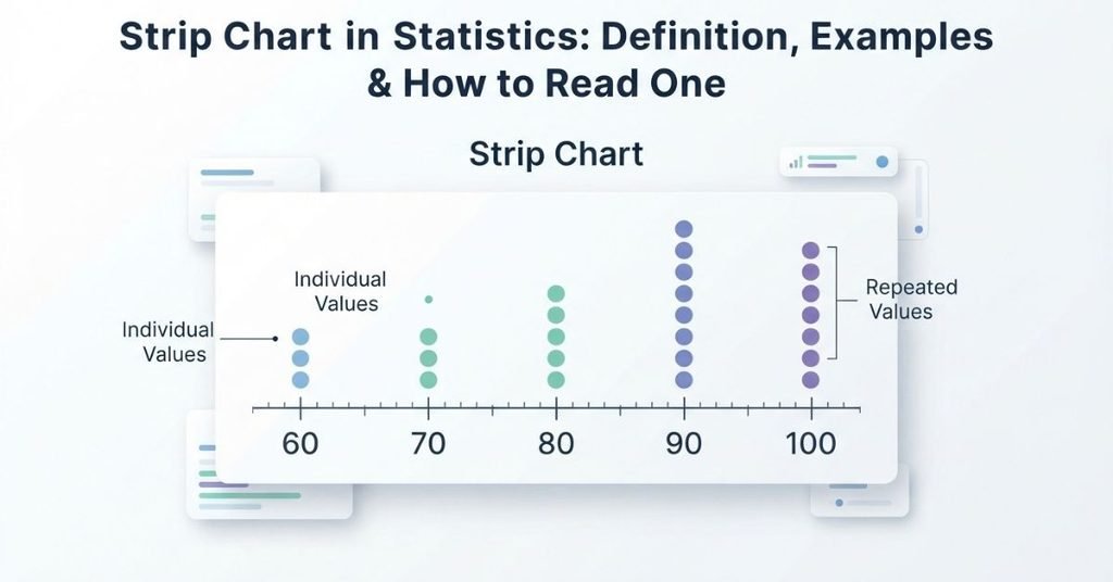
A strip chart statistics display makes individual data values easy to see and compare. It places each observation along a number line, making patterns easier to spot. This is useful for students learning statistics in U.S. high schools and colleges.
Strip charts can help you understand data before using more complex graphs. They make clusters, gaps, repeated values, and unusual observations easier to notice. They are also useful when working with small or moderate data sets.
In this guide, you’ll learn exactly what a strip chart is and how it works. You’ll also see a simple strip chart example and learn how to read one step by step. We’ll explain how to make a strip chart and when it is useful. You’ll also learn how it differs from other common statistical graphs.
By the end, you’ll have a clear understanding of strip charts and how to interpret them confidently.
If you want to see how a strip chart works with real data, try our Strip Chart Maker. You can enter your numerical values and instantly create a strip chart to visualize individual observations and repeated values.
What Is a Strip Chart in Statistics?
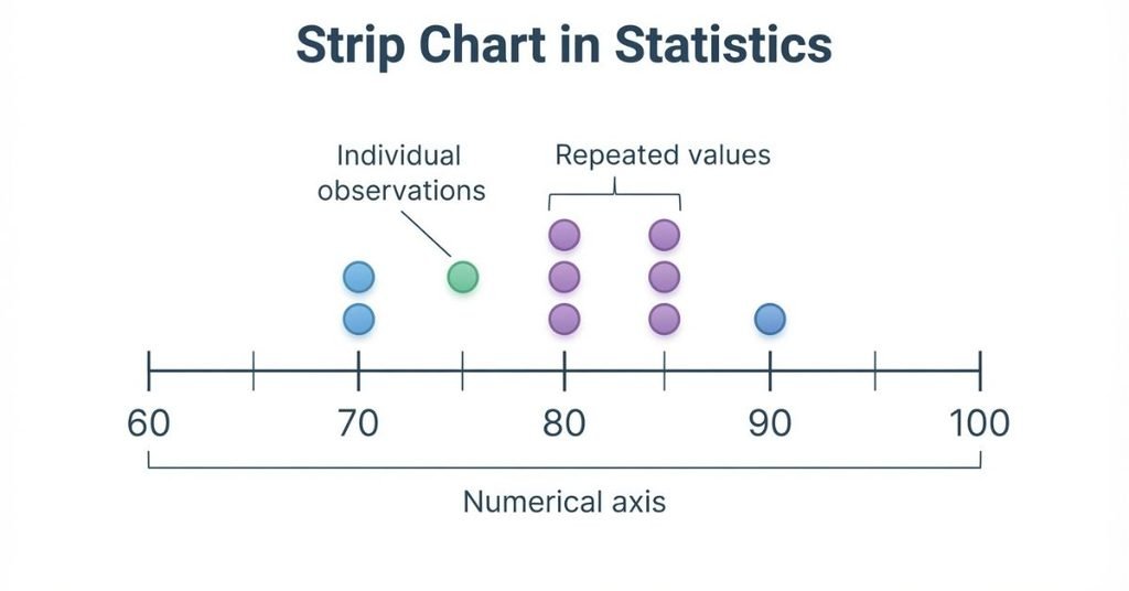
A strip chart in statistics is a graph that displays individual numerical observations along a number line. Each observation appears at its actual value, so you can see how the data are distributed.
A strip chart places values along a numerical axis. When several observations have the same value, the chart stacks them above that position. This makes repeated values easy to spot.
For example, consider these test scores:
70, 70, 75, 80, 80, 80, 90
A simple strip chart would place the observations like this:
90        ●
85
80        ●
          ●
          ●
75        ●
70        ●
          ●
          ─────────────────
          70  75  80  85  90
This display quickly shows where the scores cluster. It also reveals gaps, repeated values, and unusually high or low observations.
Important Terminology Note
The term strip chart can vary between textbooks and statistical software. Different sources may use slightly different names or layouts for similar displays.
In introductory statistics, a strip chart is closely related to a dot plot. Both display individual observations along a number line. Both can show the shape and distribution of a small data set.
Always check how your textbook or software defines the term. Understanding the underlying idea matters more than the label.
What Does a Strip Chart Look Like?
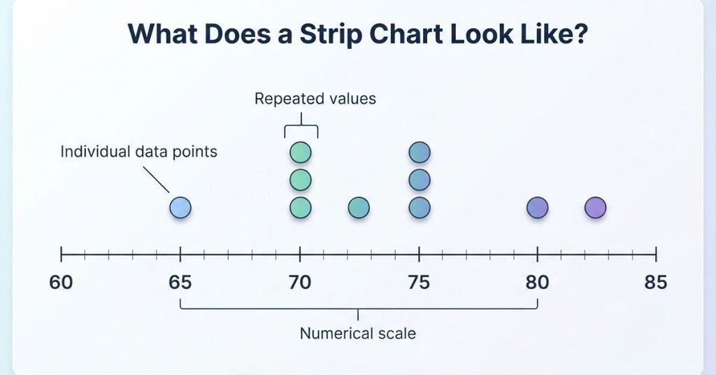
A strip chart shows individual numerical observations along a horizontal number line. Each point represents one observation from the data set.
For example, consider this data set: 65, 70, 70, 72, 75, 75, 75, 80, 82. A strip chart places each value at its matching location on the numerical axis.
The horizontal axis represents the numerical values in the data. Each point represents one observation. When multiple observations have the same value, the points stack above each other.
This simple layout makes repeated values easy to identify. You can also see where observations cluster and where gaps appear in the data.
For this example, the three observations with a value of 75 would appear stacked at 75. The two observations at 70 would also stack together. Values such as 65, 72, 80, and 82 would appear as individual points.
A strip chart therefore gives you a quick view of the data’s distribution. It lets you see both individual values and the overall pattern at the same time.
Ready to create one with your own data? Our Strip Chart Maker makes it easy to plot individual observations, stack repeated values, and see the distribution clearly without creating the graph manually.
How Does a Strip Chart Work?
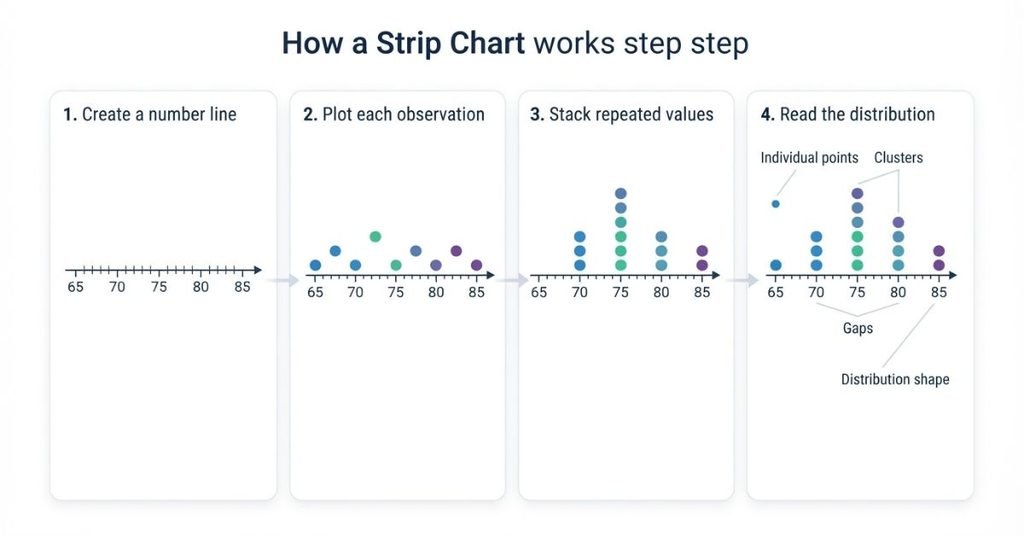
A strip chart works by placing each numerical observation at its correct position on a number line. The process is simple, so beginners can build and interpret one with ease.
1. Put the Data on a Number Line
Start by creating a numerical scale that covers the values in your data set. Arrange the numbers from smallest to largest with even spacing.
The scale gives every observation a clear position. For example, scores from 60 to 90 would use a number line covering that range.
2. Plot Each Observation
Next, place one mark at the position of each data value. Every mark represents exactly one observation.
If your data contains a value of 75 three times, you need three marks at 75. This keeps the original data visible in the display.
3. Stack Repeated Values
When the same value appears more than once, stack the marks above that value. This shows the frequency of repeated observations.
Taller stacks indicate values that occur more often. Single marks show values that appear only once.
4. Read the Distribution
Once all observations appear, examine the overall pattern. A strip chart can reveal several important features:
- Center: Where the observations tend to gather.
- Spread: How widely the values are distributed.
- Clusters: Groups of observations close together.
- Gaps: Ranges with few or no observations.
- Repeated values: Values that occur multiple times.
- Possible unusual observations: Values far from most other observations.
Reading these features helps you understand the data before performing further statistical analysis.
You can also create a strip chart online using our free Strip Chart Maker. Enter your data, generate the graph, and use the visual to identify patterns such as clusters, gaps, and repeated observations.
Strip Chart Example
Imagine a student reviewing test scores from a recent statistics quiz. The scores are:
72, 74, 74, 76, 78, 78, 78, 81, 84, 88
A strip chart places each score at its correct location on a numerical axis. Repeated scores appear stacked above the same value.
This display makes the data easier to understand without hiding individual observations. You can quickly identify the most common score, the main cluster, the range, and gaps.
What Is the Most Common Score?
The most common score is 78. It appears three times in the data set.
On the strip chart, the three marks at 78 would stack vertically. This makes 78 the most frequently observed score.
Where Are Most Scores Concentrated?
Most scores are concentrated between 74 and 81. This area contains several observations close together.
The scores 74, 76, 78, 78, 78, and 81 form the main cluster. The chart makes this concentration easy to recognize.
What Is the Range?
The range shows the difference between the highest and lowest values.
Range = Maximum − Minimum
Range = 88 − 72 = 16
So, the range of these test scores is 16 points.
Are There Any Gaps?
Yes. The data has gaps where no observations occur. For example, there are no scores from 79 through 80.
There are also no scores from 85 through 87. On a strip chart, these gaps appear as empty spaces along the numerical axis.
How to Read a Strip Chart
Reading a strip chart means looking for patterns in the individual observations. Start by checking where the marks are located, then examine how they group together.
Center
The center shows where most observations are located. Look for the area where the marks appear most concentrated.
The center gives you a quick sense of a typical value. It does not always equal the mean or median.
Spread
Spread describes how far the observations extend across the numerical axis. A wider spread means the values cover a larger range.
Compare the lowest and highest observations to understand the overall extent of the data.
Clusters
Clusters are groups of observations located close together. They can show where the data has a strong concentration.
Look for areas with several nearby marks. A data set can have more than one cluster.
Gaps
Gaps are areas where few or no observations appear. They can separate different groups within the data.
A noticeable empty space may help you recognize changes in the distribution.
Outliers or Unusual Values
An observation may look unusual when it sits far from the main group. A strip chart makes these potentially unusual values easier to notice.
However, distance alone does not prove that a value is an outlier. Context and appropriate statistical rules may be needed.
Frequency
Frequency tells you how often a value occurs. Count the marks stacked above the same numerical value.
A taller stack means that value occurs more frequently in the data.
What Can You Learn From a Strip Chart?
A strip chart provides several useful details about a numerical data set. Because it displays individual observations, you can identify both specific values and broader patterns.
You can use a strip chart to identify:
- Minimum: The smallest observation.
- Maximum: The largest observation.
- Range: The difference between the maximum and minimum.
- Mode: The value that occurs most often.
- Clusters: Groups of observations close together.
- Gaps: Areas with few or no observations.
- Frequency: How often individual values occur.
- Distribution shape: The overall pattern of the observations.
- Approximate center: The area where observations tend to concentrate.
A strip chart can also help you notice potentially unusual observations. However, the graph alone does not automatically prove that a value is an outlier.
You may need subject-matter context or a statistical rule to classify an observation as an outlier. This distinction is important when interpreting data accurately.
How to Make a Strip Chart
Learning how to make a strip chart is straightforward. You only need numerical data, a number line, and one mark for each observation.
Step 1 — Collect Your Numerical Data
Start with a numerical data set. Make sure every observation represents a measurable numerical value.
For example, you might collect quiz scores, temperatures, heights, or daily study hours.
Step 2 — Identify the Minimum and Maximum
Find the smallest and largest values in your data set. These values help determine the range of your number line.
Check the data carefully before plotting. One missed value can change the entire display.
Step 3 — Create a Number Line
Draw a horizontal number line that covers all observations. Choose equal intervals so the numerical scale stays accurate.
Label enough values to make each observation easy to locate.
Step 4 — Plot Each Observation
Place one mark at the correct position for every observation. Each mark represents exactly one data value.
Follow the numerical scale carefully when positioning each mark.
Step 5 — Stack Duplicate Values
When the same value appears multiple times, stack the marks vertically. This shows how frequently that value occurs.
For example, three observations with the same value create a stack of three marks.
Step 6 — Label the Axis
Add a clear label to the numerical axis. The label should explain what the values represent.
For test scores, you could label the axis Test Score.
Step 7 — Check the Distribution
Review the completed strip chart for accuracy. Look for the center, spread, clusters, gaps, repeated values, and possible unusual observations.
Make sure every original observation appears exactly once.
Instead of plotting every value manually, you can use our Strip Chart Maker to generate the graph automatically. It can save time and reduce plotting errors when working with a larger data set.
Why Use a Strip Chart in Statistics?
A strip chart is useful because it shows individual observations without grouping them into intervals or bins. This makes the original data easy to inspect.
Strip charts work especially well when:
- The data set is relatively small.
- Individual observations matter.
- Repeated values are important.
- You want to see the distribution without using bins.
- Students need to analyze center and spread visually.
Because every observation remains visible, you can quickly spot clusters, gaps, repeated values, and the overall spread. This makes strip charts useful for learning basic data analysis.
They also provide a simple way to explore a data set before calculating statistics such as the mean, median, or range.
When Should You Use a Strip Chart?
A strip chart works best when you want to see individual numerical observations clearly. It is especially helpful with smaller data sets that do not contain too many values.
Common examples include test scores, measurements, survey responses, reaction times, heights, and daily study hours. These data sets can reveal useful patterns when each observation remains visible.
A strip chart is a good choice when:
- The data set is relatively small.
- Individual observations matter.
- Repeated values are important.
- You want to view the distribution without grouping values into bins.
- Students need to examine center and spread visually.
Strip charts become less suitable when the data set contains many observations. Too many marks can overlap and make the display difficult to read.
They can also become harder to interpret when values cover a very wide numerical range. In these situations, another visualization may communicate the distribution more clearly.
The main goal is simple: use a strip chart when showing individual values adds useful information.
Strip Chart vs. Dot Plot
Strip charts and dot plots can look very similar. Both place individual numerical observations along a number line.
The terminology can vary between textbooks, statistics courses, and software. Some sources may use strip chart for a display that another source calls a dot plot.
| Feature | Strip Chart | Dot Plot |
|---|---|---|
| Individual observations | Shows individual observations | Shows individual observations |
| Numerical axis | Uses a numerical axis | Uses a numerical axis |
| Repeated values | Can stack repeated values | Can stack repeated values |
| Smaller data sets | Useful for small data sets | Useful for small data sets |
| Distribution | Shows the distribution of values | Shows the distribution of values |
In many introductory statistics settings, the two displays are very similar. However, you should not assume that every textbook or software program defines them identically.
When studying for a class, follow the terminology and definition used by your instructor or course materials. The key idea is understanding how individual observations appear along a numerical scale.
Strip Chart vs. Histogram
A strip chart and a histogram both display numerical data, but they organize the observations differently.
| Feature | Strip Chart | Histogram |
|---|---|---|
| Individual observations | Visible | Grouped into bins |
| Data size | Best for smaller data sets | Works well with larger data sets |
| Repeated values | Clearly visible | Combined into frequencies |
| Exact values | Remain visible | Individual values may be hidden |
| Main purpose | Show individual data points | Show the overall distribution |
Choose a strip chart when you want to see every observation. This is useful for smaller data sets, repeated values, and exact numerical results.
Choose a histogram when you have many observations or want to focus on the overall shape of the distribution. Histograms group numerical values into intervals called bins.
For example, a strip chart can show each student’s exact test score. A histogram can group those scores into ranges, such as 60–69, 70–79, and 80–89.
The right choice depends on what you want the graph to communicate. Use a strip chart when individual values matter. Use a histogram when grouping values makes a large data set easier to understand.
Strip Chart vs. Box Plot
A strip chart shows individual observations along a numerical axis. This lets you see exact values, repeated observations, clusters, gaps, and the overall distribution.
A box plot provides a compact summary instead of displaying every observation. It commonly shows the median, quartiles, and whiskers. Depending on the box plot convention, whiskers may represent the minimum and maximum or extend to the most extreme non-outlier values. Potential outliers may also be marked separately.
The main difference is the level of detail. A strip chart preserves the individual data points, while a box plot summarizes the distribution using key statistics.
Use a strip chart when you want to inspect individual observations. Use a box plot when you want to compare distributions or quickly summarize their center, spread, and potential outliers.
Advantages of a Strip Chart
Strip charts are useful because they show numerical data in a simple, visual format. They work especially well when you want to examine individual observations.
Shows Individual Data Values
A strip chart keeps each observation visible on the numerical axis. This lets you see the actual values instead of only a summary.
For example, you can identify the exact test scores in a small class dataset. This makes the graph useful when individual observations matter.
Makes Repeated Values Easy to See
Repeated values appear as stacked points at the same location. You can quickly see which values occur most often.
A taller stack means more observations have that value. This makes frequencies easy to compare without calculating them separately.
Reveals Clusters and Gaps
A strip chart makes groups of nearby values easy to spot. These groups are called clusters.
It can also reveal gaps where few or no observations occur. These patterns can help you understand how the data are distributed.
Easy to Understand
Strip charts use a simple numerical axis and individual data points. Students can often understand the graph without advanced statistical knowledge.
They provide a clear way to explore data before calculating statistics such as the mean, median, or range.
Useful for Small Datasets
Strip charts work especially well with small or moderate data sets. The number of observations remains manageable, so individual values stay easy to inspect.
They are useful for classroom examples, test scores, measurements, survey responses, and other numerical data.
Limitations of a Strip Chart
Although strip charts are simple and useful, they are not ideal for every data set. Understanding their limitations helps you choose the right graph.
Can Become Crowded
A strip chart can become difficult to read when many observations appear in the same area. Large stacks may also make the graph visually busy.
When the data become crowded, another graph may communicate the distribution more clearly.
Not Ideal for Very Large Datasets
Strip charts are usually better for smaller data sets. With hundreds or thousands of observations, displaying every value can create too much visual clutter.
A histogram or another summary graph may work better for very large data sets.
Overlapping Values Can Reduce Readability
Repeated or closely spaced values can create tall stacks or crowded areas. This may make individual observations harder to distinguish.
Good spacing and a clear numerical scale can improve readability, but extreme overlap remains a limitation.
May Not Summarize Data as Quickly as a Box Plot
A strip chart shows detailed observations, but you may need more time to assess the overall distribution.
A box plot gives a quick summary using the median, quartiles, and whiskers. Choose between them based on whether you need individual values or a compact summary.
Common Strip Chart Mistakes
Small plotting errors can change how a strip chart looks and how you interpret it. Check these common mistakes before using your graph.
Using an Incorrect Numerical Scale
The numerical axis should increase in equal intervals. Uneven spacing can make distances between values look misleading.
Always check that the scale matches the actual numerical values.
Missing Axis Labels
A clear strip chart should identify what the numerical values represent. Without a label, readers may not know whether the data show scores, heights, times, or another measurement.
Add a meaningful axis label whenever the context requires one.
Failing to Stack Repeated Values
If the same value occurs several times, the observations should be represented clearly at that value. Stacking repeated points helps show their frequency.
For example, if 75 occurs three times, the graph should make those three observations visible at 75.
Plotting Values in the Wrong Location
Each observation must appear at its correct numerical position. Even a small placement error can change the apparent distribution.
Double-check the original data before interpreting clusters, gaps, or unusual values.
Confusing Frequency With the Actual Value
The location of a point represents the data value. The number of stacked points represents its frequency.
For example, three points at 80 mean that the value 80 occurs three times. The number three is the frequency, not the data value.
Using a Strip Chart for an Excessively Large Dataset
Trying to display too many observations can make a strip chart crowded and difficult to read.
Consider a histogram or another visualization when the dataset contains many observations.
Incorrectly Identifying an Outlier
A value that looks far from the main group is not automatically an outlier. You should consider the context and, when appropriate, a formal statistical rule.
Do not label a point an outlier based only on how it looks on the graph.
How to Interpret a Strip Chart Example
Suppose a strip chart shows the test scores of 15 students. To interpret it, focus on the center, spread, frequency, clusters, gaps, and unusual observations.
Question
The strip chart represents these 15 test scores:
68, 72, 74, 74, 76, 78, 78, 78, 80, 82, 82, 84, 86, 86, 92
What can you conclude about the distribution?
1. Identify the Center
The scores are mainly concentrated around the upper 70s and low 80s. The median is 78, so 78 provides a useful measure of the center.
The mean is also useful when required, but the strip chart itself mainly shows where the observations concentrate.
2. Identify the Range
The lowest score is 68, and the highest score is 92.
Use the range formula:
Range = Maximum − Minimum
Range = 92 − 68 = 24
So, the scores span 24 points.
3. Find the Most Frequent Value
The value 78 appears three times. No other score appears more than twice.
Therefore, 78 is the mode of the data set.
On a strip chart, the tallest stack represents the most frequent value.
4. Look for Clusters
Most scores fall between 74 and 86. This creates the main cluster of the distribution.
The data show that most students scored within this central region rather than near the lowest or highest values.
5. Check for Gaps
There are no scores between 69–71, 75, 77, 79, 81, 83, 85, 87–91, and other individual intervals.
However, not every empty value represents an important statistical gap. A meaningful gap usually involves a noticeable interval with no observations.
The clearest gap appears between 86 and 92, where no scores occur from 87 through 91.
6. Look for Unusually Distant Observations
The score 92 sits above the main cluster. It may look unusual because most scores fall between 74 and 86.
However, a strip chart alone does not prove that 92 is an outlier. You should use the data’s context or an appropriate statistical rule before labeling it an outlier.
Conclusion
The distribution is centered around the upper 70s to low 80s, with a range of 24 points. The most frequent score is 78, and most observations form a cluster from 74 to 86.
The score of 92 is separated from the main group and may be unusual. Overall, the strip chart shows both the individual test scores and the distribution’s main patterns clearly.
Exam Tip
When a question asks you to interpret a strip chart, don’t just describe one feature. Check the center, spread, frequency, clusters, gaps, and unusual observations.
A strong answer connects these features to the actual values shown in the data.
Conclusion
A strip chart in statistics makes individual numerical values easy to see and compare. We covered how strip charts work, how to read them, and when they are useful.
You also learned how to identify the center, range, repeated values, clusters, gaps, and unusual observations. We compared strip charts with histograms, dot plots, and box plots. These comparisons can help you choose the right graph for your data.
If you’re new to statistics, start with small data sets. Look at each value and focus on the overall pattern. With practice, strip chart examples become much easier to interpret.
Ready to explore your data? Try our Strip Chart Maker and create a clear graph in seconds. Then explore more statistics calculators and guides on our website.
Frequently Asked Questions
A strip chart in statistics is a graph that displays individual numerical observations along a number line. Each point represents one data value. Repeated values can appear as stacked points, making frequencies easy to see.
A strip chart is used to explore and compare numerical data. It helps you see individual values, repeated observations, clusters, gaps, and the overall distribution. It works especially well with small or moderate data sets.
To make a strip chart, start with a numerical data set. Find the minimum and maximum values, then create a correctly spaced number line. Plot each observation at its value and stack repeated values clearly.
A strip chart shows the individual values in a numerical data set. It can reveal the center, spread, range, frequency, clusters, gaps, and possible unusual observations. This makes the distribution easier to examine.
Start by identifying the smallest and largest values. Then look for the center, repeated values, clusters, gaps, and unusual observations. Count stacked points to determine how often specific values occur.
A strip chart keeps individual observations visible while showing the overall distribution. It is useful when exact values matter and the data set is small enough to avoid overcrowding.
Strip charts and dot plots are very similar in many introductory statistics settings. Both place individual observations along a numerical axis and can stack repeated values. However, terminology and formatting can vary by textbook or software.
A strip chart displays individual observations, while a histogram groups observations into numerical intervals called bins. Strip charts preserve exact values, while histograms emphasize frequencies and the overall shape of larger data sets.
Strip charts work best with numerical data, especially small or moderate data sets. Examples include test scores, heights, measurements, reaction times, survey responses, and daily study hours.
Yes. Repeated values can be shown by stacking points at the same numerical location. The height of the stack indicates the frequency of that value.
Usually, no. A large data set can make a strip chart crowded and difficult to read. A histogram or another summary graph may communicate the distribution more clearly when many observations exist.

Team ClassRank builds smart, student-friendly calculators to make grade and rank tracking simple and accurate. For questions or feedback, contact us at classrankcalculator@gmail.com.