

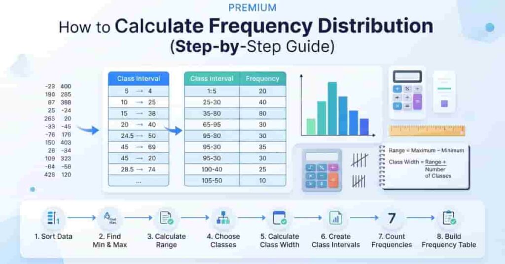
Table of Contents
Introduction
Have you ever looked at a long list of numbers and wondered how to organize them quickly? Learning how to calculate frequency distribution is one of the easiest ways to turn raw data into meaningful information. It helps beginners understand patterns, compare values, and analyze data with confidence. In the USA, students, teachers, researchers, and business professionals use frequency distributions in statistics, surveys, exam scores, and data analysis every day.
In this step-by-step guide, you’ll learn what a frequency distribution is, why it matters, and how to calculate it manually using simple formulas and worked examples. We’ll also explain grouped and ungrouped frequency distributions, class width, relative frequency, and cumulative frequency in an easy-to-follow way. Whether you’re studying statistics for school or working with real-world data, this guide will help you build accurate frequency distribution tables with confidence. If you want to save time after learning the process, you can also use our Frequency Distribution Calculator to generate accurate results instantly.
What Is a Frequency Distribution?
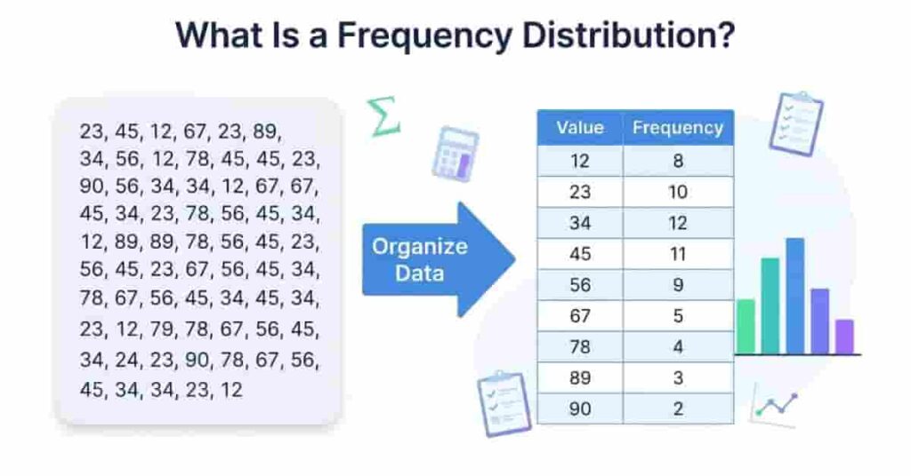
A frequency distribution is a simple way to organize raw data into a clear and easy-to-read format. Instead of looking at a long list of numbers, you can group similar values and count how often each one appears. This makes it much easier to spot patterns, compare results, and understand your data.
In statistics, a frequency distribution is one of the first tools students learn because it turns scattered information into meaningful insights. Whether you’re analyzing exam scores, survey responses, or sales figures, a frequency distribution table helps you summarize data quickly and accurately.
Definition
A frequency distribution is a table, chart, or graph that shows how many times each value or group of values appears in a dataset. The number of times a value occurs is called its frequency.
For example, imagine a teacher records the following quiz scores:
75, 80, 80, 82, 85, 85, 85, 90
Instead of reading every score individually, a frequency distribution organizes the data like this:
| Score | Frequency |
|---|---|
| 75 | 1 |
| 80 | 2 |
| 82 | 1 |
| 85 | 3 |
| 90 | 1 |
This table quickly shows that 85 is the most common score. Without a frequency distribution, finding this pattern would take much longer.
Pro Tip: Always sort your data before creating a frequency distribution. It helps you count values faster and reduces mistakes.
Why Frequency Distribution Is Important
A frequency distribution makes large datasets easier to understand. Instead of examining every individual value, you can focus on the overall pattern. This saves time and improves accuracy during data analysis.
It also helps you:
- Organize raw data into a structured table.
- Identify the most and least common values.
- Compare different groups easily.
- Prepare data for charts and graphs.
- Support better decisions using statistical summaries.
Many statistical calculations, including the mean, median, mode, relative frequency, and cumulative frequency, become easier once your data is organized into a frequency distribution table.
Expert Tip: Before calculating advanced statistics, create a frequency distribution first. It helps you catch missing values, duplicates, and unusual patterns early.
Real-World Uses
Frequency distributions are useful in many fields because they simplify complex data and reveal important trends.
Education
Teachers use frequency distributions to summarize test scores, assignment grades, attendance records, and classroom performance. This helps them identify learning trends and students who may need extra support.
Business
Companies analyze product sales, customer purchases, and inventory data using frequency distributions. The results help managers understand demand and make informed business decisions.
Research
Researchers organize observations from experiments and studies into frequency tables before performing statistical analysis. This improves accuracy and makes findings easier to interpret.
Surveys
Survey results often contain hundreds of responses. A frequency distribution groups similar answers together, making it easier to identify common opinions and preferences.
Data Analysis
Data analysts use frequency distributions as the first step in exploring a dataset. They help detect patterns, identify unusual values, and prepare data for graphs such as histograms and bar charts.
Types of Frequency Distribution
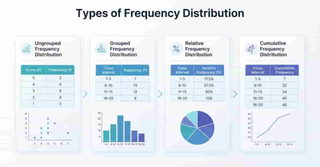
Not all datasets are organized the same way. The right frequency distribution depends on the size of your data and what you want to analyze. Some datasets contain only a few values, while others include hundreds or even thousands of observations.
The four main types of frequency distribution are ungrouped, grouped, relative, and cumulative frequency distributions. Each serves a different purpose, but all help organize data and make statistical analysis easier.
Ungrouped Frequency Distribution
An ungrouped frequency distribution lists every unique value in a dataset along with the number of times it appears. Each value has its own row, making this method simple and easy to understand.
This type works best when the dataset is small and contains only a few different values.
Example
Suppose a teacher records the following quiz scores:
70, 75, 75, 80, 80, 80, 90
| Score | Frequency |
|---|---|
| 70 | 1 |
| 75 | 2 |
| 80 | 3 |
| 90 | 1 |
Here, every unique score appears separately with its frequency.
When to Use
Use an ungrouped frequency distribution when:
- Your dataset is small.
- There are only a few unique values.
- You want to see every value individually.
- Grouping data is unnecessary.
Grouped Frequency Distribution
A grouped frequency distribution combines data into class intervals instead of listing every individual value. This makes large datasets much easier to organize and analyze.
Instead of displaying every score separately, similar values are placed into ranges.
Example
Student exam scores:
58, 62, 65, 67, 71, 74, 76, 79, 82, 88
| Class Interval | Frequency |
| 50–59 | 1 |
| 60–69 | 3 |
| 70–79 | 4 |
| 80–89 | 2 |
The grouped table quickly shows where most scores fall without listing every value.
When to Use
A grouped frequency distribution is best when:
- You have a large dataset.
- There are many different values.
- You want a cleaner summary.
- You plan to create charts such as histograms.
Expert Tip: Choose equal class widths whenever possible. Consistent intervals make your table easier to read and compare.
Relative Frequency Distribution
A relative frequency distribution shows the proportion or percentage of observations in each category instead of only the count. It helps you understand how much each group contributes to the entire dataset.
How It Differs
- Frequency distribution shows the actual count.
- Relative frequency distribution shows the percentage or decimal proportion.
Simple Example
| Score | Frequency | Relative Frequency |
| A | 8 | 40% |
| B | 6 | 30% |
| C | 4 | 20% |
| D | 2 | 10% |
This table shows not only the number of students in each grade but also their percentage of the class.
Cumulative Frequency Distribution
A cumulative frequency distribution displays a running total of frequencies. Each row adds the current frequency to the previous total, making it easy to see how many observations fall at or below a certain value.
How It Differs
- Frequency distribution lists separate counts.
- Cumulative frequency distribution shows the running total.
Simple Example
| Class Interval | Frequency | Cumulative Frequency |
| 10–19 | 3 | 3 |
| 20–29 | 5 | 8 |
| 30–39 | 4 | 12 |
| 40–49 | 2 | 14 |
The final cumulative frequency always equals the total number of observations.
Information You Need Before Calculating Frequency Distribution
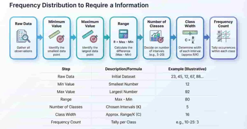
Before you calculate a frequency distribution, gather a few important pieces of information. These values help you organize the data correctly and create accurate class intervals. Skipping any of these steps can lead to incorrect results.
Raw Data
Raw data is the original list of observations before any sorting or grouping. It can include test scores, sales figures, survey responses, or measurements.
Example:
45, 52, 48, 60, 55, 62, 58, 49, 54, 57
Always review your raw data first to check for missing or duplicate values.
Minimum Value
The minimum value is the smallest number in the dataset. It marks the starting point for your frequency distribution.
Example:
Dataset: 45, 52, 48, 60, 55
Minimum Value = 45
Maximum Value
The maximum value is the largest number in the dataset. It determines the upper limit of your distribution.
Example:
Dataset: 45, 52, 48, 60, 55
Maximum Value = 60
Range
The range shows how spread out the data is. It is the difference between the highest and lowest values.
Example:
Maximum = 60
Minimum = 45
Range = 15
The range helps you decide suitable class intervals.
Number of Classes
The number of classes tells you how many groups your frequency table will have. Most datasets use 5 to 10 classes, depending on their size and variation.
Choosing too few classes hides important details, while too many classes make the table harder to read.
Class Width
Class width is the size of each class interval. It keeps all intervals consistent and easy to understand.
For example, if your class width is 5, the intervals might be:
- 45–49
- 50–54
- 55–59
- 60–64
Equal class widths make your frequency distribution cleaner and more accurate.
Frequency Count
The frequency count is the number of observations that fall within each value or class interval. Count every observation only once to avoid errors.
For example, if four students scored between 50 and 54, the frequency for that class is 4.
Summary Table
| Information | Purpose |
|---|---|
| Raw Data | Original observations |
| Minimum Value | Starting point of the dataset |
| Maximum Value | Ending point of the dataset |
| Range | Measures data spread |
| Number of Classes | Decides how many groups to create |
| Class Width | Determines interval size |
| Frequency Count | Counts observations in each class |
Key Takeaways
- Start with clean and complete raw data.
- Find the minimum and maximum values first.
- Calculate the range before creating class intervals.
- Choose an appropriate number of classes.
- Use equal class widths whenever possible.
- Count each observation only once.
Frequency Distribution Formula
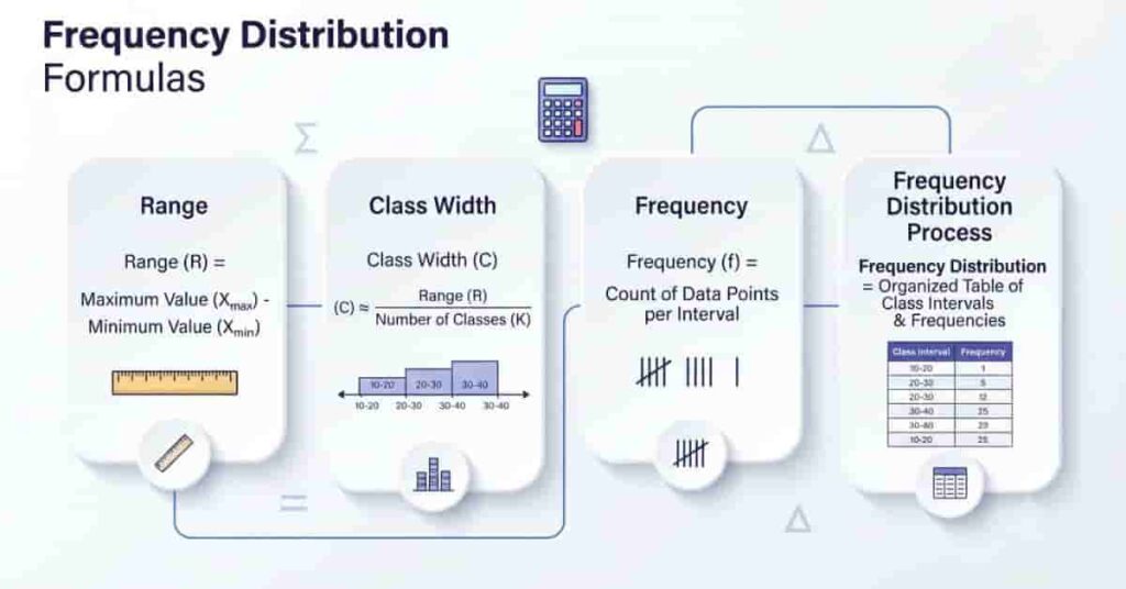
Creating a frequency distribution involves a few simple formulas. Each one helps you organize the data into clear class intervals and count observations correctly. Understanding these formulas also makes manual calculations much easier.
1. Range Formula
Formula
Range = Maximum Value − Minimum Value
Variables
- Maximum Value: The largest observation in the dataset.
- Minimum Value: The smallest observation in the dataset.
- Range: The spread of the data.
Example
Maximum = 92
Minimum = 52
Range = 92 − 52 = 40
2. Class Width Formula
Formula
Class Width = Range ÷ Number of Classes
If the result is a decimal, round it up to the nearest whole number to create equal intervals.
Variables
- Range: Difference between the largest and smallest values.
- Number of Classes: Total intervals in the table.
- Class Width: Size of each class interval.
Example
Range = 40
Number of Classes = 5
Class Width = 40 ÷ 5 = 8
3. Frequency Formula
Unlike other calculations, there is no algebraic formula for frequency. You simply count how many observations belong to each value or class interval.
Frequency = Number of observations within a value or class interval
Variables
- Frequency: Total observations in a class.
- Observation: An individual data value.
Example
Class Interval: 60–69
Scores: 61, 63, 65, 68, 69
Frequency = 5
4. Main Frequency Distribution Process
After calculating the range and class width, create class intervals and count the observations that belong to each interval. The completed table is your frequency distribution.
| Step | Formula or Action |
| Find Range | Maximum − Minimum |
| Find Class Width | Range ÷ Number of Classes |
| Create Intervals | Use equal class widths |
| Count Frequency | Count observations in each interval |
How to Calculate Frequency Distribution (Step-by-Step)
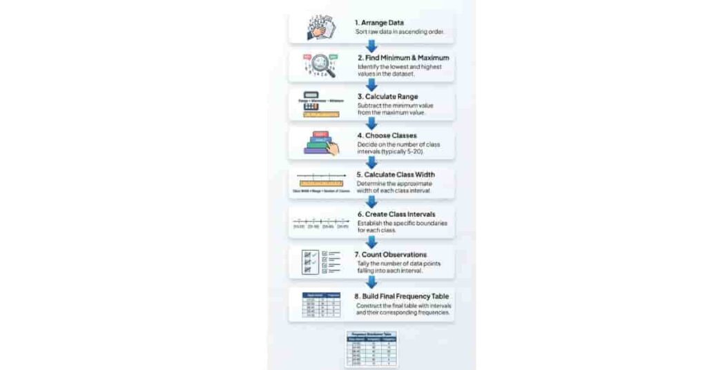
Calculating a frequency distribution is easier when you follow a clear process. Each step builds on the previous one, helping you organize raw data into a structured table. Once you understand the manual method, you’ll also find it much easier to use a frequency distribution calculator correctly.
Want to skip manual calculations? Use our Frequency Distribution Calculator to instantly generate accurate frequency tables, class intervals, relative frequencies, and cumulative frequencies in just a few clicks.
Step 1: Arrange the Data
Start by sorting your raw data from the smallest value to the largest. An organized dataset makes it easier to identify the minimum value, maximum value, and repeated observations.
Example
Raw Data:
62, 55, 71, 60, 68, 55, 74, 66, 58, 63
Sorted Data:
55, 55, 58, 60, 62, 63, 66, 68, 71, 74
Step 2: Find the Minimum and Maximum Values
Identify the smallest and largest numbers in the sorted dataset.
Example
- Minimum Value = 55
- Maximum Value = 74
These values define the limits of your frequency distribution.
Step 3: Calculate the Range
Find how spread out the data is by subtracting the minimum value from the maximum value.
Formula
Range = Maximum Value − Minimum Value
Example
Range = 74 − 55 = 19
You’ll use the range to determine an appropriate class width.
Step 4: Choose the Number of Classes
Decide how many class intervals your table should contain. For most datasets, 5 to 10 classes provide a clear summary.
For this example, we’ll use 4 classes.
Choosing the right number of classes keeps the table easy to read without hiding important details.
Pro Tip: Too many classes create unnecessary complexity, while too few may hide useful patterns.
Step 5: Calculate the Class Width
Divide the range by the number of classes.
Formula
Class Width = Range ÷ Number of Classes
Example
Range = 19
Classes = 4
Class Width = 19 ÷ 4 = 4.75
Round up to 5.
Each class interval will now cover 5 values.
Pro Tip: Always round class width up to the nearest whole number to keep intervals consistent.
Step 6: Create Class Intervals
Use the class width to build equal intervals that include every value in the dataset.
Example
| Class Interval |
|---|
| 55–59 |
| 60–64 |
| 65–69 |
| 70–74 |
Every observation should fit into exactly one interval.
Step 7: Count the Observations
Go through the dataset and count how many values fall within each class interval.
Example
| Class Interval | Frequency |
| 55–59 | 3 |
| 60–64 | 3 |
| 65–69 | 2 |
| 70–74 | 2 |
The total frequency should equal the number of observations in your dataset.
Pro Tip: Use tally marks while counting. They make it easier to verify your totals.
Step 8: Prepare the Final Frequency Distribution Table
Combine the class intervals and frequency counts into a complete frequency distribution table.
| Class Interval | Frequency |
| 55–59 | 3 |
| 60–64 | 3 |
| 65–69 | 2 |
| 70–74 | 2 |
| Total | 10 |
Your frequency distribution is now complete. You can use this table to calculate statistics, create graphs, or identify data patterns more easily.
Example 1 – Calculate Frequency Distribution from Raw Data
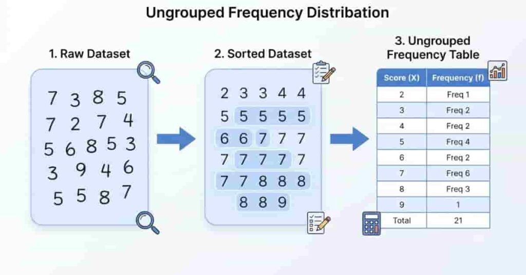
Let’s start with a simple example using a small dataset. Since there are only a few unique values, an ungrouped frequency distribution is the best choice.
Working with a larger dataset? Save time and reduce calculation errors with our Frequency Distribution Calculator, which automatically creates a complete frequency distribution table in seconds.
Dataset
65, 70, 72, 70, 68, 65, 75, 72, 70, 68
Step 1: Arrange the Data
65, 65, 68, 68, 70, 70, 70, 72, 72, 75
Step 2: Count Each Value
| Value | Frequency |
|---|---|
| 65 | 2 |
| 68 | 2 |
| 70 | 3 |
| 72 | 2 |
| 75 | 1 |
Final Frequency Distribution Table
| Value | Frequency |
| 65 | 2 |
| 68 | 2 |
| 70 | 3 |
| 72 | 2 |
| 75 | 1 |
| Total | 10 |
Interpretation
The score 70 appears most often, making it the highest-frequency value. The total frequency is 10, which matches the number of observations. This confirms that every value has been counted correctly.
Example 2 – Grouped Frequency Distribution
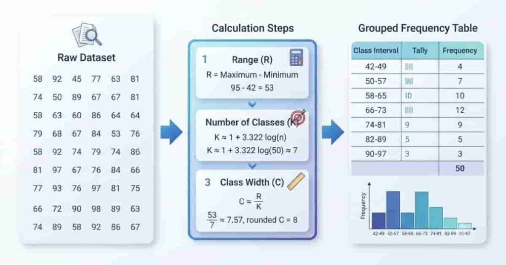
Now let’s work with a larger dataset. Instead of listing every value separately, we’ll group similar values into class intervals.
Dataset
42, 45, 47, 49, 51, 53, 55, 56, 58, 60, 61, 63, 64, 66, 68, 70, 72, 74, 75, 78
Step 1: Find the Range
- Minimum Value = 42
- Maximum Value = 78
Range = 78 − 42 = 36
Step 2: Choose the Number of Classes
We’ll use 4 classes.
Step 3: Calculate the Class Width
Class Width = 36 ÷ 4 = 9
We’ll round up and use a class width of 10.
Step 4: Create Class Intervals
- 40–49
- 50–59
- 60–69
- 70–79
Step 5: Count the Frequencies
| Class Interval | Frequency |
| 40–49 | 4 |
| 50–59 | 5 |
| 60–69 | 6 |
| 70–79 | 5 |
| Total | 20 |
Interpretation
Most observations fall within the 60–69 interval, indicating that the dataset is concentrated in the middle range. Grouping the data makes overall trends much easier to identify than reading individual values.
Check your manual calculations instantly. Enter your data into our Frequency Distribution Calculator to verify your answers and analyze your dataset with confidence.
Example 3 – Frequency Distribution for Exam Scores
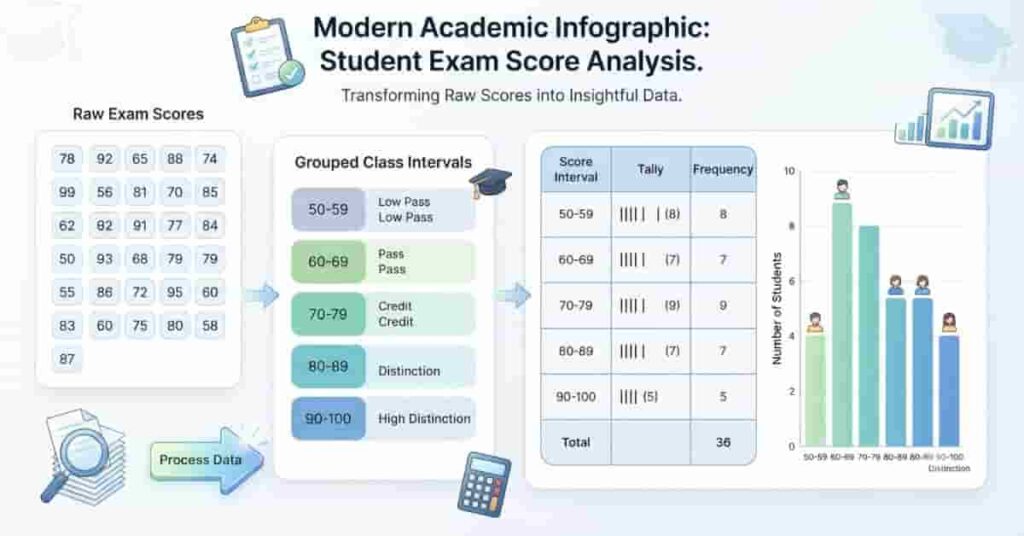
Frequency distributions are widely used in schools to summarize student performance. Teachers can quickly identify score patterns without reviewing every individual mark.
Student Marks
56, 61, 65, 67, 69, 71, 72, 74, 76, 77, 79, 81, 83, 85, 87, 89, 91, 92, 94, 96
Frequency Distribution Table
| Marks | Frequency |
| 50–59 | 1 |
| 60–69 | 4 |
| 70–79 | 6 |
| 80–89 | 5 |
| 90–99 | 4 |
| Total | 20 |
Interpretation
Most students scored between 70 and 79, showing that this was the most common performance range. Only one student scored below 60, while several students earned marks above 90. This distribution suggests that the class performed consistently well overall.
Teachers can also use this table to create histograms, compare classes, or calculate additional statistics such as the mean, median, relative frequency, and cumulative frequency.
How to Make a Frequency Distribution Table
A frequency distribution table organizes raw data into a structured format, making it easier to analyze patterns and compare values. Whether you’re working with grouped or ungrouped data, the table follows the same basic structure. Each column serves a specific purpose and helps present the data clearly.
Standard Table Columns
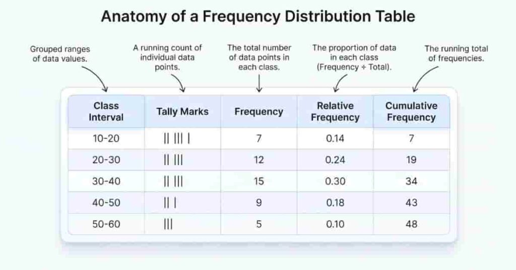
A complete frequency distribution table may include the following columns:
| Column | Purpose |
|---|---|
| Class Interval | Groups values into equal ranges. |
| Tally Marks | Helps count observations accurately. |
| Frequency | Shows how many observations fall in each class. |
| Relative Frequency (Optional) | Displays the percentage or proportion of each class. |
| Cumulative Frequency (Optional) | Shows the running total of frequencies. |
Example Frequency Distribution Table
| Class Interval | Tally Marks | Frequency | Relative Frequency | Cumulative Frequency |
| 40–49 | ||| | 3 | 15% | 3 |
| 50–59 | ||||/ | 5 | 25% | 8 |
| 60–69 | |||||/ | 6 | 30% | 14 |
| 70–79 | ||||/ | 5 | 25% | 19 |
| 80–89 | | | 1 | 5% | 20 |
You don’t have to include relative frequency or cumulative frequency unless they’re needed for your analysis. A simple table with class intervals and frequencies is often enough for basic statistical problems.
Best Practices
Follow these tips to create an accurate frequency distribution table:
- Use equal class widths throughout the table.
- Make sure class intervals do not overlap.
- Count each observation only once.
- Check that the total frequency matches the total number of observations.
- Keep the table simple and easy to read.
- Add relative or cumulative frequency only when needed.
How to Calculate Class Width
Class width is the size of each class interval in a grouped frequency distribution. Choosing the correct class width keeps your intervals consistent and your table easy to understand.
Formula
Class Width = Range ÷ Number of Classes
If the result is not a whole number, round it up to the nearest whole number.
Example
Suppose a dataset has:
- Minimum Value = 25
- Maximum Value = 75
- Number of Classes = 5
Step 1: Calculate the range.
Range = 75 − 25 = 50
Step 2: Calculate the class width.
Class Width = 50 ÷ 5 = 10
Your class intervals would be:
- 25–34
- 35–44
- 45–54
- 55–64
- 65–74
Each interval covers 10 values, making the table consistent and easy to read.
Tips for Choosing Class Width
- Keep every interval the same size.
- Round up decimal results when necessary.
- Avoid intervals that overlap.
- Choose a width that produces 5–10 clear classes.
How to Calculate Relative Frequency
A relative frequency shows the proportion or percentage of observations in each class. Unlike a regular frequency, it tells you how much each category contributes to the entire dataset. This makes it easier to compare groups of different sizes.
Formula
Relative Frequency = Frequency ÷ Total Number of Observations
Multiply the result by 100 if you want the answer as a percentage.
Example
Suppose a class has 20 students, and 5 students scored between 70 and 79.
Relative Frequency = 5 ÷ 20 = 0.25
Percentage = 0.25 × 100 = 25%
This means 25% of the students scored between 70 and 79.
Interpretation
Relative frequency helps you understand the importance of each class compared to the whole dataset.
For example:
- A class with 50% contains half of all observations.
- A class with 10% contains only a small portion of the data.
Because relative frequency uses percentages, it makes comparisons much easier than using raw counts alone.
How to Calculate Cumulative Frequency
A cumulative frequency is the running total of frequencies in a frequency distribution table. Instead of looking at each class separately, it shows how many observations fall at or below a particular class interval. This makes it useful for identifying trends, finding percentiles, and creating cumulative frequency graphs.
Formula
Cumulative Frequency = Previous Cumulative Frequency + Current Frequency
For the first class interval, the cumulative frequency is simply the frequency itself.
Running Total Example
Suppose you have the following frequency table:
| Class Interval | Frequency | Cumulative Frequency |
|---|---|---|
| 40–49 | 3 | 3 |
| 50–59 | 5 | 8 |
| 60–69 | 4 | 12 |
| 70–79 | 6 | 18 |
| 80–89 | 2 | 20 |
Here’s how the running total is calculated:
- First class: 3
- Second class: 3 + 5 = 8
- Third class: 8 + 4 = 12
- Fourth class: 12 + 6 = 18
- Fifth class: 18 + 2 = 20
The final cumulative frequency should always equal the total number of observations.
Common Mistakes When Calculating Frequency Distribution
Even a small mistake can make your entire frequency distribution inaccurate. Taking a few extra minutes to review your work can help you avoid incorrect calculations and misleading results.
1. Choosing the Wrong Class Width
A class width that is too small creates unnecessary intervals, while one that is too large hides important details.
Example
Instead of using a class width of 10, you choose 25. The table becomes too broad to show meaningful patterns.
2. Creating Overlapping Class Intervals
Every value should belong to only one class interval.
Incorrect
- 20–30
- 30–40
The value 30 appears in both intervals.
Correct
- 20–29
- 30–39
3. Counting Frequencies Incorrectly
Missing or double-counting observations changes the final frequency totals.
Using tally marks while counting helps reduce these errors.
4. Using Unequal Class Intervals
Class intervals should remain consistent throughout the table.
Incorrect
- 10–19
- 20–39
- 40–49
The interval sizes are inconsistent, making comparisons difficult.
5. Missing Data Values
Every observation should appear in one class interval. Skipping even one value affects the entire table.
Always compare the original dataset with the completed frequency table.
6. Incorrect Frequency Totals
The total frequency should always equal the total number of observations.
If the totals don’t match, recount the data before moving to additional calculations.
Tips for Creating Accurate Frequency Distribution Tables
A well-designed frequency distribution table is both accurate and easy to read. Following a few simple best practices will help you avoid common errors and produce reliable statistical results.
Best Practices
- Sort the data before creating the table.
- Calculate the range correctly.
- Choose equal class widths.
- Use clear, non-overlapping intervals.
- Count observations using tally marks.
- Verify every frequency before finishing.
- Confirm that total frequency equals total observations.
- Keep the table clean and consistent.
Accuracy Checklist
Use this checklist before finalizing your table:
- ✅ Raw data is complete.
- ✅ Minimum and maximum values are correct.
- ✅ Range calculation is accurate.
- ✅ Class width is consistent.
- ✅ Class intervals do not overlap.
- ✅ Every observation appears once.
- ✅ Frequency totals are correct.
- ✅ Relative and cumulative frequencies are accurate (if included).
Ready to analyze your data faster? Try our free Frequency Distribution Calculator to build professional frequency tables, visualize data patterns, and get accurate results instantly.
Manual Calculation vs Frequency Distribution Calculator
You can create a frequency distribution manually or use an online calculator. Both methods have advantages, depending on your goal.
If you’re learning statistics, manual calculation helps you understand each step. However, when working with large datasets, a Frequency Distribution Calculator is much faster and reduces the chance of errors.
| Feature | Manual Calculation | Frequency Distribution Calculator |
| Speed | Slower | Instant |
| Accuracy | Depends on careful counting | High accuracy with correct input |
| Time Required | More time | A few seconds |
| Learning Value | Excellent for beginners | Best after learning the process |
| Large Datasets | Difficult to manage | Handles them easily |
| Best Use | Practice and education | Homework, research, and real-world analysis |
Which Method Should You Choose?
Choose manual calculation if you want to understand how frequency distributions work and improve your statistical skills.
Choose a Frequency Distribution Calculator when you need quick, accurate results for larger datasets or want to avoid repetitive calculations.
Conclusion
Learning how to calculate frequency distribution is an essential statistics skill that helps you organize raw data and uncover meaningful patterns. By following the correct steps—sorting the data, finding the range, choosing class intervals, and counting frequencies—you can build accurate frequency distribution tables with confidence.
Understanding the manual process is important because it helps you recognize errors, verify your results, and develop a stronger foundation in statistics. Whether you’re working on school assignments, research projects, business reports, or survey data, these skills will make data analysis much easier.
Once you’re comfortable with the manual method, you don’t have to calculate every table by hand. Our Frequency Distribution Calculator can generate accurate frequency tables, class intervals, relative frequencies, and cumulative frequencies in seconds. It saves time, reduces mistakes, and lets you focus on interpreting your results instead of performing repetitive calculations.
Start by practicing with a few manual examples, then use the calculator to verify your answers and analyze larger datasets more efficiently.
Frequently Asked Questions
Find quick answers to the most common questions about frequency distribution, formulas, class width, grouped data, and more.
A frequency distribution is a table that organizes raw data by showing how many times each value or class interval appears. It makes large datasets easier to understand by revealing patterns, trends, and the most common values.
Sort the data, identify the minimum and maximum values, calculate the range, choose the number of classes, determine the class width, create class intervals, and count how many observations fall into each interval.
There isn’t a single formula for a frequency distribution. You typically use:
- Range = Maximum − Minimum
- Class Width = Range ÷ Number of Classes
- Frequency = Number of observations in each class
Class width is the size of each class interval in a grouped frequency distribution. It is usually calculated by dividing the range by the chosen number of classes.
A grouped frequency distribution combines similar values into class intervals. It is ideal for large datasets because it provides a cleaner summary and makes patterns easier to see.
An ungrouped frequency distribution lists every unique value and its frequency. It works best for smaller datasets with only a few different values.
Frequency distributions organize raw data into an easy-to-read format, helping you identify patterns, compare groups, summarize information, and prepare data for statistical analysis and charts.
Yes. Excel can calculate a frequency distribution using the FREQUENCY() function or the Histogram tool. However, a dedicated Frequency Distribution Calculator is faster and automatically generates tables and statistics.

Team ClassRank builds smart, student-friendly calculators to make grade and rank tracking simple and accurate. For questions or feedback, contact us at classrankcalculator@gmail.com.