

Table of Contents
Introduction
Ever wondered how to calculate relative frequency in Excel without getting confused by formulas? If so, you’re not alone. Learning relative frequency in Excel is a valuable skill for students, teachers, researchers, and professionals who work with data. Excel makes it easy to organize information, count values, and analyze results much faster than doing calculations by hand. Whether you’re completing a classroom assignment, creating a business report, or analyzing survey data, understanding this process can save time and reduce mistakes.
In this guide, you’ll learn how to calculate relative frequency in Excel using simple formulas, built-in functions, and easy-to-follow examples. We’ll also show you how to create frequency tables, convert results into percentages, and build clear charts for better data visualization. If you need results even faster, you can use our Relative Frequency Calculator to generate accurate answers instantly—no formulas or Excel experience required.
What Is Relative Frequency?
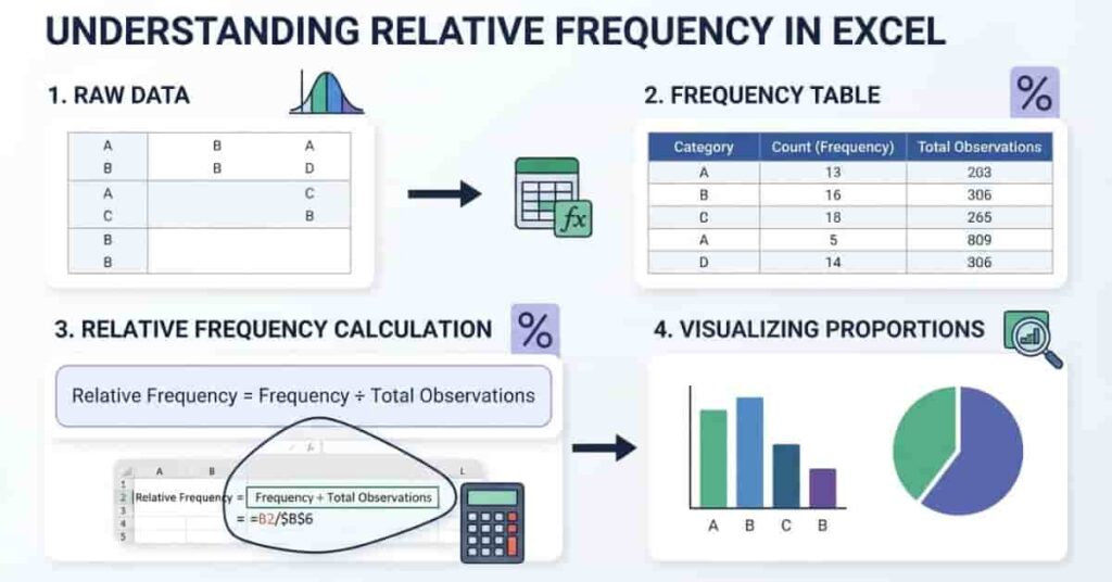
Relative frequency shows how often a value appears compared to the total number of observations in a dataset. Instead of showing only the count, it expresses that count as a fraction, decimal, or percentage of the whole. This makes it easier to compare categories, even when datasets are different sizes.
Before creating Excel tables, it’s helpful to understand what a relative frequency distribution is and how it represents data visually.
For example, if a value appears 15 times in a dataset of 100 observations, its relative frequency is 0.15 or 15%. This tells you that the value represents 15% of the entire dataset.
Learning relative frequency in Excel helps you organize data, identify patterns, and present results clearly. Excel automates the calculations, reducing manual work and minimizing errors.
Definition
The formula for relative frequency is:
Relative Frequency = Frequency ÷ Total Number of Observations
Where:
- Frequency = Number of times a value appears.
- Total Observations = Total number of data points in the dataset.
For example:
- Frequency = 12
- Total Observations = 60
Relative Frequency = 12 ÷ 60 = 0.20 or 20%
Why Relative Frequency Is Useful
Relative frequency helps you understand how important each value is within a dataset. Instead of comparing raw counts, you compare proportions, making your analysis more meaningful.
It is useful because it:
- Makes large datasets easier to understand.
- Shows percentages instead of only counts.
- Helps compare different datasets fairly.
- Supports charts and data visualization.
- Improves reports and presentations.
Many students, researchers, and business professionals use relative frequency to summarize data and communicate results more effectively.
When Should You Use Excel?
Excel is an excellent tool for calculating relative frequency because it performs calculations automatically and updates results whenever your data changes. It also allows you to create tables, charts, and reports in one place.
You should use Excel for:
- Homework: Solve statistics problems quickly with formulas.
- Classroom assignments: Build organized frequency tables for projects.
- Business reports: Analyze sales, customers, or operational data.
- Survey analysis: Calculate response percentages with ease.
- Research datasets: Process large amounts of data accurately and efficiently.
If you only need a quick answer without entering formulas, an online Relative Frequency Calculator can generate accurate results instantly.
Prepare Your Data in Excel
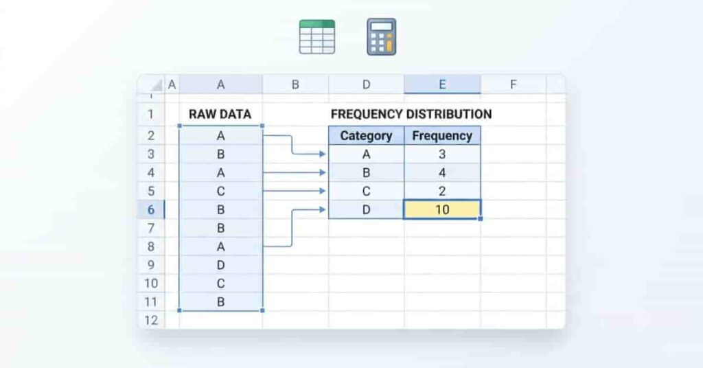
Before you calculate relative frequency, organize your worksheet correctly. A well-structured spreadsheet makes formulas easier to use and reduces the chance of errors.
Start by entering your raw dataset in a single column. Each value should occupy its own cell. Next, create a separate frequency table that lists each unique value and its frequency. Finally, calculate the total number of observations, which you’ll use to find the relative frequency for each value.
Sample Dataset
| Student Grade |
|---|
| A |
| B |
| A |
| C |
| B |
| A |
| B |
| C |
| A |
| B |
This dataset contains 10 total observations.
Next, create a frequency table like this:
| Grade | Frequency |
|---|---|
| A | 4 |
| B | 4 |
| C | 2 |
Once your frequency table is ready, you can divide each frequency by the total number of observations (10) to calculate the relative frequency in Excel. In the next section, you’ll learn the easiest formula to do this step by step.
Method 1: Calculate Relative Frequency Using an Excel Formula
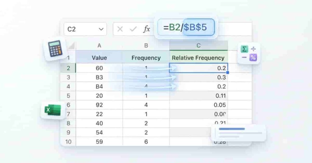
The easiest way to calculate relative frequency in Excel is by dividing each value’s frequency by the total number of observations. This method is simple, accurate, and works well for most datasets.
If you’re still learning the basics, read our complete guide on how to calculate relative frequency with easy formulas and worked examples.
Step 1: Create a Frequency Table
Start by listing each unique value in one column and its frequency in the next.
Example:
| Grade | Frequency |
|---|---|
| A | 4 |
| B | 4 |
| C | 2 |
Step 2: Find the Total Number of Observations
Add the frequencies to find the total number of observations.
If your frequencies are in cells B2:B4, use:
=SUM(B2:B4)
If the total appears in B5, the result is:
10
Step 3: Use the Relative Frequency Formula
Create a new column named Relative Frequency.
In cell C2, enter:
=B2/$B$5
The dollar signs create an absolute cell reference, so the total remains fixed when you copy the formula.
Step 4: Copy the Formula Down the Column
Press Enter, then drag the fill handle down to copy the formula for the remaining rows.
Excel automatically calculates the relative frequency for every value.
Formula Example
Relative Frequency = Frequency ÷ Total Observations
Excel formula:
=B2/$B$5
Cell Reference Example
- B2 = Frequency for Grade A
- B5 = Total observations
- C2 = Relative frequency result
Final Output Table
| Grade | Frequency | Relative Frequency |
|---|---|---|
| A | 4 | 0.40 |
| B | 4 | 0.40 |
| C | 2 | 0.20 |
| Total | 10 | 1.00 |
You can also format the Relative Frequency column as percentages to display 40%, 40%, and 20%.
Don’t want to build formulas manually? Use our Relative Frequency Calculator to calculate relative frequencies instantly and compare your Excel results.
Method 2: Calculate Relative Frequency Using Excel Functions
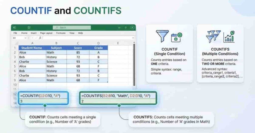
Excel functions make frequency analysis even faster, especially when working with raw data. Instead of counting values manually, you can use COUNTIF or COUNTIFS to calculate frequencies automatically.
Using COUNTIF
The COUNTIF function counts how many times a value appears in a range.
Suppose your raw grades are in cells A2:A11, and your unique grades are listed in D2:D4.
Use this formula in E2:
=COUNTIF($A$2:$A$11,D2)
Copy the formula down to count each grade automatically.
Next, calculate the total observations:
=COUNTA(A2:A11)
Finally, calculate the relative frequency in F2:
=E2/$E$5
Your completed table will look like this:
| Grade | Frequency | Relative Frequency |
|---|---|---|
| A | 4 | 0.40 |
| B | 4 | 0.40 |
| C | 2 | 0.20 |
COUNTIF is best for:
- Counting a single value
- Student grades
- Survey responses
- Product categories
- Small and medium datasets
Using COUNTIFS (Optional)
Use COUNTIFS when you need to count values that meet multiple conditions.
For example, count sales made by John in the East region:
=COUNTIFS(A:A,"John",B:B,"East")
After finding the frequency, divide it by the total number of matching records to calculate the relative frequency.
COUNTIFS is useful for:
- Business reports
- Sales analysis
- Customer data
- Research projects
- Large datasets with multiple filters
For most beginners, COUNTIF is the easiest option. Choose COUNTIFS only when your data requires more than one condition.
How to Convert Relative Frequency to Percentage in Excel
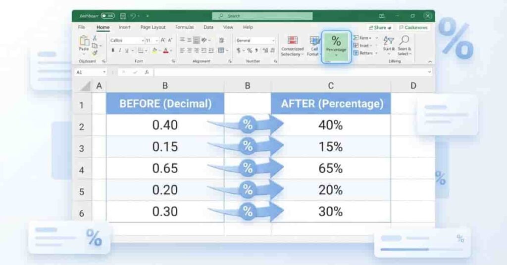
Relative frequency is often easier to understand when displayed as a percentage. Excel can convert decimal values into percentages with just a few clicks. This makes reports, assignments, and presentations much clearer.
Step 1: Calculate Relative Frequency
Before converting to percentages, calculate the relative frequency for each value.
Use the formula:
=B2/$B$5
If B2 contains the frequency and B5 contains the total observations, Excel returns a decimal value such as 0.40.
Step 2: Apply Percentage Formatting
Select the cells containing the relative frequency values.
Then:
- Go to the Home tab.
- Find the Number group.
- Click the Percent Style (%) button.
- Adjust the decimal places if needed.
Excel automatically converts:
- 0.40 → 40%
- 0.20 → 20%
- 0.15 → 15%
The values stay the same mathematically. Only the display format changes.
Step 3: Interpret the Results
Percentages show the share of each category in the entire dataset.
For example:
- 40% means the value represents 40% of all observations.
- 20% means the value appears in one-fifth of the dataset.
The percentages in a complete relative frequency table should add up to 100%. If they do not, check your formulas and total count.
Worked Example
Suppose you have the following frequency table:
| Grade | Frequency | Relative Frequency | Percentage |
|---|---|---|---|
| A | 4 | 0.40 | 40% |
| B | 4 | 0.40 | 40% |
| C | 2 | 0.20 | 20% |
| Total | 10 | 1.00 | 100% |
This table shows that Grades A and B each account for 40% of the class, while Grade C represents 20%.
How to Create a Relative Frequency Table in Excel
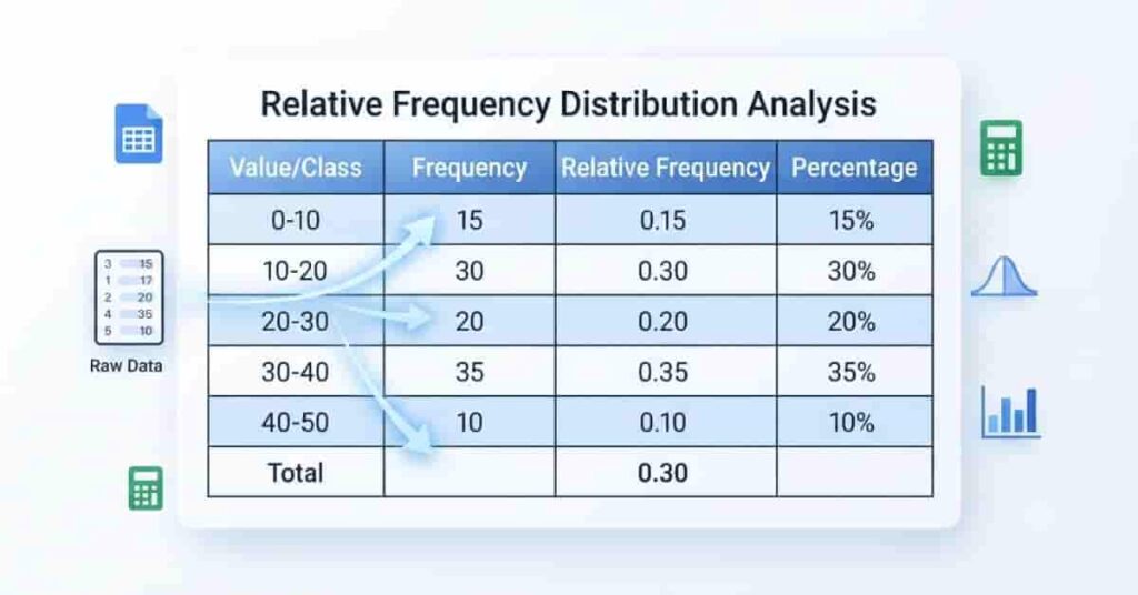
A relative frequency table organizes your data into an easy-to-read format. It shows each value, how many times it appears, its relative frequency, and its percentage. This type of table is commonly used in statistics, research, business reports, and classroom assignments.
Step 1: Enter Your Raw Data
Type your dataset into a single column. Each observation should be in its own cell.
Example:
| Raw Data |
|---|
| A |
| B |
| A |
| C |
| B |
| A |
| B |
| C |
| A |
| B |
Step 2: List the Unique Values
In another section of the worksheet, list each unique value or class.
Example:
- A
- B
- C
Step 3: Calculate the Frequency
Use the COUNTIF function to count each value.
Example:
=COUNTIF($A$2:$A$11,D2)
Copy the formula down for the remaining values.
Step 4: Calculate Relative Frequency
Find the total number of observations using:
=COUNTA(A2:A11)
Then calculate the relative frequency:
=E2/$E$5
Step 5: Convert to Percentages
Select the Relative Frequency column and apply Percentage formatting from the Home tab.
Complete Relative Frequency Table
| Value/Class | Frequency | Relative Frequency | Percentage |
|---|---|---|---|
| A | 4 | 0.40 | 40% |
| B | 4 | 0.40 | 40% |
| C | 2 | 0.20 | 20% |
| Total | 10 | 1.00 | 100% |
This table provides a complete summary of your dataset. The Frequency column shows the count, Relative Frequency displays the decimal value, and Percentage presents the same result in an easier-to-read format. Once your table is complete, you can use it to create charts, compare categories, and analyze data more effectively.
Create a Relative Frequency Chart in Excel
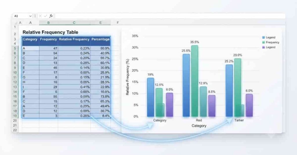
A relative frequency chart makes your data easier to understand by displaying the proportion of each category visually. Instead of reading numbers from a table, you can quickly compare values using bars or columns. Excel can create these charts in just a few steps.
Step 1: Select the Frequency Table
Start with a completed relative frequency table that includes the values and their relative frequencies or percentages.
For example:
| Grade | Relative Frequency |
|---|---|
| A | 0.40 |
| B | 0.40 |
| C | 0.20 |
Highlight both columns, including the headers.
Step 2: Insert a Column or Bar Chart
After selecting the data:
- Click the Insert tab.
- Open the Charts group.
- Choose Column Chart or Bar Chart.
- Select the Clustered Column or Clustered Bar option.
Excel will automatically generate a chart based on your data.
Step 3: Customize Chart Labels
Make your chart easier to read by adding clear labels.
You can:
- Add a descriptive chart title.
- Label the horizontal axis with the categories.
- Label the vertical axis as Relative Frequency or Percentage.
- Display data labels on each bar.
- Apply percentage formatting if needed.
Clear labels help readers understand your chart at a glance.
Step 4: Interpret the Visualization
Compare the height or length of each bar to see which category appears most often.
For the example above:
- Grade A represents 40% of the dataset.
- Grade B also represents 40%.
- Grade C represents 20%.
The taller the bar, the higher the relative frequency. Charts are especially useful for reports, presentations, survey summaries, and classroom assignments because they make trends easier to identify.
Worked Example
Let’s calculate relative frequency in Excel using a complete example from start to finish.
Step 1: Enter the Raw Data
Suppose you have the following grades in column A:
| Raw Data |
|---|
| A |
| B |
| A |
| C |
| B |
| A |
| B |
| C |
| A |
| B |
There are 10 total observations.
Step 2: Create the Frequency Table
Count how many times each grade appears.
| Grade | Frequency |
|---|---|
| A | 4 |
| B | 4 |
| C | 2 |
Step 3: Calculate Relative Frequency
Use the following Excel formula:
=B2/$B$5
Where:
- B2 = Frequency
- B5 = Total observations (10)
Excel returns:
- A = 0.40
- B = 0.40
- C = 0.20
Step 4: Convert to Percentage
Apply Percentage formatting from the Home tab.
The results become:
- 40%
- 40%
- 20%
Final Excel Output
| Grade | Frequency | Relative Frequency | Percentage |
|---|---|---|---|
| A | 4 | 0.40 | 40% |
| B | 4 | 0.40 | 40% |
| C | 2 | 0.20 | 20% |
| Total | 10 | 1.00 | 100% |
This completed table shows both the count and the proportion of each grade. It can also be used to create a relative frequency chart, making the data easier to compare and present. Whether you’re working on homework, research, or business reports, this method provides a quick and accurate way to analyze your data in Excel.
Common Excel Mistakes
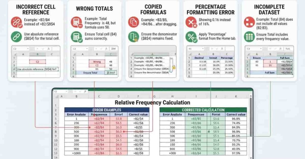
Excel makes calculating relative frequency simple, but small mistakes can lead to incorrect results. Before using your data, review these common errors to ensure your calculations are accurate.
Incorrect Cell References
One of the most common mistakes is using the wrong cell reference in your formula. If the total number of observations changes as you copy the formula, your results will be incorrect.
Always use an absolute cell reference for the total count.
Example:
=B2/$B$5
The dollar signs keep the total fixed when you copy the formula down the column.
Wrong Total Count
Relative frequency depends on the total number of observations. If your total is incorrect, every result will also be wrong.
Before calculating, verify your total using:
=SUM(B2:B4)
or
=COUNTA(A2:A11)
Choose the formula that matches your worksheet.
Formula Copied Incorrectly
After entering the formula in the first row, copy it carefully to the remaining rows. Accidentally changing a reference or skipping a row can produce incorrect values.
Double-check that every row contains the correct formula.
Percentage Formatting Mistakes
Many beginners multiply their results by 100 and then apply percentage formatting. This displays incorrect values.
For example:
- Correct: 0.40 → 40%
- Incorrect: 40 → 4000%
Simply calculate the relative frequency first, then use Excel’s Percentage format.
Using Unsorted or Incomplete Data
Missing values, duplicate entries, or inconsistent labels can affect your frequency counts.
Before creating a frequency table:
- Remove blank cells.
- Check for duplicate records.
- Use consistent category names.
- Make sure all observations are included.
A clean dataset produces more accurate results and reliable charts.
Excel vs Online Relative Frequency Calculator
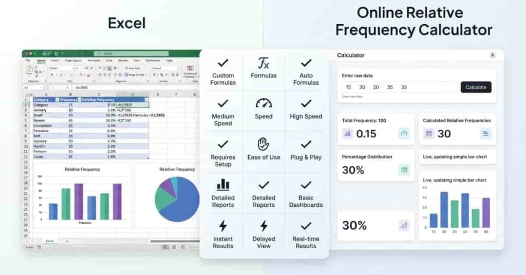
Excel is a powerful tool for data analysis, but it requires formulas, setup, and careful checking. An online Relative Frequency Calculator is often a better choice when you need quick and accurate results without building formulas or tables yourself.
The best option depends on your needs.
| Feature | Excel | Online Relative Frequency Calculator |
|---|---|---|
| Requires formulas | ✔ Yes | ✘ No |
| Easy for beginners | Moderate | ✔ Yes |
| Flexible for reports | ✔ Yes | Limited |
| Fast for quick calculations | Good | ✔ Excellent |
| Good for assignments | ✔ Yes | ✔ Yes |
| Manual setup required | ✔ Yes | ✘ No |
| Instant results | ✘ No | ✔ Yes |
| Automatic calculations | Limited | ✔ Yes |
Which Option Should You Choose?
Choose Excel if you:
- Need detailed reports.
- Want to customize tables and charts.
- Are working with large spreadsheets.
- Need to save or share your workbook.
Choose an Online Relative Frequency Calculator if you:
- Want answers in seconds.
- Prefer not to write Excel formulas.
- Need a quick check for homework.
- Want to avoid common calculation errors.
If you’re looking for the fastest solution, try our Relative Frequency Calculator. Simply enter or paste your dataset, and it will automatically calculate the frequency, relative frequency, and percentages for you. It’s an easy way to verify your Excel results or complete quick calculations without using formulas.
How to Use Our Relative Frequency Calculator
If you need fast and accurate results, our Relative Frequency Calculator is the easiest way to calculate relative frequency without writing Excel formulas. It automatically creates a frequency table, calculates relative frequencies, and displays percentages in just a few seconds. Whether you’re a student, teacher, researcher, or professional, the tool helps you save time and avoid manual calculation errors.
Step 1: Enter or Paste Your Dataset
Type your data directly into the calculator or paste it from Excel, Google Sheets, or another spreadsheet. Make sure each value is separated correctly so the calculator can identify every observation.
Step 2: Generate the Frequency Table
Click the Calculate button to analyze your dataset. The calculator automatically counts how many times each value appears and creates a complete frequency table.
Step 3: View Relative Frequencies Automatically
Once the calculation is complete, you’ll instantly see:
- Frequency for each value
- Relative frequency (decimal)
- Relative frequency as a percentage
- Total number of observations
There’s no need to create formulas or calculate percentages manually.
Step 4: Copy or Export Your Results
After reviewing your results, you can copy the completed table or export it for use in homework, classroom assignments, research projects, business reports, or presentations. This makes it easy to share your analysis or continue working in Excel if needed.
Try the Relative Frequency Calculator
Skip the formulas and let the calculator do the work for you. Simply paste your dataset, click Calculate, and get accurate relative frequencies, percentages, and a complete frequency table in seconds. It’s the fastest way to check your Excel calculations or analyze data with confidence.
Conclusion
Calculating relative frequency in Excel is easier than it may seem once you understand the basic steps. In this guide, you learned how to build a frequency table, use Excel formulas and functions, convert results into percentages, and create charts to visualize your data. These methods are ideal for homework, classroom assignments, business reports, and data analysis projects.
If you need faster, error-free results, our Relative Frequency Calculator is a great alternative. Simply enter your dataset to generate frequencies and percentages instantly without writing formulas.
Ready to continue learning? Read our Relative Frequency Distribution Explained guide to better understand how relative frequency tables are used in statistics. If you found this article helpful, share it with others, and explore more statistics guides and calculators on our website.
Frequently Asked Questions
How do you calculate relative frequency in Excel?
To calculate relative frequency in Excel, divide the frequency of each value by the total number of observations. For example, if the frequency is in cell B2 and the total is in B5, use:
=B2/$B$5
After entering the formula, drag it down to calculate the relative frequency for every value in your table.
Which Excel formula is used for relative frequency?
Excel does not have a built-in Relative Frequency function. Instead, divide the frequency by the total number of observations.
=B2/$B$5
You can also use functions such as COUNTIF, COUNTIFS, SUM, and COUNTA to calculate the values needed.
Can I use COUNTIF to calculate relative frequency?
Yes. COUNTIF counts how many times a value appears in your dataset. After finding the frequency, divide it by the total number of observations.
Example:
=COUNTIF(A2:A11,D2)
This counts the occurrences of the value stored in cell D2.
How do I convert relative frequency into percentages in Excel?
First, calculate the relative frequency as a decimal. Then:
- Select the result cells.
- Open the Home tab.
- Click the Percent Style (%) button.
Excel automatically converts values like 0.40 into 40% without changing the calculation.
How do I create a relative frequency table in Excel?
Create a relative frequency table using these steps:
- Enter your raw data.
- List each unique value or category.
- Calculate the frequency using COUNTIF.
- Find the total number of observations.
- Divide each frequency by the total.
- Format the results as percentages if needed.
This creates a complete table showing the frequency, relative frequency, and percentage for each category.
Can Excel create charts from relative frequency data?
Yes. Excel can create professional charts from your relative frequency table. Simply select the table, open the Insert tab, and choose a Column Chart or Bar Chart. Charts make it easier to compare categories and present your findings visually.
What is the difference between frequency and relative frequency in Excel?
Frequency is the number of times a value appears in a dataset.
Relative frequency shows the proportion of that value compared to the total number of observations. It is usually displayed as a decimal or percentage, making comparisons easier.
Is Excel suitable for large datasets?
Yes. Excel can efficiently analyze small and medium-sized datasets and many large datasets as well. Features such as COUNTIF, COUNTIFS, PivotTables, filters, and charts make it a powerful tool for statistical analysis.
Can I calculate relative frequency using a PivotTable?
Yes. A PivotTable can automatically count the occurrences of each value. You can then display those counts as a percentage of the grand total or calculate the relative frequency with a simple formula. This method is especially useful for large datasets.
Is there an online Relative Frequency Calculator?
Yes. An online Relative Frequency Calculator lets you calculate frequencies, relative frequencies, and percentages instantly. Simply paste your dataset into the calculator, and it automatically generates the results without requiring Excel formulas.
Which is easier: Excel or an online Relative Frequency Calculator?
It depends on your needs.
- Excel is ideal for reports, charts, and detailed data analysis.
- An online Relative Frequency Calculator is best for fast, accurate calculations without writing formulas.
Many users calculate their results in Excel and then use an online calculator to verify their answers.
Why doesn’t my relative frequency total equal 100%?
If your percentages do not total exactly 100%, check:
- The total number of observations.
- Your cell references.
- The formulas used.
- Any missing or duplicate data.
Small differences such as 99.9% or 100.1% are usually caused by rounding and are completely normal.

Team ClassRank builds smart, student-friendly calculators to make grade and rank tracking simple and accurate. For questions or feedback, contact us at classrankcalculator@gmail.com.