

Table of Contents
Introduction
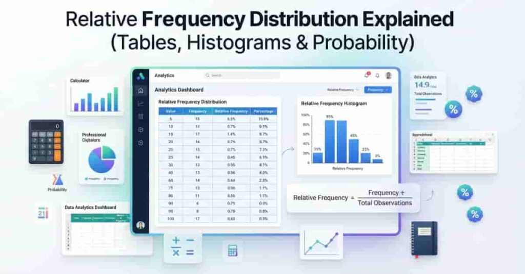
Have you ever wondered why percentages often tell a clearer story than simple counts? A relative frequency distribution makes it easy to compare data by showing how often each value occurs as a proportion of the total. Unlike a standard frequency distribution, it focuses on percentages or decimals instead of raw numbers. This approach helps beginners understand patterns more quickly, especially when comparing datasets of different sizes. Whether you’re studying statistics, analyzing survey results, or working with business data, learning relative frequencies is a valuable skill.
In this guide, you’ll learn what a relative frequency distribution is, how it differs from a regular frequency distribution, and how to build a relative frequency distribution table step by step. You’ll also discover how to interpret histograms, estimate probability from relative frequency, and understand concepts like joint and marginal relative frequency. To save time and avoid calculation errors, you can use our Relative Frequency Calculator to generate accurate relative frequency distributions instantly.
What Is a Relative Frequency Distribution?
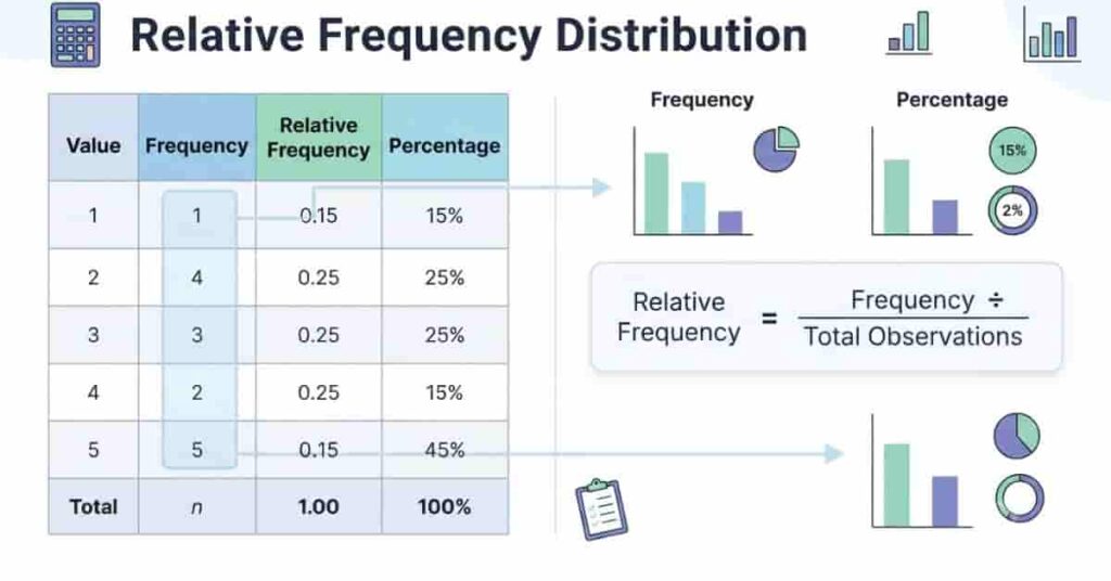
A relative frequency distribution shows how often each value or group appears compared to the total number of observations. Instead of using only raw counts, it expresses each frequency as a decimal or percentage. This makes it much easier to compare different datasets, even when they have different sample sizes.
For example, imagine two classrooms that took the same test. One class has 20 students, while the other has 40. Looking only at the number of students who passed can be misleading. A relative frequency distribution converts those counts into proportions, giving you a fair comparison.
Unlike a standard frequency distribution, which lists only frequencies, a relative frequency distribution shows the share of the total that each value represents. This simple change helps you identify trends, compare categories, and estimate probabilities more effectively.
If you’re new to statistics, first learn how to calculate relative frequency step by step before exploring complete relative frequency distributions.
Definition
A relative frequency distribution is a table or graph that displays the relative frequency of each value or class in a dataset. You calculate the relative frequency by dividing the frequency of a value by the total number of observations.
Formula
Relative Frequency = Frequency ÷ Total Number of Observations
The result is usually written as a decimal or converted into a percentage.
Why It Is Important
Relative frequency distributions make data easier to understand because they focus on proportions instead of raw numbers. This allows you to compare datasets of different sizes without confusion.
They also help you:
- Compare categories fairly.
- Identify patterns and trends.
- Estimate experimental probabilities.
- Create clearer charts and histograms.
- Present survey or research results more effectively.
Pro Tip: Always check that all relative frequencies add up to 1.00 or 100%. If they don’t, review your calculations for errors.
When Is It Used?
Relative frequency distributions appear in many fields because they simplify data analysis and comparison.
Common uses include:
- Statistics: Compare data distributions and identify patterns.
- Research: Summarize experimental results using percentages.
- Surveys: Show the percentage of respondents choosing each answer.
- Business Analytics: Compare sales, customer feedback, or product performance.
- Probability: Estimate the likelihood of future events from observed data.
- Data Science: Explore datasets before building predictive models.
A small business, for example, may compare customer purchases across different stores. Relative frequencies make those comparisons meaningful, even if each store serves a different number of customers.
Relative Frequency Distribution Table
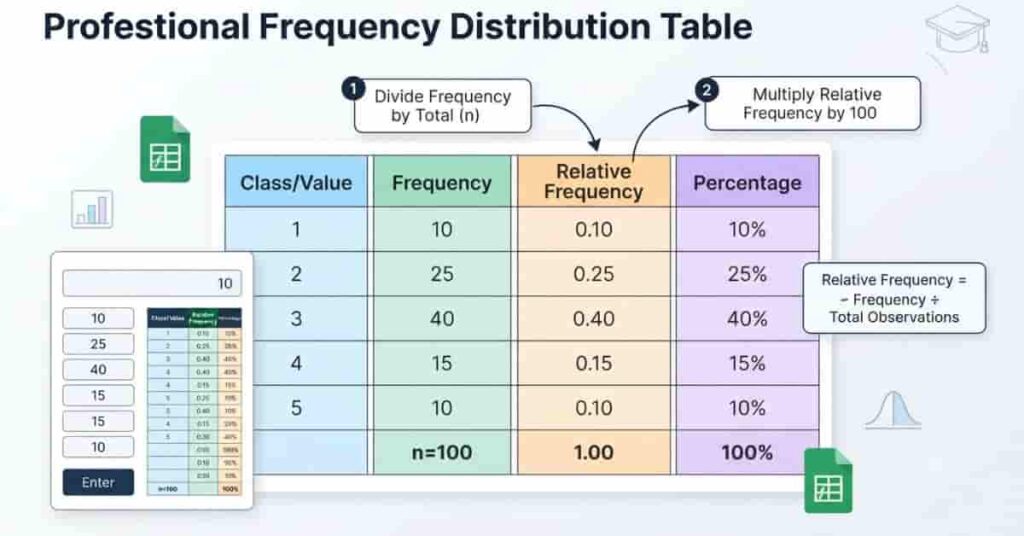
A relative frequency distribution table organizes data into an easy-to-read format by combining raw frequencies with their corresponding proportions and percentages. It helps readers understand not only how often each value appears but also how large its share is within the entire dataset.
Building the table is straightforward. First, list each value or class. Next, record its frequency by counting how many times it appears. Then divide each frequency by the total number of observations to find the relative frequency. Finally, multiply each relative frequency by 100 if you want to display percentages.
This format is commonly used in classrooms, research reports, survey analysis, and business dashboards because it presents both counts and proportions in one place.
Structure of a Distribution Table
A relative frequency distribution table usually contains one row for each value or class in the dataset. Each row summarizes the information needed to understand that category.
A standard table includes:
- Class or value
- Frequency
- Relative frequency
- Percentage
The sum of all frequencies equals the total number of observations. Likewise, all relative frequencies should total 1.00, while all percentages should total 100%.
Required Columns
Each column has a specific purpose.
| Class/Value | Frequency | Relative Frequency | Percentage |
|---|---|---|---|
| A | 8 | 0.20 | 20% |
| B | 12 | 0.30 | 30% |
| C | 15 | 0.375 | 37.5% |
| D | 5 | 0.125 | 12.5% |
| Total | 40 | 1.00 | 100% |
Here’s how each column is calculated:
- Class/Value: The category or data value being measured.
- Frequency: The number of times the value appears.
- Relative Frequency: Divide the frequency by the total observations.
- Percentage: Multiply the relative frequency by 100.
For example, if Class B appears 12 times in a dataset of 40 observations:
- Relative Frequency = 12 ÷ 40 = 0.30
- Percentage = 0.30 × 100 = 30%
Pro Tip: Keep extra decimal places during calculations and round only your final answers. This helps ensure the total remains exactly 1.00 or 100%.
How to Create a Relative Frequency Distribution
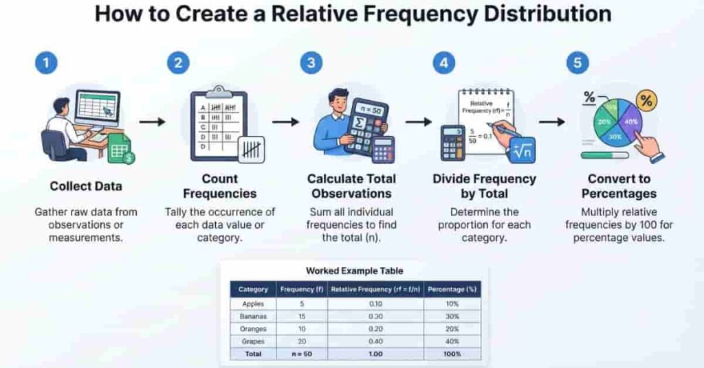
Creating a relative frequency distribution is simple once you understand the process. You only need your dataset, the number of times each value appears, and the total number of observations. After that, a few quick calculations turn raw counts into meaningful proportions and percentages.
Follow these five steps to build a relative frequency distribution accurately.
Working with spreadsheets? Follow our guide on how to calculate relative frequency in Excel to build tables and charts more efficiently.
Step 1: Collect the Data
Start by gathering the dataset you want to analyze. The data can come from a classroom survey, sales report, research study, or any other source.
For example, suppose a teacher records the grades of 20 students.
Step 2: Count the Frequencies
Count how many times each value or category appears. This number is called the frequency.
| Grade | Frequency |
|---|---|
| A | 4 |
| B | 7 |
| C | 6 |
| D | 3 |
Step 3: Calculate the Total Observations
Add all the frequencies together to find the total number of observations.
Total = 4 + 7 + 6 + 3 = 20
This total will be the denominator in every relative frequency calculation.
Step 4: Calculate the Relative Frequencies
Divide each frequency by the total number of observations.
Formula
Relative Frequency = Frequency ÷ Total Observations
Using the example:
- A = 4 ÷ 20 = 0.20
- B = 7 ÷ 20 = 0.35
- C = 6 ÷ 20 = 0.30
- D = 3 ÷ 20 = 0.15
Step 5: Convert to Percentages (Optional)
Multiply each relative frequency by 100 if you want to express the results as percentages.
| Grade | Frequency | Relative Frequency | Percentage |
| A | 4 | 0.20 | 20% |
| B | 7 | 0.35 | 35% |
| C | 6 | 0.30 | 30% |
| D | 3 | 0.15 | 15% |
| Total | 20 | 1.00 | 100% |
This completed table clearly shows both the raw counts and each grade’s share of the entire class. The same method works for grouped and ungrouped datasets.
Want instant results without manual calculations? Try our Relative Frequency Calculator to generate accurate tables, percentages, and distributions in seconds.
Relative Frequency Histogram
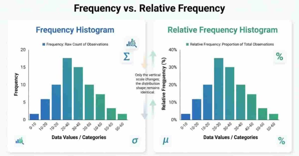
A relative frequency histogram displays the same information as a frequency histogram, but it uses relative frequencies instead of raw counts on the vertical axis. This makes it easier to compare datasets with different sample sizes because each bar represents a proportion or percentage of the total observations.
The overall shape of the histogram stays the same. Only the scale on the y-axis changes. As a result, relative frequency histograms are widely used in statistics, research, business analytics, and probability.
What Is a Relative Frequency Histogram?
A relative frequency histogram is a bar graph that shows how often values occur relative to the total number of observations. The height of each bar represents a decimal or percentage rather than a simple count.
For example, if 25% of students scored between 80 and 89, the corresponding bar reaches 0.25 or 25% on the vertical axis.
Why It Is Important
A relative frequency histogram helps you compare data fairly, even when sample sizes differ. It also makes patterns easier to recognize because every dataset uses the same proportional scale.
It is especially useful for:
- Comparing multiple datasets.
- Identifying the most common value ranges.
- Understanding the shape of a distribution.
- Estimating probabilities from observed data.
Pro Tip: Always label the y-axis as Relative Frequency or Percentage to avoid confusing it with a standard frequency histogram.
How to Create One
Creating a relative frequency histogram is straightforward.
- Organize the data into classes or intervals.
- Calculate the frequency for each class.
- Find the relative frequency of each class.
- Draw the horizontal axis using the class intervals.
- Plot the relative frequencies on the vertical axis.
- Draw bars that touch because the data is continuous.
Most spreadsheet programs and statistical software can generate the chart automatically after you calculate the relative frequencies.
How to Interpret It
Reading a relative frequency histogram is simple.
- Taller bars represent more common value ranges.
- Shorter bars represent less common value ranges.
- The total area represents the entire dataset.
- The y-axis shows proportions or percentages instead of counts.
For example, if one bar reaches 0.40, it means 40% of the observations fall within that class interval.
Relative Frequency Histogram vs. Frequency Histogram
| Feature | Frequency Histogram | Relative Frequency Histogram |
| Vertical Axis | Frequency (Count) | Relative Frequency or Percentage |
| Shows | Raw counts | Proportions or percentages |
| Best For | Counting observations | Comparing different datasets |
| Total | Number of observations | 1.00 or 100% |
| Probability | Less direct | Easier to estimate experimental probability |
Joint Relative Frequency
Joint relative frequency shows the proportion of observations that fall into two categories at the same time. It is commonly used with two-way tables, also called contingency tables, to examine the relationship between two variables.
For example, a school may record students by grade level and club participation. A joint relative frequency tells you the percentage of students who belong to a specific grade and participate in a club. Because it uses proportions instead of raw counts, it makes comparisons much easier across different datasets.
Definition
A joint relative frequency is the relative frequency for a single cell in a two-way table. It represents the proportion of observations that meet both conditions.
Formula
Joint Relative Frequency = Cell Frequency ÷ Total Number of Observations
The answer can be written as a decimal or converted into a percentage.
How to Calculate Joint Relative Frequency
Calculating joint relative frequency only takes a few steps.
- Create a two-way table.
- Count the observations in each cell.
- Find the total number of observations.
- Divide each cell frequency by the total.
- Convert the result into a percentage if needed.
This method works for surveys, research studies, business reports, and probability problems.
Worked Two-Way Table Example
Suppose a survey asks 40 students whether they participate in a sports club.
| Grade Level | Club Member | Not a Member | Total |
|---|---|---|---|
| Freshman | 12 | 8 | 20 |
| Sophomore | 10 | 10 | 20 |
| Total | 22 | 18 | 40 |
Now calculate a joint relative frequency.
For Freshmen who are club members:
12 ÷ 40 = 0.30 (30%)
For Sophomores who are not club members:
10 ÷ 40 = 0.25 (25%)
Each value describes the proportion of the entire dataset, not just one row or column.
Marginal Relative Frequency
A marginal relative frequency shows the proportion of observations found in an entire row or column of a two-way table. Unlike joint relative frequency, which focuses on one cell, marginal relative frequency summarizes a complete category.
These values appear along the margins, or edges, of the table. They help you understand the overall distribution of one variable without considering the second variable.
Definition
A marginal relative frequency is the row total or column total divided by the grand total of observations.
Formula
Marginal Relative Frequency = Row Total or Column Total ÷ Grand Total
The result is usually expressed as a decimal or percentage.
How to Calculate Marginal Relative Frequency
Follow these simple steps.
- Find the row total or column total.
- Find the grand total of observations.
- Divide the row or column total by the grand total.
- Convert the answer to a percentage if desired.
Remember that every marginal relative frequency describes an entire row or column, not a single cell.
Worked Example
Using the same survey data:
| Grade Level | Club Member | Not a Member | Row Total |
| Freshman | 12 | 8 | 20 |
| Sophomore | 10 | 10 | 20 |
| Column Total | 22 | 18 | 40 |
Now calculate the marginal relative frequencies.
Freshman (Row Total)
20 ÷ 40 = 0.50 (50%)
This means 50% of all students are freshmen.
Club Members (Column Total)
22 ÷ 40 = 0.55 (55%)
This means 55% of all students belong to the club.
Row Totals vs. Column Totals
- Row totals summarize all observations across one row.
- Column totals summarize all observations within one column.
- Both are divided by the grand total to find the marginal relative frequency.
Using both row and column totals gives you a quick overview of how the data is distributed.
Using Relative Frequency to Estimate Probability
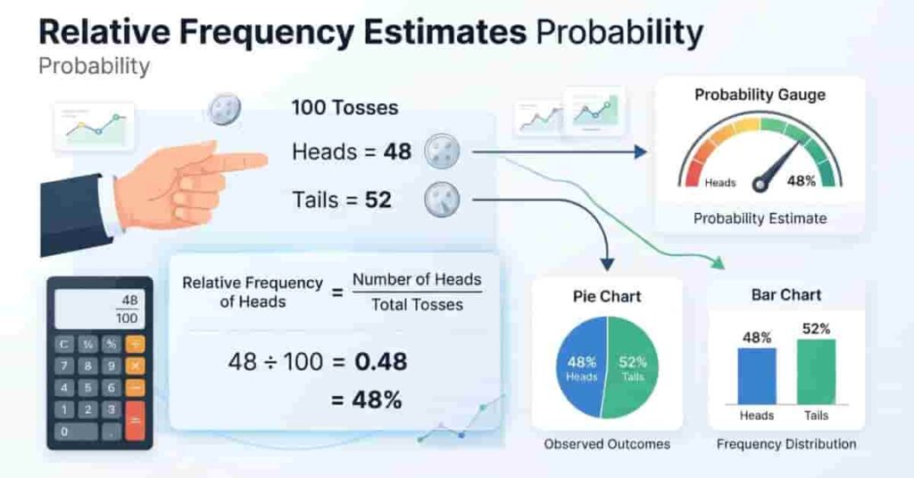
One of the most useful applications of a relative frequency distribution is estimating the probability of future events. Instead of relying on theoretical formulas, you use real observations to predict what is likely to happen. This approach is called experimental probability and is widely used in statistics, research, and everyday decision-making.
As you collect more data, the relative frequency of an event usually gets closer to its true probability. While it may not be exact, it often provides a reliable estimate, especially when the sample size is large.
Experimental Probability
Experimental probability is the likelihood of an event based on actual observations or experiments rather than assumptions.
Formula
Experimental Probability = Number of Times the Event Occurs ÷ Total Number of Trials
This formula is the same calculation used to find a relative frequency.
Relative Frequency as an Estimate of Probability
A relative frequency can serve as an estimate of probability because it measures how often an event occurs in real data.
For example, imagine you flip a coin 100 times and get:
- Heads: 48
- Tails: 52
The estimated probability of getting heads is:
48 ÷ 100 = 0.48
This means the experimental probability of heads is 0.48, or 48%. If you repeat the experiment many more times, this value will usually move closer to the theoretical probability of 0.50.
Real-World Examples
Relative frequency helps estimate probability in many practical situations.
- A retailer estimates the chance of selling a product based on previous sales.
- A weather agency estimates the likelihood of rain using historical weather data.
- A hospital studies recovery rates from past patient records.
- A teacher predicts common exam grades using previous class results.
- A sports analyst estimates a team’s chance of winning from recent performance.
These estimates support better decisions because they rely on observed data instead of guesses.
Relative Frequency vs. Frequency Distribution
Although these terms sound similar, they serve different purposes. A frequency distribution reports the number of times each value appears, while a relative frequency distribution shows the proportion or percentage of the total.
Choosing the right method depends on your goal. If you want to count observations, use a frequency distribution. If you want to compare datasets or estimate probabilities, a relative frequency distribution is the better choice.
Comparison Table
| Feature | Frequency Distribution | Relative Frequency Distribution |
|---|---|---|
| Values Shown | Raw counts | Proportions or percentages |
| Main Purpose | Count observations | Compare datasets |
| Total | Total number of observations | 1.00 or 100% |
| Best For | Counting occurrences | Comparing groups of different sizes |
| Probability | Less useful | Useful for estimating experimental probability |
| Common Format | Frequency table | Relative frequency table |
For example, two schools may report that 40 students passed a test. Without knowing the class sizes, those numbers tell only part of the story. A relative frequency distribution converts the counts into percentages, making the comparison fair and meaningful.
Common Mistakes
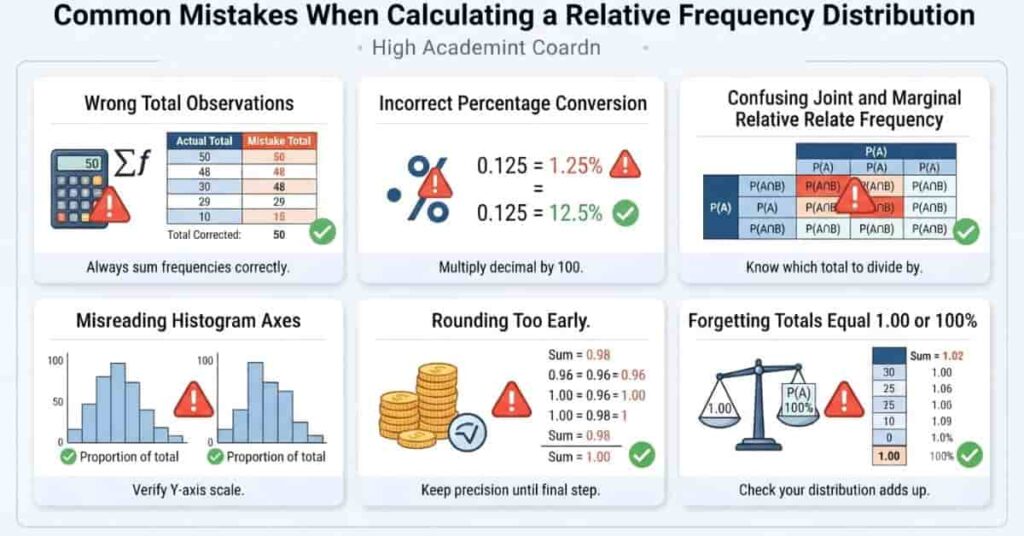
Learning how to calculate a relative frequency distribution is straightforward, but a few common mistakes can lead to incorrect results. Taking a moment to review your work can help you avoid calculation errors and improve accuracy.
1. Using the Wrong Total Number of Observations
Every relative frequency calculation should use the grand total of observations as the denominator.
For example, if your dataset contains 50 observations, every relative frequency should be divided by 50.
2. Calculating Percentages Incorrectly
A common error is forgetting to multiply the relative frequency by 100 when converting it into a percentage.
For example:
- Relative Frequency = 0.32
- Percentage = 32%
3. Confusing Joint and Marginal Relative Frequencies
Remember the difference:
- Joint relative frequency uses one cell in a two-way table.
- Marginal relative frequency uses a row total or column total.
Mixing these concepts leads to incorrect interpretations.
4. Misreading Histograms
Always check the vertical axis before interpreting a histogram.
If the y-axis displays relative frequency or percentage, the bars represent proportions rather than raw counts.
5. Rounding Too Early
Avoid rounding during intermediate calculations. Keep extra decimal places until you finish all computations.
Early rounding can prevent your totals from adding up to exactly 1.00 or 100%.
How to Use Our Relative Frequency Calculator
Calculating a relative frequency distribution by hand is a great way to learn the concept. However, it can become time-consuming when working with large datasets or grouped data. Our Relative Frequency Calculator simplifies the entire process by generating accurate results in seconds.
Instead of performing multiple calculations manually, you can upload or enter your data and let the calculator do the work. It automatically creates a frequency table, calculates relative frequencies, and displays percentages, helping you save time while reducing calculation errors.
Follow these simple steps to get started.
Step 1: Enter Your Dataset
Type or paste your dataset into the calculator. Make sure the values are entered correctly and separated according to the calculator’s instructions.
The calculator accepts both small and large datasets, making it useful for homework, research, and data analysis.
Step 2: Generate the Frequency Table
Click the Calculate or Generate button. The calculator counts how many times each value appears and organizes the results into a frequency distribution table automatically.
This eliminates the need to count observations manually.
Step 3: View Relative Frequencies Automatically
Once the frequency table is created, the calculator divides each frequency by the total number of observations.
It instantly displays:
- Frequency
- Relative frequency
- Percentage
- Total observations
This helps you verify your results without performing extra calculations.
Step 4: Copy or Export the Results
After reviewing the table, you can copy the results for assignments or reports. If your calculator includes export options, you can also download the table for future use.
Using ready-made results saves time when preparing presentations, research papers, or classroom projects.
Try the Relative Frequency Calculator
Ready to create a relative frequency distribution in seconds?
Use our Relative Frequency Calculator to generate accurate frequency tables, relative frequencies, and percentages instantly. It’s fast, beginner-friendly, and helps you avoid common calculation mistakes.
Applications of Relative Frequency Distributions
A relative frequency distribution is useful in many fields because it makes data easier to compare and interpret. By expressing results as proportions or percentages, it allows people to understand patterns without focusing only on raw numbers.
From classrooms to businesses, relative frequency distributions help users analyze data, identify trends, and make informed decisions.
Statistics
Statisticians use relative frequency distributions to summarize datasets and compare different groups. They also help identify patterns before performing more advanced analyses.
Business Analytics
Businesses analyze customer behavior, product sales, and marketing performance using relative frequencies. Comparing percentages often provides better insights than comparing raw sales numbers alone.
Research
Researchers use relative frequency distributions to summarize study results and compare outcomes across different samples. This makes reports easier to interpret and explain.
Machine Learning
Data scientists explore datasets with relative frequency distributions before training machine learning models. Understanding how values are distributed helps identify imbalances and unusual patterns.
Survey Analysis
Survey results are often reported as percentages rather than counts. Relative frequency distributions make it easy to compare responses across different demographic groups or time periods.
Quality Control
Manufacturers use relative frequencies to monitor product defects and production quality. Comparing defect rates helps identify problems that require attention.
Education
Teachers and students use relative frequency distributions to analyze grades, attendance records, quiz results, and classroom surveys. These tables make statistical concepts easier to understand and visualize.
Conclusion
A relative frequency distribution helps organize data into clear proportions or percentages, making patterns easier to understand. You learned how to create distribution tables, interpret relative frequency histograms, calculate joint and marginal relative frequencies, and use relative frequencies to estimate probability. These skills make it easier to compare datasets of different sizes and draw meaningful conclusions from real-world data.
If you want faster results, try our Relative Frequency Calculator to generate accurate distribution tables in seconds. You can also explore our guides on How to Calculate Relative Frequency and How to Calculate Relative Frequency in Excel to strengthen your data analysis skills. If you found this guide helpful, share it with others, leave a comment below, or explore more statistics resources on our website.
Frequently Asked Questions
A relative frequency distribution is a table or graph that shows how often each value or category appears as a proportion or percentage of the total dataset. Instead of displaying only raw counts, it converts frequencies into decimals or percentages. This makes it easier to compare datasets of different sizes and identify patterns. Relative frequency distributions are commonly used in statistics, research, business analytics, surveys, and probability.
Start by collecting your data and counting the frequency of each value or class. Next, calculate the total number of observations. Divide each frequency by the total to find the relative frequency. If needed, multiply each result by 100 to convert it into a percentage. Finally, organize the values into a table with columns for the class, frequency, relative frequency, and percentage.
A frequency distribution lists the number of times each value appears in a dataset. A relative frequency distribution shows the proportion or percentage each value represents. Frequency distributions are best for counting observations, while relative frequency distributions are ideal for comparing datasets with different sample sizes and estimating experimental probability.
A relative frequency histogram is a graph that displays relative frequencies instead of raw counts. The horizontal axis shows class intervals, while the vertical axis shows proportions or percentages. Although its shape is the same as a standard frequency histogram, it makes comparing different datasets much easier because every dataset uses the same scale.
Joint relative frequency is the proportion of observations that satisfy two conditions at the same time. It is calculated by dividing the frequency of a single cell in a two-way table by the total number of observations. Joint relative frequencies help analyze relationships between two variables and are commonly used in surveys, contingency tables, and statistical analysis.
Marginal relative frequency represents the proportion of observations in an entire row or column of a two-way table. It is found by dividing a row total or column total by the grand total of observations. Marginal relative frequencies summarize one variable at a time and provide a quick overview of the overall data distribution.
Relative frequency is commonly used to estimate experimental probability. Both calculations use the same formula: divide the number of times an event occurs by the total number of observations or trials. As more data is collected, the relative frequency generally becomes a more accurate estimate of the event’s true probability.
Yes. Microsoft Excel can create a relative frequency distribution using formulas like COUNTIF, PivotTables, or the Data Analysis ToolPak. After calculating frequencies, divide each value by the total number of observations to find the relative frequency. Excel can also generate relative frequency histograms using built-in chart tools.
Yes. An online Relative Frequency Distribution Calculator automatically creates a frequency table, calculates relative frequencies, converts them into percentages, and organizes the results in seconds. It saves time, reduces manual calculation errors, and is helpful for students, teachers, researchers, and professionals.
Use a relative frequency distribution whenever you want to compare datasets with different sample sizes or present results as percentages. It is especially useful for survey analysis, research, business reports, probability, and data science. A regular frequency distribution is more suitable when you only need raw counts.
Yes. In a complete relative frequency distribution, all relative frequencies should total 1.00. If they are shown as percentages, they should equal 100%. If your totals are different, check your calculations, verify the total number of observations, and avoid rounding values too early.
The formula is: Relative Frequency = Frequency ÷ Total Number of Observations. For example, if a value appears 15 times in a dataset of 60 observations, the relative frequency is 15 ÷ 60 = 0.25, or 25%. This formula is the foundation of every relative frequency distribution.
Yes. Relative frequency can be written as a decimal or converted into a percentage by multiplying it by 100. For example, a relative frequency of 0.40 becomes 40%. Percentages are often easier to understand and are commonly used in reports, research, surveys, and business presentations.
A relative frequency distribution helps organize and interpret data by expressing values as proportions or percentages instead of raw counts. This makes comparisons between datasets much easier, highlights important patterns, supports experimental probability, and improves charts and reports. It is widely used in statistics, education, research, business analytics, and data science.

Team ClassRank builds smart, student-friendly calculators to make grade and rank tracking simple and accurate. For questions or feedback, contact us at classrankcalculator@gmail.com.