
Introduction
Have you ever drawn a histogram and noticed the bars looked uneven or confusing? Often, this isn’t a problem with the data but with the selection of class widths.
Understanding how to choose the right class width is key to clear and accurate histograms.
If you calculate class width incorrectly in a histogram, you can easily distort the entire visualization. Crowded or spread-out bars make patterns harder to understand. Mistakes often lead to wrong conclusions, especially with school assignments and basic statistics.
In this guide, you will learn how to choose the correct class width and build clear, accurate histograms. Our step-by-step approach helps you avoid common mistakes. The main benefit is making your data easy to interpret and your graphs more meaningful, leading to better insights and informed decisions.
By the end, you will confidently understand how to calculate histogram class width and create visuals that are both accurate and easy to read.
👉 Want to avoid mistakes and save time? Try our Class Width Calculator to instantly find the perfect interval for your histogram.
What is Class Width in a Histogram?
Have you ever wondered why some histograms are clear and easy to read, while others are messy and confusing? It’s often because of the width of each bar.
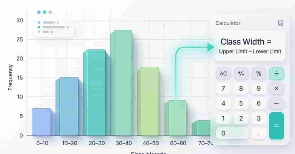
Class width is the size of each group in a histogram. It is the range each bar covers on the x-axis. If a bar covers values from 10 to 20, the class width is 10. Class width affects how your histogram looks and how easy it is to read.
Class Width = Upper Class Limit − Lower Class Limit
Each bar in a histogram matches a class interval, and its width equals the class width. If the class width is too small, your histogram will have many narrow bars. If it’s too large, important details may disappear.
Picture a histogram with bars for student scores in 0–10, 10–20, and 20–30 intervals. Each bar is the same width because the class width is consistent. This consistency makes the graph easy to compare.
A common mistake beginners make is mixing different class widths in the same histogram. This leads to distorted visuals and incorrect interpretation of data.
Expert Tip: Always keep the class width consistent across all bars unless the data specifically requires changes to the grouping. This keeps your histogram accurate and easy to read.
Understanding class width helps you create clear histograms. Get this right, and interpreting data becomes simpler.
It also helps to understand the statistical concept of class width and how it works in frequency distributions.
How Class Width Affects Histogram Shape
The class width of a histogram strongly shapes its appearance and meaning. Changing it alters how your data is represented.
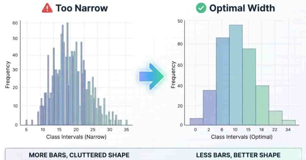
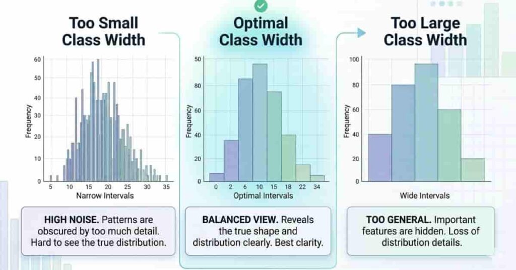
When the class width is too narrow, the histogram creates too many bars. This makes the graph look crowded and harder to interpret. Small variations in the data are overemphasized, and the overall pattern gets lost in the noise. Beginners often think this gives more detail, but it actually reduces clarity.
If the class width is too big, the histogram hides important details. The bars are too wide, and small patterns in the data disappear. This can lead to simple conclusions, especially when you need more detail.
Choose a balanced class width for clear, readable histograms where patterns stand out.
Balanced Histogram Shape→Optimal Class Width=Clear Data Distribution\text{Balanced Histogram Shape} \rightarrow \text{Optimal Class Width} = \text{Clear Data Distribution}Balanced Histogram Shape→Optimal Class Width=Clear Data Distribution
To better understand this, think of a before-and-after scenario. In the “before” case, a narrow class width produces many thin bars that overlap visually and confuse the reader. In the “after” case, a balanced class width groups the data properly, producing smooth, meaningful patterns that are easy to analyze.
More bars don’t mean better accuracy; clarity is key.
Pro Tip : Always test at least two class widths before finalizing your histogram. Choose the one that shows the clearest pattern without hiding or overloading information.
How to Calculate Class Width for a Histogram
If you want to build a clear histogram, you must first understand how to calculate class width in a histogram correctly. This step decides how your data will be grouped and how readable your final graph will be. Many beginners in the USA skip this step or guess the values, which leads to confusing or misleading histograms.
Class width is the range covered by each bar in your histogram. It controls how data is split into intervals, also called bins. If your class width is too small, you will get too many bars that make the graph crowded. If it is too large, important patterns in your data may disappear. That is why choosing the right class width is essential for accurate data visualization.
In simple terms, class width helps you turn raw numbers into organized groups. Once you understand this process, creating histograms becomes much easier and more logical. In the next steps, you will learn a simple method for finding the class width using a basic formula and a structured approach. This method works for most school-level datasets and beginner statistics problems.
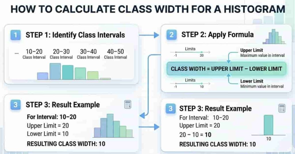
Step 1 – Identify Class Intervals
The first step in finding class width is to identify your class intervals, also called histogram bins. These intervals are the ranges that will form each bar in your histogram. For example, data might be grouped as 0–10, 10–20, 20–30, and so on. Each interval represents one section of your dataset.
To begin, look at your smallest and largest values in the dataset. Then decide how you want to divide them into equal groups. The goal is to keep intervals consistent so the histogram remains easy to read. Unequal intervals can distort the graph and confuse interpretation.
Once you list the intervals, check that each group follows a consistent pattern. This ensures your histogram will have evenly spaced bars. This step is important because it sets the foundation for calculating class width correctly.
Step 2 – Apply the Formula
After identifying intervals, the next step is to apply a simple formula to calculate class width in a histogram.
Class Width=Upper Limit−Lower Limit\text{Class Width} = \text{Upper Limit} – \text{Lower Limit}Class Width=Upper Limit−Lower Limit
For example, if a class interval is 10–20, then the class width is 20 − 10 = 10. This value represents the width of each bar in your histogram.
Let’s take a quick case. Suppose your dataset uses intervals like 0–5, 5–10, and 10–15. Here, each class width is 5. This means every bar in your histogram will cover a range of 5 units, keeping the graph balanced and easy to interpret.
Step 3 – Keep Intervals Consistent
The final step is to ensure all your class intervals have the same width. Consistency is what makes a histogram reliable and easy to read. If one interval is 5 units and another is 10 units, your graph will become misleading and unbalanced.
Always double-check your intervals before plotting the histogram. Every bar must have the same class width unless your data specifically requires a different grouping method. Consistent spacing helps viewers quickly understand patterns and compare values across groups.
A common mistake beginners make is adjusting intervals randomly during graph creation. This disrupts the histogram’s structure and reduces accuracy. Instead, decide your class width first and apply it evenly across all groups.
Pro Tip: Always review your dataset’s range before finalizing intervals. A well-planned class width makes your histogram cleaner, more professional, and easier to analyze.
Choosing the Right Class Width for Histograms
Choosing the right class width is one of the most important steps when building a histogram. It directly affects how your data is grouped and how clearly patterns appear. Many beginners focus only on formulas, but in real practice, the decision depends more on your dataset size and how readable you want the graph to be.
When your dataset is large, you usually need a slightly larger class width. This helps reduce the number of bars and keeps the histogram clean. If the dataset is small, a smaller class width works better because it shows more detail. The goal is always balance, not extreme values.
Another important factor is the number of bins. Bins are just another name for class intervals. Too many bins make the graph noisy and hard to read. Too few bins hide important patterns. A well-balanced histogram usually has enough bins to show trends without overwhelming the viewer.
Number of Bins ↑ ⇒ More Detail, Less Clarity
Number of Bins ↓ ⇒ Less Detail, More Simplicity
A simple student-friendly guideline is to start with a moderate class width and adjust based on how your histogram looks. If the graph looks crowded, increase the width slightly. If it looks too simple or flat, reduce it. This practical approach works better than rigid adherence to theoretical rules.
Common Histogram Mistakes Due to Wrong Class Width
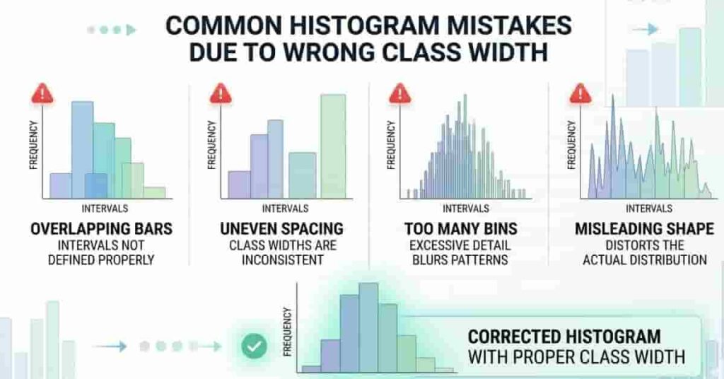
A histogram appears simple, but even minor class-width mistakes can drastically alter your data’s appearance. Many beginners emphasize plotting bars but overlook how class width impacts accuracy. This often results in misleading graphs and incorrect conclusions.
One of the most common mistakes is overlapping bars. This happens when class intervals are not clearly defined or are inconsistent. Instead of a clean separation, the bars start to look messy and confusing. It becomes hard to understand where one group ends and another begins.
Another concern is uneven spacing. When class widths vary, the histogram loses its integrity. Some bars seem disproportionate, even when the data do not warrant it. This distorts visual balance and renders comparisons unreliable.
The most serious problem is the use of misleading graphs. An incorrect class width can hide patterns or exaggerate differences in the data. A dataset that looks normal might appear skewed or unusual just because the grouping is incorrect.
Incorrect Class Width⇒Distorted Histogram Shape⇒Misleading Data Interpretation\text{Incorrect Class Width} \Rightarrow \text{Distorted Histogram Shape} \Rightarrow \text{Misleading Data Interpretation}Incorrect Class Width⇒Distorted Histogram Shape⇒Misleading Data Interpretation
Frequency Tables to Histogram (Step-by-Step)
Converting a frequency table into a histogram becomes easy once you understand how class width works in frequency distribution. This process helps you turn raw data into a clear visual graph that shows patterns instantly. Many students struggle here because they skip the step of organizing intervals properly before plotting.
The first step is to take your frequency table and identify the class intervals. These intervals represent grouped data ranges, such as 0–10, 10–20, and so on. At this stage, you also calculate class width in a frequency distribution by finding the difference between consecutive class limits. This ensures all groups are evenly spaced and ready for graphing.
Class Width=Upper Limit−Lower Limit\text{Class Width} = \text{Upper Limit} – \text{Lower Limit}Class Width=Upper Limit−Lower Limit
Once intervals are confirmed, you move to plotting the histogram. Each class interval corresponds to a bar, and the frequency determines its height. It is important that all bars follow the same class width so the graph remains balanced and easy to read.
To make it clearer, imagine a frequency table of student scores: 0–10 has 5 students, 10–20 has 8 students, and 20–30 has 3 students. Each interval has a width of 10, and these become the bars in your histogram.
Using Class Width Calculator for Histogram Data
A histogram class width calculator makes the process of building histograms much faster and more accurate. Instead of manually guessing intervals, you can quickly determine the right class width and ensure your bins are evenly distributed. This is especially helpful for students who want to avoid errors in frequency grouping and focus more on understanding patterns in data.
When you calculate class width manually, small mistakes can affect the entire histogram shape. A calculator helps reduce these errors by providing quick, reliable results. It also helps you verify whether your chosen bin size is appropriate for the dataset. This improves the accuracy of your final graph and makes your analysis more trustworthy.
In practice, you simply enter your data range or class limits into a histogram class width calculator, and it suggests a suitable width. You can then use this value to build consistent class intervals. This saves time and ensures your histogram looks clean and properly balanced.
Another benefit is that you can test different class widths quickly. If your histogram looks too crowded or too simple, you can adjust the value and immediately see improvements in clarity. This practical flexibility is more useful than relying only on fixed formulas.
Visual Examples
Visual examples make it much easier to understand how class width affects a histogram. Instead of only reading rules, you can clearly see how different class widths change the shape and clarity of the graph. This helps beginners quickly identify what a good histogram should look like in real practice.
A simple histogram example shows evenly spaced bars with a consistent class width. Each bar represents a clean interval, making it easy to read data patterns without confusion. This type of graph is ideal for learning how proper class width improves clarity and structure.
A corrected histogram comparison is even more powerful than an incorrect one. In the incorrect version, class widths may be uneven or too narrow, creating a crowded or misleading graph. In the corrected version, all bars follow equal class width, making the distribution smooth, balanced, and easy to interpret.
Tips for Better Data Visualization
Good data visualization makes your histogram easy to read and understand at a glance. The goal is not to add more details, but to present data in a clear and meaningful way. When you follow simple rules, your graphs become more accurate and professional.
First, always use consistent class intervals. If your intervals are uneven, the histogram loses balance and becomes misleading. Equal spacing helps the reader compare data easily and understand patterns without confusion. This is one of the most important rules in histogram design.
Second, avoid using too many bins. When bins are too many, the graph looks crowded and hard to interpret. Small changes in data start to look exaggerated, which can confuse beginners. A moderate number of bins keeps your histogram clean and readable.
Finally, remember that clarity is always more important than complexity. A simple, well-structured histogram is far more useful than a complicated one that is hard to understand. Your goal should be to make the data easy for anyone to read, even without technical knowledge.
Clarity > Complexity ⇒ Better Data Interpretation
Pro Tip: Always step back and check your histogram as a viewer, not as the creator. If it looks confusing, simplify the class intervals and reduce unnecessary bins for better readability.
Conclusion
In this guide, we explored how histograms work and why class width plays a key role in data visualization. You also learned how different class widths affect graph clarity and how to avoid common mistakes that distort your results. Understanding these basics helps you build more accurate and readable histograms with confidence.
When you calculate class width correctly in a histogram, your data becomes easier to interpret and visually balanced. It improves how patterns are shown and reduces confusion in statistical graphs. This simple step can greatly improve your overall data analysis skills.
Now it’s your turn to practice and apply what you’ve learned. Try using a histogram class-width calculator to test different datasets and see how the results change. Share your experience in the comments or explore more guides on our site to strengthen your statistics skills.
👉 Use our Class Width Calculator now to create accurate, clear histograms in seconds and improve your data analysis instantly.
Team ClassRank builds smart, student-friendly calculators to make grade and rank tracking simple and accurate. For questions or feedback, contact us at classrankcalculator@gmail.com.